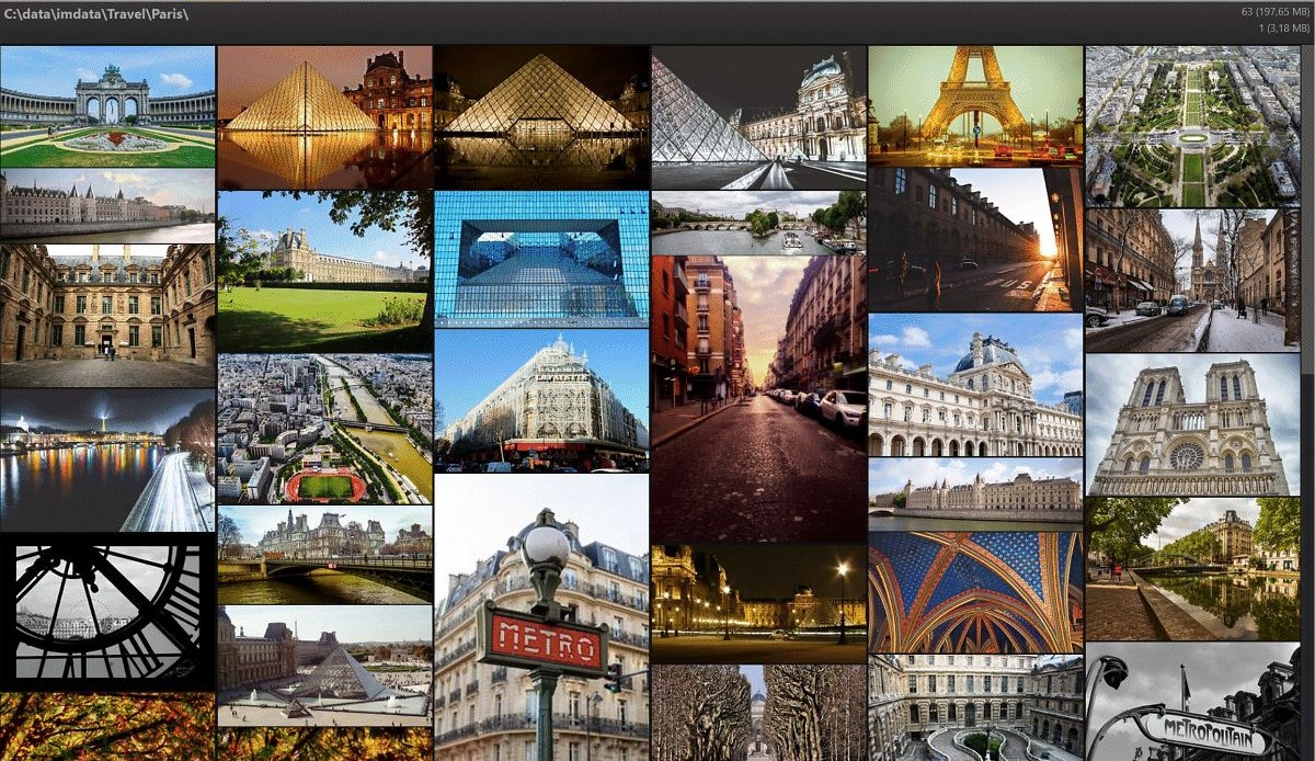
The File Window layout named Gallery arranges the files in the current scope using a smart masonry layout to produce a clean, album-like look with minimal...
The File Window layout named Gallery is an experimental feature.
It arranges the files in the current scope using a smart masonry layout to produce a clean look with minimal distractions.
It is not intended to work with thousands of images, but rather to browse images in a pleasing way.
Here is a typical example of the File Window Gallery:

To switch to the Gallery layout, use the File Window layout selector:

The Gallery layout arranges files from left to right. Depending on the current zoom level, 1 to 20 files are displayed in each column. You control the number of columns via the normal zoom slider in the File Window ribbon.
If the first row has been filled, the Gallery fills the next row, arranging images in a tight layout, side-by-side. The final look depends on the aspect ratio of the images, how many images are displayed per row and the selected sort profile.
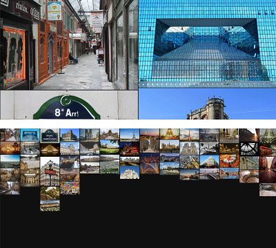
The Gallery with two and 14 columns per row.
There are only a few options for the user to control. To open the Gallery configuration, click on the gear icon in the File Window ribbon:

This enables the ribbon in the Gallery, which allows you to control the text overlay, font size, color, and the layout mode:
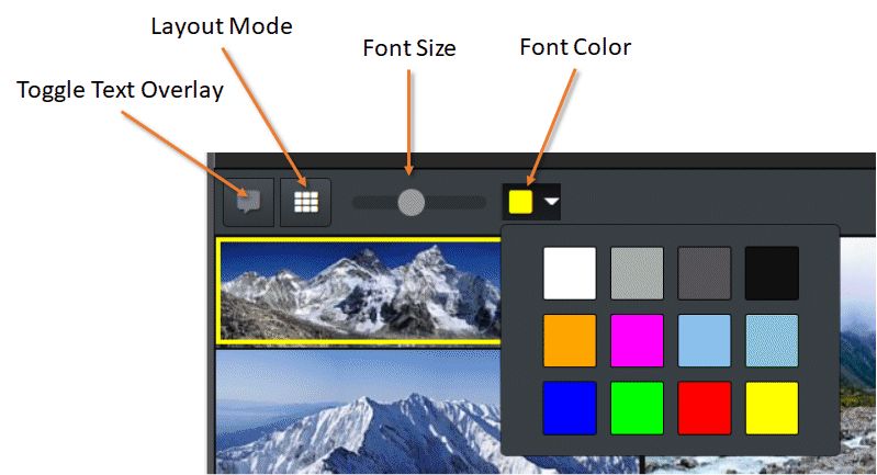
Except for very small image sizes (when many columns are displayed), the Gallery can display a text overlay:

The text overlay shows the rating and label at the top, and the file name and File.DateTime at the bottom.
With the slider, you can control the font size for the overlay, and with the color drop-down, the font color. Select a color that gives you the best readability, depending on the overall color scheme of your images.
You can toggle the text overlay on and off with Ctrl+T.
Note that the overlay is automatically hidden when you display too many images per row.
This button allows you to switch between the default smart masonry layout and a square layout. In the square layout, the Gallery produces quadratic tiles, cropping images horizontally or vertically as needed to make them fit:
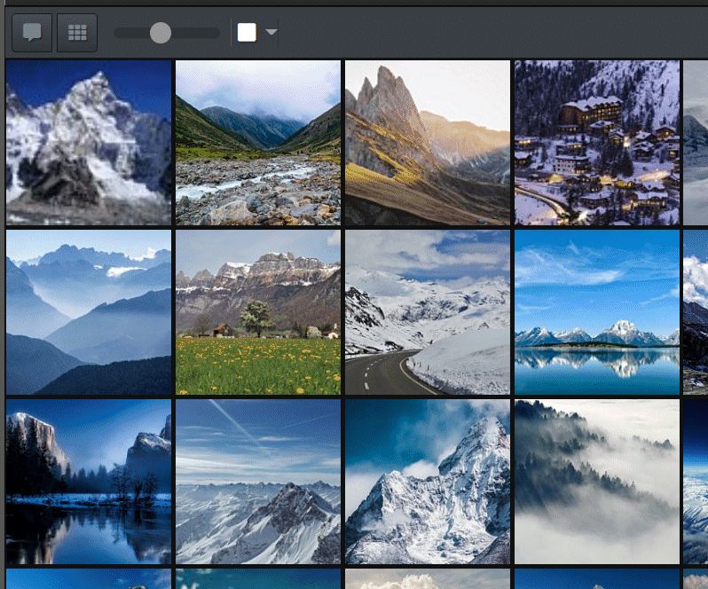
To close the Gallery ribbon, click on the button on the right of the ribbon, or click the gear icon in the File Window ribbon again.
Press and hold Shift + SPACE to Peek View an image.
The Gallery layout places images in the order created by the currently active sort profile. If the masonry layout is used, images are rendered from left to right and top to bottom. If images with varying dimensions and a mix of portrait/landscape images are used, the end result appears different from the square layout or regular File Window layouts.
It is also normal that some columns will end up longer than others, causing a somewhat uneven look for the last rows of files. This can be enhanced by using a sort profile which sorts files by their dimensions, for example.
This experimental layout has been added to IMatch to allow users to look at or present their files in a minimalistic and pleasing way, with a minimum of distractions. Consider it as an alternative to regular File Window layouts when you primarily browse your files and not work with them.
Due to the current technical limitations of app-based layouts, the Gallery layout is only suitable for displaying several hundred to a few thousand files. It automatically stops (with a message) when you try to load more than 5,000 files.
Use a regular File Window layout when you need to work with thousands or tens of thousands of files.
Normal IMatch File Window layouts work with the thumbnails stored in the database. Thumbnails typically have a maximum of 300 pixels in each dimension and are very fast to load.
The Gallery layout can use thumbnails too, but only if the column width is less than or equal to the thumbnail width. If the column width exceeds the thumbnail size, the Gallery layout uses the cache images.
This allows the Gallery to render images at any size in excellent quality, but it also requires transferring a lot more data from the disk to the File Window. When you scroll fast, you may notice a slight delay before the images become visible - especially if the cache images do not yet exist and have to be created from the original file.