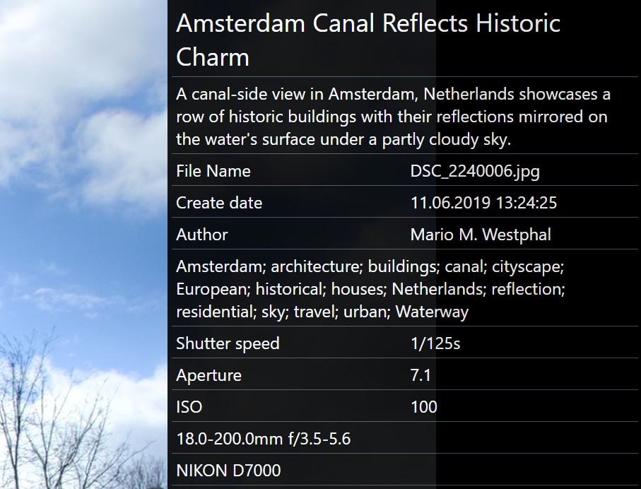
Overlays let you display extra information within the Peek View and Viewer windows. You can customize the data displayed and formatting using IMatch variables and simple HTML tags. Overlays are also used for My Panels, where you can design your own custom metadata displays.
The image below shows an example overlay layout in the Viewer. It displays information such as the headline, description, file name, creation date, keywords, and EXIF data like aperture, shutter speed, ISO, lens type, and camera make and model.
What is displayed and in which order is completely up to you. Combine all the information you want to see for a file into one single place.
In the Peek View, the overlay is visible when the overlay settings are configured to use either the overlay or visible mode (see below). To hide the overlay, set the mode to hide.
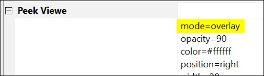
Press V to toggle the overlay in the Peek View for the current IMatch session. The display mode set in the preferences controls whether or not the Peek View overlay is initially shown and which mode is used.
To show or hide the overlay in the Viewer, you can also use the keyboard shortcut V. Alternatively, you can toggle the overlay using the smart menu or context menu.
You configure the overlays for both Viewer and Peek View via Edit menu > Preferences > Application.

The My Panel feature allows you to create custom panels that display the information you want, in a way you prefer.
See My Panel for more information.
File Window Tips show when you hover over the blue info icon in thumbnail panels.
See File Window Tips for more information.
To configure the overlays used by the Viewer and Peek View (you can use different overlays for each), go to Edit menu > Preferences > Application and search for "overlay" a few times until you find the Viewer overlay settings.

The Peek View configuration is similar and can be found in the Peek View section of this same dialog box.
Click on the ... button visible at the end of the property editor to open the overlay source in the dedicated editor:

The Overlay Editor supports syntax highlighting for both variables and HTML, which makes the overlay source code much easier to read and edit:

It also has helpful features like access to the variable selector or for inserting a HTML color value.
See Building Blocks below for example templates that you can copy and paste.
Overlays are designed to be easy to setup and customize. The configuration uses a simple key=value format to control aspects like position, mode, size, and the data displayed in the overlay.
Consider this minimal example for the Viewer overlay:
position=right
width=20
row={File.MD.headline}
row={File.MD.description}
row=File Name$${File.NameExt}
This configuration places the overlay on the right side of the Viewer or Peek View, with a width equal to 20% of the Viewer's window width.
The example uses three row statements. Each statement creates one row in the overlay. The first row displays the headline, the second shows the description, and the third displays the file name. The result is shown below:
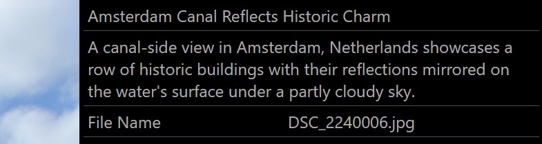
Notice that the third row uses two columns, separated by $$. The first column is used as a caption "File Name", and the second column displays the result of the file name variable.
Let's add a few more rows to our example:
position=right
width=20
row={File.MD.headline}
row={File.MD.description}
row=File Name$${File.NameExt}
row=Create date$${File.MD.createdate}
row=Author$${File.MD.creator}
row=Aperture$${File.MD.aperture}
row=ISO$${File.MD.iso}
row=Lens$${File.MD.lens}
row=Camera Name$${File.MD.cameraname}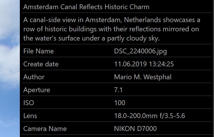
Each row uses the caption$$value format, creating a neatly aligned table with lots of useful information.
You can use variables for all columns.
Overlays use a flexible grid layout system. Each row can have up to 12 columns.
The available width is equally distributed among the columns. If a row has only one column, it gets 100% of the available width. If a row has two columns, each column gets 50% of the available width. Approximately 33.33% for three columns, 25% each for four columns and so on.
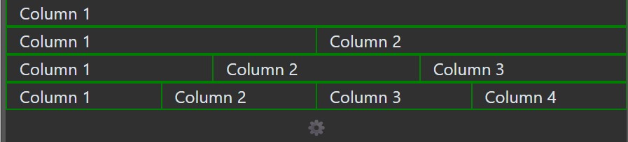
This image shows rows with different numbers of columns. We've used green borders to visualize the grid layout.
When variables return longer text values, this looks like this:

Rows automatically grow in height and text is wrapped into multiple lines as needed.
This grid system makes it very easy to create layouts that meet your needs. Use one column for rows that display longer text, like headlines or descriptions. Use two or more columns to display data in tabular form. If you dock your panel horizontally, add more columns to make good use of the space.
To override the default even distribution of width between all columns, you can specify widths for one or more columns. The width is a value between 0 and 12. The entire row has 12 units, so if you specify the width of a column as 3, the remaining columns divide the remaining 9 units among them.
The special value 0 means auto, making the cell fit to its content.
This row uses two columns (separated by $$) for a caption and the description variable:
row=Description$${File.MD.description} The result looks like this. Both columns get 50% of the available width.

A lot of space is wasted on the caption, since both columns get 50% of the available width. To change this, specify a column width for the first column:
row=Description$$:3{File.MD.description} The width specifier must start with a : directly after the $$, followed by one or two digits specifying a width between 0 and 12.

Setting a width of 3 for the first column produced a much more useful layout. The second column automatically uses the remaining width. If you need more room for the first column, just set the width to 4 or even 5. If you set it to 6, each column is 50% again, because six is 50% of 12.
If you use more than two columns, you can specify widths for each column, as needed. Make sure the total number of widths does not exceed 12, else one or more columns will wrap into a new line.
If you set the column width to 0, the layout fits the column to its content width:

The columnwidth option allows you to specify a width for the first column for all rows with two columns. This is a typical use case and avoids having to specify the width of the caption/title column for every row.
You can configure up to four My Panels using their built-in editing feature. They use (most of) the same options and formatting described here.
Overlays are essentially full-featured web browsers, supporting HTML and CSS (style sheet) formatting options. This provides significant flexibility in how you present your data.
<span> TagsIn the example overlay above, the first row is:
row={File.MD.headline}This displays the contents of the headline tag within the overlay. To change the font size or color, you can wrap the variable in a span HTML tag like this:
row=<span style="font-size: 150%;">{File.MD.headline}</span>
The style attribute within the span tag allows you to define formatting options like font, size, and color. In this example, we're increasing the font size used to display the headline to 150%:
position=right
width=20
row=<span style="font-size: 150%">{File.MD.headline}</span>
row={File.MD.description}
row=File Name$${File.NameExt}
row=Create date$${File.MD.createdate}
row=Author$${File.MD.creator}
row=Aperture$${File.MD.aperture}
row=ISO$${File.MD.iso}
row=Lens$${File.MD.lens}
row=Camera Name$${File.MD.cameraname}

To change the color of the text enclosed by the span, add the color attribute:
row= <span style="font-size: 150%; color: yellow;">{File.MD.headline}</span>

You can use this technique to style any value displayed in the overlay. Often, simply adjusting the font size and color will be enough to customize your overlays. For more advanced styling, you might also find border useful for adding borders or font-family for using a different font.
For more information on formatting HTML content using span tags and style, see the MDN Reference or search online for phrases like "Style HTML using <span>". Or ask an AI.
If you add HTML tags like <style> to your overlay, and the overlay then shows "strange" content or no content at all, you have most likely missed adding a closing >. Just check the overlay settings carefully to fix it. Each < needs a matching >, and tags like <span> need a closing </span> tag.
If you have a row like this:
row=Caption$$Value
and you want to change the color, font size, or other properties of both the caption and the value, you can wrap them in a <span> tag. This allows you to apply styling directly to each part.
row=<span style="color:red;">Caption</span>$$<span style="color:green;">Value</span>
Sometimes tags may not have a value. This results in empty rows appearing in the overlay:
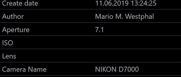
While this isn't a problem, you might prefer to suppress these empty rows. You can do this by using -row instead of row and placing the ISO and Lens captions into the variable as a prefix:
-row={File.MD.iso|hasvalue:ISO}$${File.MD.iso}
-row={File.MD.lens|hasvalue:Lens}$${File.MD.lens}
When the overlay encounters -row, it checks if the row is empty. If so, the entire row is suppressed.
The rows have two columns. The first shows the caption (ISO, Lens) and the second column shows the variable value. To suppress the rows when the ISO and lens values are empty, we also need to make sure that the captions columns are empty. We do that by using the same variable as in the second column in combination with the hasvalue function to output the captions only when the variable has a value.
Now both columns are empty when the variable has no value, and the overlay can suppress them.

Note: This only works if the row uses a variable directly. If you include HTML tags, the row will not be suppressed.
For example:
-row=<strong>{File.MD.iso}</strong>Even if the variable is empty, the <strong></strong> tags remain and prevent the row from being suppressed.
prefix and postfixTo avoid this problem, you can use the prefix and postfix variable functions to add HTML tags before and after the variable:
-row={File.MD.iso|prefix:<strong>;postfix:</strong>} These functions only output content when the variable has a value; otherwise, they produce no text. This makes them ideal for use with -row when you want to mix HTML and variable values but only if the variable contains data.
The prefix and postfix functions do not escape characters like &, <, and >. This makes it easy to use HTML code with these functions.
defaultIf you want to display rows even when tags have no value, but indicate that they are missing, use the default variable function:
row=ISO$${File.MD.iso|default:No ISO value available.}
row=Lens$${File.MD.lens|default:No lens data available.}
The default function provides a default text string when the tag itself is empty. The output will then show:
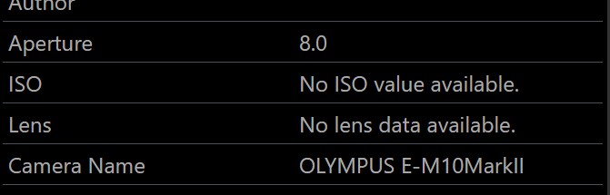
You can use a dimmed text color to visually distinguish these missing values:
row=ISO$${File.MD.iso|default:<span style="color:#555555">No ISO value available.</span>}
row=Lens$${File.MD.lens|default:<span style="color:#555555">No lens data available.</span>
The default function does not escape characters like &, <, and >.
HTML ignores carriage returns and line feeds in text data. If you use line breaks in, for example, descriptions to form paragraphs, these will not show in overlays. A description may look like this in the Metadata Panel:
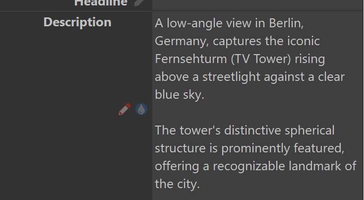
You can use Ctrl + Enter to add new line breaks and empty lines to descriptions, headlines and other long-text tags.
In the overlay, the description shows without these paragraphs and empty lines:

HTML uses the <br> tag to enforce line breaks. The trick is to replace the line breaks contained in the variable value with <br>.
This can be achieved easily with the pereplace variable function:
-row={File.MD.description|pereplace:{lf}==<br>}Line breaks contained in the description are replaced with <br> and this reproduces line breaks and empty lines in the overlay:

The trick is to use pereplace and not replace, because pereplace has been explicitly designed to not escape unsafe characters like < and > with their safe counterparts.
If you want to list the categories of the selected file, you can use this row:
-rowne=Categories$${File.Categories.Direct|pereplace:~;==<br>}It lists all categories the file is directly assigned to, and replaces the ; with an HTML line break to output one category per row. If you just want the categories listed, skip the |pereplace section entirely.
rowneBy default, IMatch automatically escapes certain characters emitted by variables to prevent errors and ensure they display correctly. This occurs when variables contain characters such as &, <, or >, which have special meanings in HTML.
When a variable's result is displayed, IMatch replaces potentially problematic characters with safe alternatives. For example, if a variable contains < (less than), IMatch changes it to <. Similarly, other special characters are replaced: & becomes &, and so on. This ensures that the text can be safely included in your overlay.
Sometimes you want a variable to generate HTML code. For instance:
row={File.Rating|numcomp:gte,3,<strong>Good Rating!</strong>}
This variable is intended to output <strong>Good Rating!</strong> when a file's rating is greater than or equal to 3. The goal is to display the text "Good Rating!" in a bold font.
Without special instructions, IMatch will escape those < and > characters, preventing the bolding from working. It doesn't recognize that you want to output HTML code!
To instruct IMatch not to escape these characters, use the rowne (row non-escape) option in your overlay settings. The same effect can be achieved with -rowne, similar to -row.
rowne={File.Rating|numcomp:gte,3,<strong>Good Rating!</strong>}
Important: Use rowne and -rowne with caution! Only use them when you're certain the output from your variable is safe HTML code that won't disrupt your overlay layout. Consider using prefix and postfix to output HTML whenever possible, or use the htmlescape function for variables that might contain unsafe characters.
To create an empty row, simply add:
rowne=
Overlays ignore empty row statements. To ensure the row is rendered, an invisible non-breaking space is used as its value.
If you work with long file names that have no embedded spaces or other breaking points, the overlay may show a horizontal scroll bar when the file name does not fit. If the file name is separated by, for example, - or _, you can use a replace statement to insert an invisible space that does not show, but allows HTML to break the file name into multiple rows.
rowne=File Name$${File.FullName|replace:_==_​~;}
The HTML entity ​ is an invisible space. By replacing _ with _​~; we allow HTML to wrap long file names into multiple rows by breaking after each _ when needed.
Note the ~; at the end. The entity must end with ;, but semicolons have a special meaning in variables. We have to escape ; with ~; to get a 'real' ;.
; When You Let Variables Output HTMLA common pitfall is including ; inside variables without escaping it using the ~ character.
Inside variables, the ; has a special meaning (it's used to separate functions when you use more than one function in a variable). Consider this example:
rowne={File.Rating|numcomp:gte,3,<span style="font-size:2rem;">⭐</span>}This variable checks the value of the rating and, if the rating is 3 or better, it outputs ⭐ (which displays as ⭐). The size of the star is controlled via the font size in the style attribute.
The problem is, this doesn't work.
When you look closely, you'll see why. The HTML code is part of the variable and contains two semicolons ;: one in the style= attribute and one within the ⭐ entity. To make this work, both ; must be written as ~; to ensure the variable outputs the semicolon character instead of treating it as a function separator.
rowne={File.Rating|numcomp:gte,3,<span style="font-size:2rem~;">⭐~;</span>}This is only relevant when the HTML code is inside the variable. If you simply wrap a variable in HTML, like this:<span style="color:red;font-size:12pt;">{File.MD.ISO}</span>, then the ; characters are not an issue.
To include an icon or small image in your overlay, use an HTML <img> tag.
IMatch creates a special "virtual host" within overlays. Consider it a shortcut to a folder on your computer where you can store images and other resources for your overlays. This virtual host is named user, pointing to the user-specific folder %APPDATA%\photools.com\IMatch6\html\templates on your system. You access files in this folder (and its subfolders) via the address https://user.
To open this folder, copy the %APPDATA% folder name shown above into the File Explorer address bar.
For instance, we copied an image named star-yellow.png into that folder:

The user template folder in Windows Explorer.
We can now include this image in the overlay as follows:
row=<img src="https://user/star_yellow.png"/>
This will display the image in your overlay!
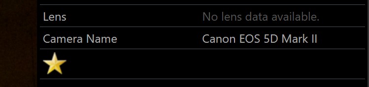
You can also show images based on a condition. For instance, to display a star when a file has a rating of 3 or better:
rowne={File.Rating|numcomp:gte,3,<img src="https://user/star_yellow.png"/>}
We again use rowne to prevent escaping.
HTML supports a wide array of icons, symbols, emojis, and other graphics, all fully scalable! For example:
😁 🌵
You can use these icons in your overlays as indicators or for various other purposes. Include the special code for the icon/emoji you want to display. The examples above use these HTML statements:
<span style="font-size:48px;">😁 🌵</span>
The numbers starting with &# are the codes for these icons and emojis, as defined in HTML standards. Use &# for decimal numbers and &#x for hexadecimal numbers.
You can control emoji sizes by adjusting the font size (e.g., font-size:3em, font-size:6em, and font-size:9em). em is a unit defining the font size relative to the current element's font size. Alternatively, you can use pixels (px), points (pt), or any other units supported by HTML.
How about displaying a globe symbol when a file has GPS coordinates?
rowne=<span style="font-size:32px">{File.MD.gpslatitude|hasvalue:🌐}</span>
This variable tests if the GPS latitude tag has a value and, if so, outputs the globe icon. The size of the icon is set to 32 pixels via a <span>:

W3Schools has a helpful overview of HTML emojis, icons, and symbols.
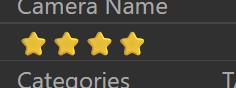
Using symbols makes it easy to output rating stars in your overlay, for example. The trick is to display 0 to 5 stars, depending on the file's rating. This can be done with a bit of variable magic:
-rowne={File.Rating|numcomp:eq,1,<span style="font-size:1rem~;">⭐~;</span>}
-rowne={File.Rating|numcomp:eq,2,<span style="font-size:1rem~;">⭐~;⭐~;</span>}
-rowne={File.Rating|numcomp:eq,3,<span style="font-size:1rem~;">⭐~;⭐~;⭐~;</span>}
-rowne={File.Rating|numcomp:eq,4,<span style="font-size:1rem~;">⭐~;⭐~;⭐~;⭐~;</span>}
-rowne={File.Rating|numcomp:eq,5,<span style="font-size:1rem~;">⭐~;⭐~;⭐~;⭐~;⭐~;</span>}
This produces output like this:
With the header= option, you create a header:
header=Keywords$$:4Description
It works exactly like row, but produces a different look for the columns:
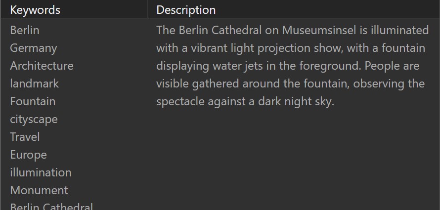
You can insert header rows any number of times to create sections in the overlay.
The neat list of keywords in the first column was created by this row statement:
rowne={File.MD.hierarchicalkeywords|replace:~;==<br>}$$:4{File.MD.description}
The statement replaces the semicolons used by the variable with <br>, an HTML line break. We also use width :4 to give more room to the description column.
<div><div> is similar to <span>, but it's a so-called block-level element (a <span> is inline). A good use case for <div> is when you want to create space in a table, offsetting subsequent rows slightly for better separation. For example:
rowne=<div style="margin-bottom:32px;">Author:{File.MD.creator}</div>
The Author caption is wrapped in a <div> with a bottom margin of 32 pixels, creating a neat spacer in the table. You can use this as an alternative to creating an empty row using , or when you want less than a full row height of spacing.
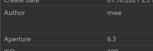
Use the <div> only for the caption. If the row doesn't have a caption, wrap the value in a <div>.
This feature is not available in Peek View.
Overlays offer a feature to execute Favorites. Adding some buttons to your My Panel to run your Favorites directly can be a big time saver. You could even create a dedicated My Panel that offers direct access to many Favorites in a very compact format.
This overlay example includes three buttons which execute Favorites:
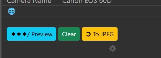
The left button adds a rating and label to all selected files using a Metadata Template. The one in the middle resets the rating and label, again using a Metadata Template. The third button runs a Batch Processor preset that exports all selected images in JPEG format.
You can of course run any kind of Favorite from your overlays.
If you use Favorites in the Viewer overlay, the Favorite is applied to the focused file in the Viewer. For My Panel, Favorites are applied to all selected files in the active File Window.
HTML supports buttons, and we can just use a <button> element in a normal row:
row=<button>My button</button>
This row produces a clickable button:

The button uses the default button style, and clicking it does nothing so far. Let's change that.
Overlays include the Bootstrap CSS library for styling what you see in the overlay and making it look good.
Bootstrap includes a number of CSS classes to style buttons and make them look nice. We use the class HTML attribute to apply a style to our button:
row=<button class="btn btn-info">My button</button>
Instead of btn-info, you can also use:
See the Bootstrap button reference for all details.
By adding the btn-sm class in addition to the other classes, you can create smaller buttons, which are usually a better fit.
row=<button class="btn btn-info btn-sm">My button</button>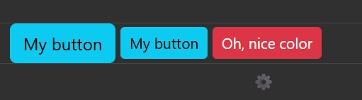
The two left buttons use btn-sm to reduce their size. The red button uses the class btn-danger.
After making the button look nice and shiny, let's add some functionality. Overlays provide a handy JavaScript method called Overlay.executeFavorite that does all the work. All we have to do is call it when the button is clicked. To do this, we need to add what's called an onclick handler:
row=<button class="btn btn-info"
    onclick="Overlay.executeFavorite('GUID',event)">My button</button>
The Overlay.executeFavorite function takes two parameters. The second parameter is always event. The function uses this parameter to determine if Shift is pressed, in order to run either the primary or secondary Favorite action.
The first parameter is the GUID of the favorite to run. You can find the GUID in the Favorite properties dialog box in the Favorites panel:
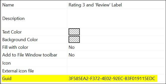
Just select the GUID, copy it into the Windows clipboard, and then paste it into the overlay:
row=<button class="btn btn-info" onclick="Overlay.executeFavorite(<span style="color:blue;">'3F585EA2-F372-4E02-92EC-B3F019115EDC'</span>,event)"</span>My button</button>
Enclose the GUID in single quotes. This is important: '3F585EA2-F372-4E02-92EC-B3F019115EDC'
That's it.
When you click "My button," it will execute the Favorite Rating 3 and 'Review' Label. In the same way, you can add buttons to execute any Favorite you have. The HTML in the overlay is always the same; just the GUID varies.
You can apply a style to your buttons to make them look exactly how you want:
row=<button class="btn btn-info" style="background-color:#303030;color:#fff;border-color:#fff">My button</button>

You can make buttons very small by using only icons. This way, you can fit many buttons in a small space:

The example uses the class btn btn-dark for all buttons, except for the last one, which uses btn btn-warning. The first button uses this code (leaving out the executeFavorite call for clarity):
row=<button class="btn btn-dark">🍋</button>
To help you remember what each button does, use the HTML title attribute for the button to add a tooltip:
row=<button title="Assign lemon label" class="btn btn-dark">🍋</button>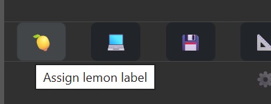
You can use btn-sm to make the buttons smaller, allowing more buttons in a row. You can also mix text buttons with icon buttons:

You can use a class named btn-compact provided by overlays to make your buttons even more compact. Just add it to the button class:
row=<button class="btn btn-info btn-compact">🍋</button>This removes some of the outer padding for buttons. In addition, you can use the colstyle option to override the default column style to remove column padding, like so (combined with columnwidth=1 to make each column the same width):
columnwidth=1
colstyle=padding:0;
This allows for overlays that are as small as possible, but still allow you to access 10, 20 or more Favorites quickly.

The ability to execute Favorites directly from the Viewer overlay or My Panels can make a big improvement for your workflow. Favorites are very powerful and big time-savers. Having them easily accessible in your overlays and My Panel further improves your workflow.
This section describes all available options for overlays. Option names are not case-sensitive.
| Option | Description | ||||||
|---|---|---|---|---|---|---|---|
mode | Supported values:
This option is ignored by My Panels. | ||||||
opacity | Optional. Controls the visibility of the overlay when in overlay mode. Values range from 5 to 100, with 100 being fully opaque. The default is 90% opacity. This option is ignored by My Panels. | ||||||
position | Specifies where the overlay will be placed. Supported values are: left, top, right, and bottom. The default position is right. This option is ignored by My Panels. | ||||||
columnwidth | This setting (values from 0 to 12) specifies the default width of the first column in rows with two columns. The idea is that most users will either use rows with one column to utilize the available width or rows with two columns for caption:value layouts. Typically, the caption column should be narrower than the column displaying the value. Instead of specifying | ||||||
width | For vertical overlays. Sets the width of the overlay as a percentage of the window's width. This option is ignored by My Panels. | ||||||
minwidth | Optional. Specifies the minimum width of the overlay in pixels. This is particularly useful for ensuring sufficient space when multiple image panels are displayed side-by-side in the Viewer overlay. This option is ignored by My Panels. | ||||||
height | For horizontal overlays. Sets the height of the overlay as a percentage of the window's height. This option is ignored by My Panels. | ||||||
minheight | Optional. Specifies the minimum height of the overlay in pixels. This option is ignored by My Panels. | ||||||
color | Optional. Allows you to change the font color using standard CSS notation, for example:color=yellow; color=#a0a0ff; | ||||||
fontsize | Optional. Allows you to change the font size using standard CSS notation, for example:fontsize=12pt; fontsize=120%; | ||||||
htmlfile | Optional. The HTML filename to load the HTML template from. | ||||||
rowstyle | Optional. The CSS <style> to add to each row. You can use this to override colors, borders and other HTML attributes configurable via a style. Example:rowstyle=border-bottom:solid 1px red; padding: 0.5rem 1rem; 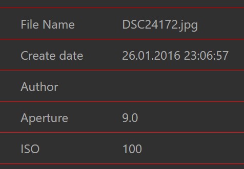 | ||||||
colstyle | Optional. The CSS <style> to add to each column. You can use this to override colors, borders and other HTML attributes configurable via a style for all columns. Example:colstyle=border:solid 2px lightblue; 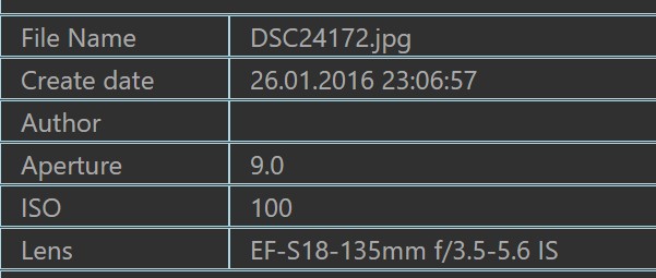 | ||||||
script | Optional. The name of a user-supplied JavaScript file to include in the overlay. This makes it very easy to run custom JavaScript code inside overlays, without the need to create your own template. See Using Your Own Script for details. |
The ability to automatically run a user-provided script function when the content of an overlay changes opens up many opportunities. From manipulating/re-formatting the content shown based on conditions to dynamic styling, creating tables from variable values and more.
Put a JavaScript file into the dedicated folder %APPDATA%\photools.com\IMatch6\html\templates or a sub-folder of it. In this example, we named the script my-script.js.
The content of the script must look like this:
function userScriptMain() {
};
The overlay calls the userScriptMain function every time the contents of the overlay changes.
Add a row with the name script to your overlay:
script=my-script.js
If you stored the script in a sub-folder of the templates folder, include the folder name:
script=js/my-script.js
That's it.
userScriptMainBasically anything. You can access HTML elements produced by the overlay and change them. Add new content. Change styles dynamically as needed, based on conditions. You can even make IMWS calls to fetch more data from IMatch.
Overlays give each row a unique id: r-1, r-2, ...
Within each row, each column has a unique id, combining the row id with the 1-based index of the column. Here is an example with two columns:
<div id="r-2" class="row">
    <div id="c-2-1" class="col value">ISO</div>
    <div id="c-2-2" class="col value">200</div>
</div>
The ids make it super easy to access individual rows and columns to manipulate them using JavaScript. For exampe:
function userScriptMain() {
    let e = document.getElementById('c-2-1');
    if (e !== null) {
        e.style.color = '#ff0000';
    }
};
This user-defined function changes the color of the text in column 1 of row 2 to red.
The next example searches for the value column where the name column is 'File Name'. It then looks if the value column (the 2nd column in that row) matches the regular expression \.jpg. And if the file is a JPG, it changes the text color of the value column to yellow:
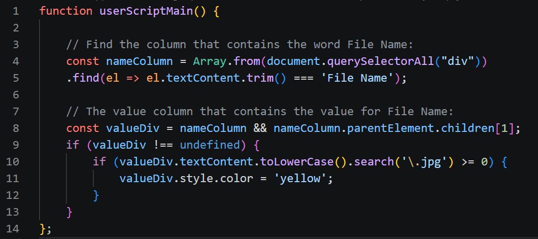
This is how the result looks in My Panel:

Using this principle you can find the value for specific tags (for as long as you know the id or the name) and then manipulate it in any way you want.
JavaScript allows you to add HTML content at runtime, which means you can lookup values and then .e.g use them to create a table (e.g. from repeatable values like categories or keywords). Only your imagination and JavaScript skills are the limit.
This section provides copy and paste examples you can use for your own overlay settings.
row={File.MD.description}
<span> to Change the Font Size and Color
row=<span style="font-size:150%;color:#f0f0ff">{File.MD.description}</span>
-row={File.MD.description}
prefix and postfix to Output HTML Only When the Variable Is Not Empty
-row={File.MD.description|prefix:<span style="font-size:150%~;">;postfix:</span>}
Note that : must be escaped with ~ when used within a variable.
columnwidth=3
-row=Aperture$${File.MD.aperture}
-row=ISO$${File.MD.iso}
-row=Lens$${File.MD.lens}
-row=Camera Name$${File.MD.cameraname}
We use columnwidth to make the first column of each row 3 parts wide.
-row={File.MD.createdate}$$:4{File.MD.description}
rowne={File.MD.hierarchicalkeywords|replace:~;==<br>}
This replaces the semicolons used by variables with <br>, which causes a line break.
rowne={File.Rating|numcomp:gte,3,<strong>Good Rating!</strong>}
rowstyle=border-bottom: solid 1px #888888;
rowstyle=border-bottom:none;
rowstyle=background-color:#202080;
colstyle=background-color:#202040; margin: 0.5em;
This uses a margin to separate the columns a bit to let the background shine through.
Copy images into the folder %APPDATA%\photools.com\IMatch6\html\templates and then display them using
rowne=<img src="https://user/my_image.jpg"/>
The built-in IMatch Anywhere WebService (IMWS) in IMatch offers an endpoint that can be used to fetch a thumbnail from the database in a way that makes it directly usable with a standard HTML <img> tag. All you need is the unique id (OID) of the image. And there is a variable for that:
{File.OID|cast:int}To load a thumbnail from the database and display it in an overlay, use this code:
-row=<img src="http://127.0.0.1:{Application.IMWS.PortNumber|cast:int}/v1/files/image?id={File.OID|cast:int}&imagesize=dbthumbnail&auth_token="">
The {Application.IMWS.PortNumber|cast:int} variable returns the port number IMWS is listening to on your PC. This number may be different for different users, so using a variable makes this universal.
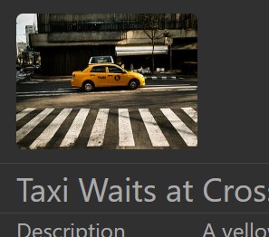
Using a HTML style for the img tag allows you to control the image size, margins, even corner roundness. Use this row to display the thumbnail for the focused file at 100 pixel height and some neat margins:
-row=<img style="height:100px; width:auto; margin: 10px 0; border-radius: 5px;" src="http://127.0.0.1:{Application.IMWS.PortNumber|cast:int}/v1/files/image?id={File.OID|cast:int}&imagesize=dbthumbnail&auth_token=">
rowne=<span style="font-size:5em;">😁</span>
row=<button class="btn btn-info" onclick="Overlay.executeFavorite('GUID',event)">My Favorite</button>The GUID is the unique ID of the Favorite to execute. You can find the GUID in the Favorite properties dialog box in the Favorites panel.