File Window tip with advanced formatting.
This topic explains how to use advanced XAML formatting for features like the File Window Tip, Slide Show text overlays, the Batch Processor or the Design...
This topic explains how to use advanced XAML formatting for features like the File Window Tip, Slide Show text overlays, the Batch Processor or the Design & Print feature.
Several features in IMatch which allow you to use variables to specify the information to display also provide options to control font, font size and colors. IMatch uses a subset of the XAML markup language to allow you to control these attributes. XAML is text-based, similar to HTML, and integrates well with the variables concept and features in IMatch which render custom text.
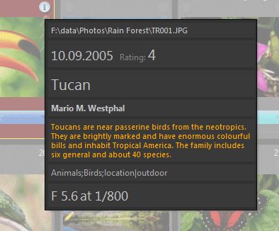
The following File Window tip has been created by using standard IMatch variables and the formatting options explained below.

File Window tip with advanced formatting.
These tips are also used as text overlays in the Viewer and the Slide Show.
This Batch Processor result uses a text overlay with customized formatting: A larger font for the title, a bold font for the copyright notice and a different color for the description.

Formatting text overlays in the Batch Processor
IMatch printing allows you render output for Text Containers using custom XAML code. This gives you very fine control over character formatting, enables you mix font families, sizes and colors within the same Text container. You can even add simple tables using XAML <Grid>s.
XAML was designed to render user interfaces. Many measures (e.g. Border or TextBlock widths and heights, column withs for grids) are specified in pixels. This causes some problems when rendering markup for printers, because when you specify a Border width of 600, this means 600 pixels. And while 600 pixel on a 1920 pixel HD monitor are quite big, on a 600 DPI printer this produces a rather small one inch border.
To work around that, the IMatch Design & Print feature supports a special syntax for specifying measurements in markup. If you use the following syntax:
"measurement unit | diu"
When IMatch finds the filter diu IMatch converts the specified measurement into pixels, taking the resolution of the current output device (screen, printer, PDF export, ...) into account.
An example:
<TextBlock Width="10in|diu" Height="5in|diu" Background="#ff0000" Foreground="#ffff00">This is a 10in x 5in text block.</TextBlock>
Here we specify the width and height of the Textblock in inches. The |diu filter ensures that XAML gets the resulting pixel values.
You can also specify attributes like margins, padding, BorderThickness etc. using device-independent units:
<Border Width="10cm|diu" Height="10cm|diu" BorderThickness="0.25in|diu" BorderBrush="#ff0000" Padding="0.5cm,0.5cm,0.5cm,0.5cm|diu"></Border>
This border uses width, height, BorderThickness and even Padding in device-neutral units.
Since &, < and > have a special meaning in XAML, you cannot use these three characters directly in your text. Instead you have to encode these special characters as follows:
| To get this in your text | You write: |
|---|---|
| & | & |
| < | < |
| > | > |
For example, the following XAML markup:
IMatch is clever & smartyields this output:
IMatch is clever & smartOpen Edit > Preferences > File Window Tip. In this dialog box you can enter your Variables and XAML formatting and try it out immediately by pointing the mouse cursor at the Test Tip box:

If there is a problem with the XAML you test, the Test Tip feature shows a useful error message:

Don't forget to close the dialog box with Cancel to avoid overwriting your File Window Tip. Or save it before.
In order to find a balance between ease-of-use and flexibility, IMatch offers a selected set of formatting tokens or 'tags' (not to be confused with metadata tags). Unless explicitly modified by you, IMatch uses safe default values or global options to control attributes like font family, font size and colors. You can override any of these attributes via formatting tags if needed.
| <Bold><Italic>Some text</Italic></Bold> | Correct. The Bold and Italic tags are opened and closed in the correct order. |
| <Bold><Italic>Some text</Bold></Italic> | Wrong. |
All formatting tokens must be written exactly as specified. Upper- and lower-case are relevant. If a token is declared as <Bold>, you cannot write <bold> or <BOLD> because this would cause a syntax error.
If you make syntax errors, the resulting output will be incorrect or fail to display altogether.
In this case just go back to your source text and check for syntax errors like missing < , wrong spelling or mismatched opening and closing braces.
| <Bold> | This tag allows you to format text in a bold font. Don't forget to add a closing </Bold> for each opening <Bold>.
| ||||||
| <Italic> | This tag is used to format text as italic.
| ||||||
| <Underline> | This tag is used to format text as underlined.
| ||||||
| <LineBreak/> | This special tag causes a line break in the output. This tag has no closing tag, it is always closed by itself using the trailing /.
|
This strange combination of characters can be used to force a space (blank) somewhere inside the text, e.g. to create a small distance between two variables or text. Like HTML, the markup language used by IMatch does ignore multiple consecutive space characters and reduces them to one. In HTML you can use the token to force any number of spaces, in the XAML dialect IMatch uses, use   instead.
This example adds two spaces between the text File name: and the file name variable.
File name:  {File.FullName}Run is the most flexible and powerful formatting tag. You can add any number of runs to a text. Runs cannot be nested. Always close the current run before you open a new run. Each run allows you to choose font, size, foreground and background color and other attributes.
A typical use for <Run> would be:
<Run FontSize='24pt'>Headline</Run>
This creates a run around the text Headline and changes the font size to 24 points. Whatever font is currently set for that text, the size for the Headline will be changed to 24pt. The Run is closed with </Run>, which also resets any changes made by the <Run> back to the default settings.
The following attributes are supported for <Run> in IMatch:
| FontSize='Size' | Changes the font size to the given Size. The font size can be specified using these units: px : Pixel in : Inch; 1in = 96px cm: centimeter; 1cm= 96/2.54 px pt: points; 1pt= 96/72 px <Run FontSize='24pt'>Text</Run> <Run FontSize='100px'>Text<Run> |
| FontWeight='Weight' | Changes the font weight to one of: Normal Bold Light <Run FontWeight='Bold'>Text</Run> |
| FontFamily='Family' | Change the font family to use.<Run FontFamily='Tahoma'>Text</Run> <Run FontFamily='Times New Roman'>Text<Run> |
| Foreground='Color' | Change the foreground color to the given value. Either specify a hexadecimal color value in the format: #RRGGBB or use one of the X11 color names. For a list of color names, see this Wikipedia article. <Run Foreground='#ff0000'>Text in red</Run> <Run FontFamily='Arial' FontSize='16pt' Foreground='MidnightBlue'>Text in Midnight Blue<Run> |
| Background='Color' | Change the background color to the given value. Either specify a hexadecimal color value in the format: #RRGGBB or use one of the X11 color names. <Run Background='AliceBlue' Foreground='#0000ff'>Text in blue on Alice blue</Run> |
The following examples all use the File Window tip with one variable to demonstrate various versions of the <Run> tag. Of course these formatting runs can be used anywhere IMatch supports custom formatting.
{File.MD.XMP::dc\title\Title\0}Using the default settings:  |
<Run FontSize='18pt'>{File.MD.XMP::dc\title\Title\0}</Run> Larger font:  |
<Run FontSize='18pt' FontWeight='Bold'>{File.MD.XMP::dc\title\Title\0}</Run> Larger and bold font:  |
<Run FontSize='18pt' Foreground='DarkOrange'>{File.MD.XMP::dc\title\Title\0}</Run> Large font, different color:  |
<Run FontSize='18pt' Background='AliceBlue' Foreground='#000000'>{File.MD.XMP::dc\title\Title\0}</Run> Larger font, different colors for fore- and background:  |
A Border can be used to render a border around another element (e.g., a TextBlock> or to fill an area with a color.
| Margin='L,T,R,B' | The outer margin in pixels (Left, Top, Right, Bottom). |
| Padding='L,T,R,B' | The inner padding in pixels (Left, Top, Right, Bottom). |
| Width= | Width in pixels. |
| Height= | Height in pixels. |
| Background=Color | Color is a standard hexadecimal #rrggbb value. If no background is given, the border is transparent. |
| BorderThickness= | Thickness of the border in pixels. |
| BorderBrush=Color | Color is a standard hexadecimal #rrggbb value. |
A <Border> can contain another <Border> or a <TextBlock>. By nesting Borders and playing with the Margin or Padding attributes you can create sophisticated border effects.
The following XAML markup uses two nested <Border> tags and an <TextBlock> tag.
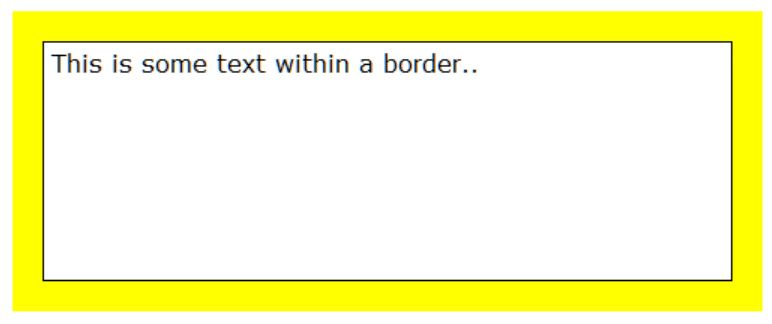
The outer border uses a yellow background color and a 20 pixel padding. This produces the yellow border you see in the image below. The nested Border uses a BorderBrush in black color (#000000) and a border thickness of 1 pixel. This produces the thin black border around the TextBlock. The text block uses a white background color and also sets text orientation and font family.
<Border Background="#ffff00" Width="500" Height="200" Padding="20,20,20,20">
    <Border BorderBrush="#000000" BorderThickness="1">
        <TextBlock Background="#ffffff" TextWrapping="Wrap" FontFamily="Verdana" FontSize="12pt" Padding="5,5,5,5" TextAlignment="Left">This is some text within a border.</TextBlock>
    </Border>
</Border>
A TextBlock tag represents a block of text. The following attributes are supported by IMatch:
 <TextBlock VerticalAlignment="Center" HorizontalAlignment="Center" TextAlignment="Center"
Background="#00a0ff" Padding="20,20,20,20" Foreground="#ffffff" FontFamily="Verdana" FontSize="14pt">
This is a text.
</TextBlock>
| VerticalAlignment= | Top, Center, Bottom. Default: Top. This option controls how the text is aligned vertically within the TextBlock. |
| HorizontalAlignment= | Left, Center, Right. Default: Left. This option controls how the text is aligned horizontally within the TextBlock. |
| Margin='L,T,R,B' | The outer margin in pixels (Left, Top, Right, Bottom). |
| Padding='L,T,R,B' | The inner padding in pixels (Left, Top, Right, Bottom). |
| Width= | Width in pixels. |
| Height= | Height in pixels. |
| Background=Color | Color is a standard hexadecimal #rrggbb value. If no background is given, the TextBlock is transparent. |
| Foreground=Color | Color is a standard hexadecimal #rrggbb value. |
| TextWrapping="Wrap" | Specify TextWrapping="Wrap" if you want the text to wrap within the TextBlock. If this is not specified, the TextBlock has only one line and text is clipped on the right edge. |
| TextAlignment= | Left, Right, Center, Justify |
| TextDecorations= | Strikethrough, Underline |
| FontSize= | Font size in points, e.g. FontSize="12pt" |
| FontWeight= | Light,Normal,Medium,Regular,Bold,Semibold,Demibold,ExtraLight,ExtraBlack |
| FontFamily= | Name of the font to use, e.g., FontFamily="Verdana" |
| FontStyle= | Normal, Italic |
| xml:space= | default or preserve. In default mode, multiple succeeding white spaces (blanks) are folded into one. Use the preserve mode (xml:space="preserve") to retain multiple spaces in the output. |
TextBlocks can only used in IMatch Printing. File Window Tips and the Batch Processor already wrap the text contents you enter in a TextBlock, and TextBlocks cannot be nested.
A StackPanel can stack one or more TextBlocks.
<StackPanel Orientation="Vertical">
  <TextBlock VerticalAlignment="Center" HorizontalAlignment="Center" TextAlignment="Justify">Textblock 1</TextBlock>
  <TextBlock VerticalAlignment="Center" HorizontalAlignment="Center" TextAlignment="Justify">Textblock 2</TextBlock>
</StackPanel>
| Orientation= | Vertical, Horizontal How the stacked elements are oriented. |
| VerticalAlignment= | Top, Center, Bottom |
| HorizontalAlignment= | Left, Center, Right |
| Margin='L,T,R,B' | The outer margin in pixels (Left, Top, Right, Bottom). |
| Width= | Width in pixels. |
| Height= | Height in pixels. |
| Background=Color | Color is a standard hexadecimal #rrggbb value. |
A WrapPanel can stack one or more TextBlocks, and uses the available space by automatically wrappnig the TextBlocks as needed.
<WrapPanel Orientation="Horizontal">
    <TextBlock VerticalAlignment="Center" HorizontalAlignment="Center" Width="200" TextAlignment="Center" Background="#00a0ff" Padding="20,20,20,20" Foreground="#ffffff" FontFamily="Verdana" FontSize="14pt">Textblock 1</TextBlock>
    <TextBlock VerticalAlignment="Center" HorizontalAlignment="Center" Width="400" TextAlignment="Center" Background="#ff8000" Padding="20,20,20,20" Foreground="#ffffff" FontFamily="Verdana" FontSize="14pt">Textblock 2</TextBlock>
    <TextBlock VerticalAlignment="Center" HorizontalAlignment="Center" Width="200" TextAlignment="Center" Background="#00a0ff" Padding="20,20,20,20" Foreground="#ffffff" FontFamily="Verdana" FontSize="14pt">Textblock 3</TextBlock>
</WrapPanel>
| Orientation= | Vertical, Horizontal How the stacked elements are oriented. |
| VerticalAlignment= | Top, Center, Bottom |
| HorizontalAlignment= | Left, Center, Right |
| Margin='L,T,R,B' | The outer margin in pixels (Left, Top, Right, Bottom). |
| Width= | Width in pixels. |
| Height= | Height in pixels. |
| Background=Color | Color is a standard hexadecimal #rrggbb value. |
The grid tag allows you to produce tables with any number of rows or columns. A grid consists of two part: The first part defines the layout of the grid, e.g. how many columns and rows it has. The second part defines the content of the grid, e.g. the <Border> or <TextBlock>.
| VerticalAlignment= | Top, Center, Bottom |
| HorizontalAlignment= | Left, Center, Right |
| Margin='L,T,R,B' | The outer margin in pixels (Left, Top, Right, Bottom). |
| Width= | Width in pixels. |
| Height= | Height in pixels. |
| Background=Color | Color is a standard hexadecimal #rrggbb value. |
This element defines the columns in the grid. You need to add one ColumnDefinition for each column in the grid.
The following example defines two columns. The first column is 200 pixels wide, the second column is 300 pixels wide.
<Grid.ColumnDefinitions>
    <ColumnDefinition Width="200/>
    <ColumnDefinition Width="300"/>
</Grid.ColumnDefinitions> | Width | Width of the column. 3 types of values are supported:
The * can be prefixed by a number between 0.0 and 1.0 that is uses as a percentage. 0.5* means: 50% of what is available. |
This element defines the rows in the grid. You need to add one RowDefinition for each row in the grid.
The following example defines two rows. No Height= is specified, which means that the rows automatically size to match whatever they contain.
<Grid.RowDefinitions>
    <RowDefinition />
    <RowDefinition />
</Grid.RowDefinitions> | Height | Height of the row. 3 types of values are supported:
The * can be prefixed by a number between 0.0 and 1.0 that is uses as a percentage. 0.5* means: 50% of what is available. |
To place something, e.g. a <Border> or <TextBlock> in a grid cell, you use the following syntax:
<Border Grid.Column="0" Grid.Row="0" Background="#0000ff">
| Grid.Column | The column into which to place the content. Column numbers start at 0. |
| Grid.Row | The row into which to place the content. Row numbers start at 0. |
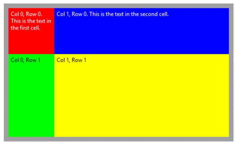
This markup shows a complete grid with four cells (2 columns and 2 rows):
<Border Width="500" Background="#a0a0a0" Height="300" Padding="10,10,10,10">

  <Grid VerticalAlignment="Top" HorizontalAlignment="Left">
    <Grid.ColumnDefinitions>
      <ColumnDefinition Width="100"/>
      <ColumnDefinition Width="380"/>
    </Grid.ColumnDefinitions>

    <Grid.RowDefinitions>
      <RowDefinition Height="100"/>
      <RowDefinition Height="180"/>
    </Grid.RowDefinitions>

    <TextBlock Grid.Column="0" Grid.Row="0" TextWrapping="Wrap" Background="#ff0000" Foreground="#ffffff" Padding="5,5,5,5">Col 0, Row 0. This is the text in the first cell.</TextBlock>
    <TextBlock Grid.Column="1" Grid.Row="0" TextWrapping="Wrap" Background="#0000ff" Foreground="#ffffff" Padding="5,5,5,5">Col 1, Row 0. This is the text in the second cell.</TextBlock>
    <TextBlock Grid.Column="0" Grid.Row="1" TextWrapping="Wrap" Background="#00ff00" Foreground="#000000" Padding="5,5,5,5">Col 0, Row 1</TextBlock>
    <TextBlock Grid.Column="1" Grid.Row="1" TextWrapping="Wrap" Background="#ffff00" Foreground="#000000" Padding="5,5,5,5">Col 1, Row 1</TextBlock>
  </Grid>

</Border> 
The resulting table.
Support for images is pretty limited. IMatch does not use the <Image> tag itself. But it might be helpful to display an image with XAML occasionally.
The Image tag supports JPG and PNG images only.
| Source | The fully-qualified name of the image file to load. |
| Width | The width in pixels. |
| Height | The height in pixels. |
| Stretch | How to fit the image into the area created by width/height. Supported values are: Fill (fills the area, aspect ratio is not preserved) and Uniform (resizes the image to fit within the area, aspect ratio is preserved). |
<Image Source="c:\pictures\icon.png" Stretch="Uniform" HorizontalAlignment="Center"></Image>
Displays the specified icon in its original size.
<Image Source="{File.CacheFileName|default:{File.FullName}}" MaxHeight="300" MaxWidth="300" Stretch="Uniform" HorizontalAlignment="Center"></Image>
This could be used e.g. in a File Window Tip to display small rendition of a file.
Note that this will only work when the file does not need a cache image (JPG files) or the cache image has already been created.
The XAML support in IMatch is based on a 3rd party toolkit. The implementation is at this time still pretty rudimentary and basic. But what can be achieved with the basic XAML features is awesome. You can find information about XAML markup on the Internet, e.g., on the Microsoft developer websites.
Please note that not all functions, tags and Attributes listed there are supported by the XAML implementation used in IMatch at this time.