Drop your files here to start printing.
You can also start Design & Print via the File menu > Design & Print command (Ctrl+P). In this case, Design & Print uses the selected files in the active File Window.
The IMatch Printing module enables you to produce high-quality photo books, contact sheets, reports and other print products.
To start using IMatch Printing, select a couple of files in a File Window and drop them onto the Design & Print export module in the Import & Export Panel.
Drop your files here to start printing.
You can also start Design & Print via the File menu > Design & Print command (Ctrl+P). In this case, Design & Print uses the selected files in the active File Window.
Here are some examples of photo books and contact sheets you can create:
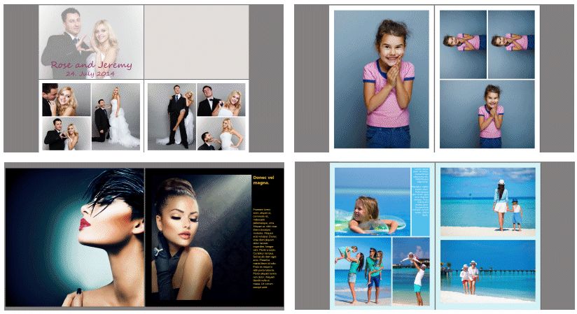
Example 'photo book' documents created with IMatch Printing.
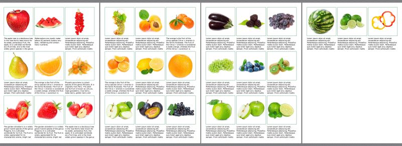
A contact sheet document created with IMatch Printing.
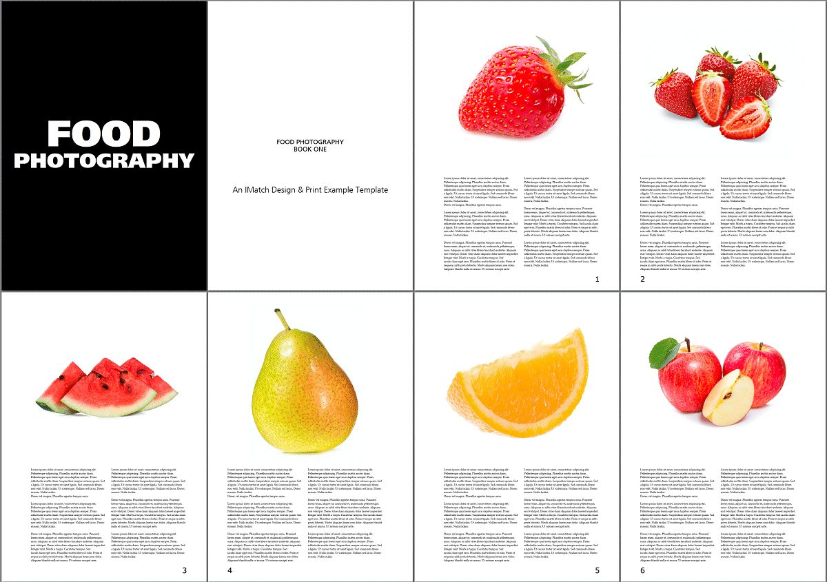
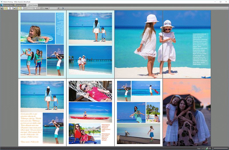
A dynamic photo book layout with mirrored pages, lead-in, and pagination.
Before we demonstrate and explain all the features available in IMatch Design & Print, let's do a quick practical example. We create a contact sheet using one of the standard templates included in IMatch.
1. Select 10 to 20 images in a File Window:

Selecting the files you want to print in a File Window.
2. Press Ctrl+P to open the Design & Print module. Switch to the System Template View and click on the 'Contact Sheet (6x) with file name' template to load it:
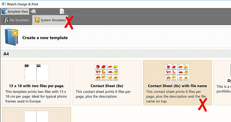
Choose the template you want to use for printing.
3. Click on the Preview tab at the top to switch to the Preview View:
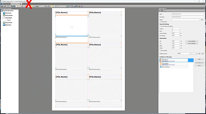
The template editor. This is where you edit your templates. For now, just switch to the Preview View to see the result.

This is how the template looks in the preview. It prints 6 files per page, with file name and description.
4. Now click on the Print button on the left side of the toolbar to print the contact sheet.
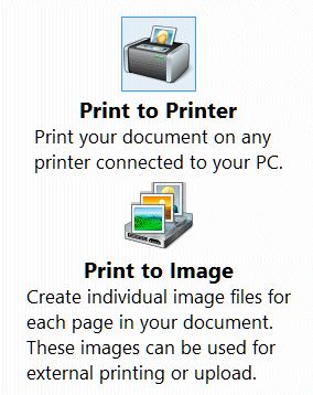
You can print on any connected printer or save each page to a separate image file, e.g., to share them or to send them to a print service.
Printing the resulting document.
That's all that is to it. You select the files you want to print, choose a template, and print.
The remainder of this help topic explains how this simple approach can be used to create contact sheets, posters, calendars, photo books and more. IMatch Design & Print is designed to create both simple and complex print results. This is where IMatch Design & Print differs from many of the other photo book applications available for free or at a cost: If you have specific requirements, you want to include lots of metadata, you need to create complex designs or just want to automate as much as possible, IMatch Design & Print won't let you down.
 | The printing system in IMatch is powerful, flexible and versatile. What you can do with it is almost limitless. There are dozens of options to explore, things to try out and switches to fiddle with. We tried our best to describe everything in great detail and to include examples of how to use the various options and properties. Start simple and try things out. Have fun creating exciting layouts, photo books, contact sheets and other print documents. Try things out without risk: You can always use the built-in Undo function to revert your last changes. With a somewhat playful attitude you should have a lot of fun exploring the possibilities of this module. |
It all starts with the print template. A print template describes a document you want to print:
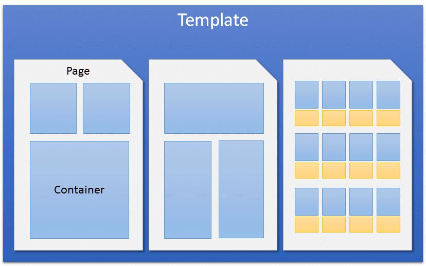
A template contains one or more pages. Pages contain containers. Containers contain images, graphics, text and other things.
When you print a template, IMatch processes the instructions and pages contained in the template and produces the output document. This document is then sent to any connected printer, or the pages are saved as image files on disk.

IMatch supports two types of templates, which are used for different purposes.
Standard templates are used for documents like photo books, leaflets and similar. You choose which files you want to print, add as many pages as needed to the document and arrange the files on these pages manually. The result can be printed and saved, and you can later re-open the template, exchange files, print it again etc.
If you have ever created a photo book in another software, this kind of workflow will be familiar.
This type is used for all templates which should be able to operate with any number of files.
Typical examples for this are contact sheets or reports. Here the number of files to print is usually not known in advance and the template should dynamically adapt to the files in the current print job.
Envision a template with one page that prints 10 files in two rows. If you print this template later with up to 10 images, one page will be printed. If you print 20 files instead, IMatch creates two output pages by duplicating the template page. Each page shows 10 different images. And when you print the same template with 200 files, the result will be 20 printed pages. Fully automatic.
You set up the template once and then you can use it with any number of files later. The Print module in IMatch contains many options that allow you to control how new pages are generated, if you want to include cover, header or footer pages, how the page flow operates and more.
Dynamic templates are a flexible and powerful utility to handle reoccurring print jobs with variable file quantities.
Standard templates are used for all print jobs where you want to manually control the number of pages and place the images manually. Photo books are a typical example for this kind of template.
Dynamic templates are for print jobs where you create a template once and then run it with variable file numbers later. The template automatically controls the number of pages printed to process all files. Contact sheets or reports are usually created as dynamic templates.
When you launch the Print module, it opens a separate window with three views. You can switch between these views using the tabs at the top of the window.
Template View | This view shows you all templates you have created, and the templates shipped with IMatch (System Templates). From here you open templates into the Designer and Preview views. |
Designer View | This is the view where you work with your layouts, design photo books or other print products. |
Preview View | In this view you can see the document resulting from your template 'as-is', before sending it to the printer. |
To start using IMatch Design & Print, select a number of files in a File Window and drop them on the Design & Print export module in the Import & Export Panel.
To open the Import & Export Panel, press F9 followed by X or use the View > Panels menu.
You can also open the Design & Print module by using the File > Print command or by pressing Ctrl+P. In this case, IMatch uses the files currently selected in the active File Window for the Design & Print feature.
After a few seconds, IMatch opens the Design & Print window and activates the Template View. When you start fresh, the print user interface only shows one button. You have not created templates yet.
The Template View. Above it, the tabs which switch between the different views.
Click this button to create a new template. IMatch opens a dialog box where you can enter the basic options:
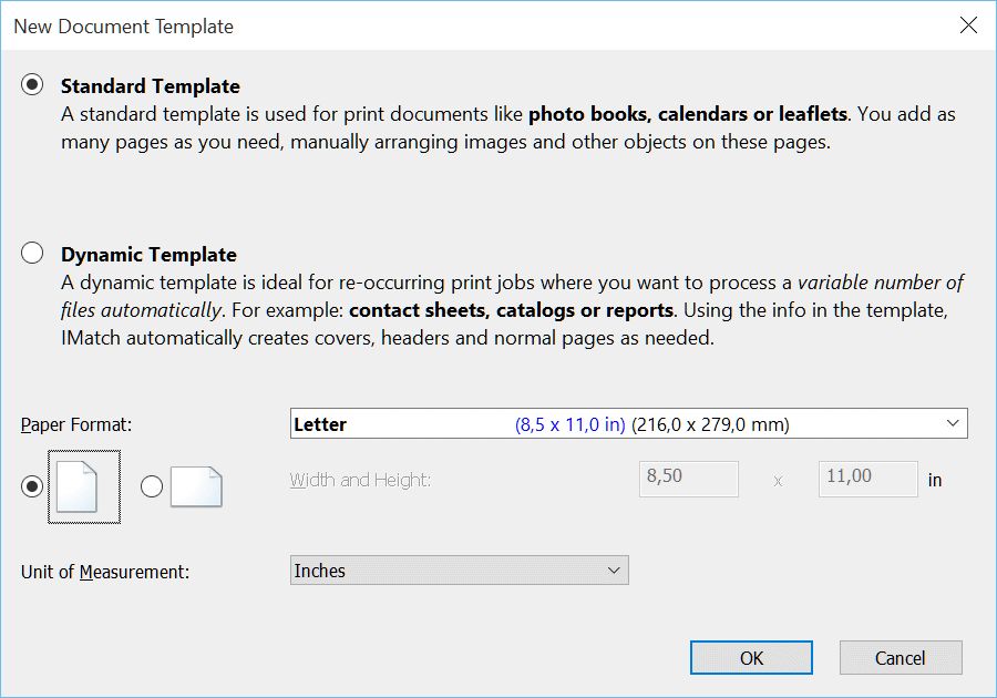
In this dialog box you set the most basic options for your print template:
You cannot change these settings after the template has been created.
Choose the type of template (see above for more info) you want to create. In this first run-through, we'll create a photo book and choose Standard Template.
The next setting is the paper format. Choose the paper format matching your printer, or if you later want to create a PDF or XPS file, you probably want to choose one of the common U.S. or DIN formats. In this example, we use the standard Letter format (8 x 11 inches). If you live in Germany or another European country, you'll probably better start with a DIN A4 format.
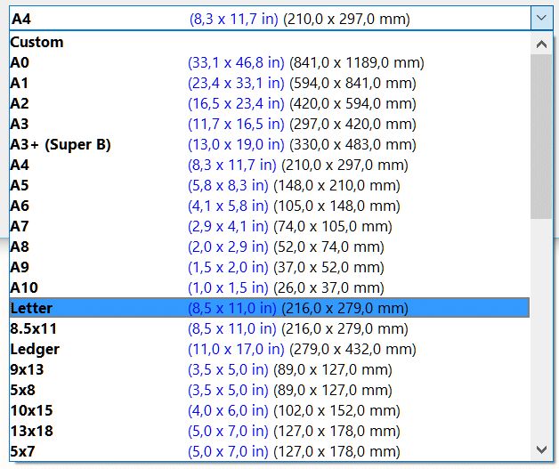
IMatch includes a wide range of pre-defined paper sizes you can just pick from the drop-down list:
Some of the many pre-defined paper sizes to choose from.
If you select the Custom format, you can configure individual paper sizes. This may be useful if you work with non-standard paper, or you want to print to image files with specific pixel dimensions.
If you plan to produce documents measured in pixel units, the custom format and a custom width/height in pixels is the best choice.
Choose either landscape or portrait orientation for your document. This controls how the paper is rotated. If you work with square paper formats (e.g., 21 x 21 cm), the orientation does not matter.
This is another important setting. It controls the units in which everything is measured and calculated in your print document. This includes margins, distances, widths and heights of elements and everything else. In most cases you will pick either Inches (e.g., when you live in the U.S.) or Centimeters when you live in Europe or other countries.
If you want to create image files for your website or images that fit perfectly on your TV, smartphone, or tablet, using the Pixel unit is usually a good choice. You can then specify the output size in pixels (e.g., 1920 x 1280 for Full HD), and all measures in the template are also expressed in pixels.
For this example, we create a Standard Template in U.S. Letter format and portrait orientation. The unit of measurements is inches. Click OK in the dialog box to create your template.
IMatch switches to the Designer View and opens a dialog box where you can choose from one of the many pre-defined page layouts. For now, just click on the empty white page in the top left corner.
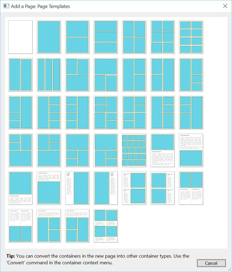
The available page layouts IMatch can create. You can of course create any kind of custom layout.
The Designer is where you lay out your template, add and place images and other objects. The Designer is divided into a central editor area and three panels.
In this panel IMatch displays the document node (at the top) and all pages in your document. You can add and remove pages, reorder pages etc. Use the right-click context menu to access the commands, or the toolbar at the top of the Designer View to access all commands.
This panel displays one or two pages. This is where you create the layout of your document and work with containers and other objects.
In Standard Templates, this panel (at the bottom) displays the files you have dropped on the Print module. You can use drag-and-drop to place the files on the pages or to fill containers.
This panel is only visible when you work with Standard Templates.
The thumbnail panel makes it very easy to position files on a page or to assign files to containers just by drag-and-drop. Each thumbnail indicates how often the image has been used in the template. This makes it easy to spot images not printed or images that are printed multiple times (which is perfectly OK).
The thumbnail panel with multiple files. The green indicator shows how often a file has been used in the current template.
This panel on the right displays the properties and settings for the currently selected object. This can be the document itself, a page or a focused container.
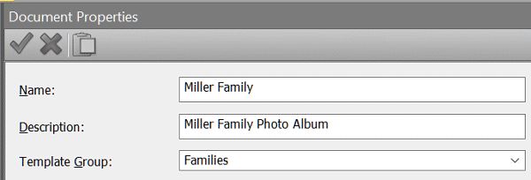
Let's have a quick look at the document properties first: Click on the node named Document in the panel on the left. This opens the document properties in the properties panel on the right.
Name | This is the name of the template. It is used to represent the template in the Template View. If you enter no name here, IMatch uses the file name instead. |
Description | An optional description. Enter a short text if you want. The text is displayed in the Template View. |
Template Group | If you create many templates, you can put them into groups. The Template View organizes itself using these groups. If you leave this empty, all your templates will be in the same group. |
These properties allow you to define the global page grid. It will be used if you don't configure individual grids for your pages. Page grids are explained below in the Anatomy of a Page topic.
When you move objects around on a page using the mouse or keyboard, they snap to an invisible grid you define with these properties. Usually you'll use something like 0.05 to 0.25 of an inch or 0.1 to 0.2 cm if you work with metric units.
Snapping makes it easier to align objects on the page evenly.
You can temporarily suppress the snap at any time by pressing and holding Ctrl when moving objects around.
These options control how pages flow in dynamic templates. We'll cover that in the topic about dynamic templates in detail.
This is also used for dynamic templates. It allows you to control the order in which files are printed, independent from the order they had when you dropped them onto the Print module.
Here you can define variables which you can use anywhere in the template later. Variables are defined in a simple format:
Name=Value
| Name | This is the name of the variable you create. Use only letters and digits for simplicity. |
| Value | The contents of your variable. You can use a mix of literal text and other variables. |
Each row produces one variable. To add another row, press Shift+Enter.
Title=Mario's photo book
Description=This photo book shows some of my best photos
The variables you create this way can later be accessed using
{Print.Property.nnn}where nn is the name of the variable. For example:
{Print.Property.Title}
{Print.Property.Description}The key idea of document variables is that they allow you to define things like titles, descriptions, copyright statement, colors, font family names and font sizes in a central place. When you later use these variables when configuring your pages and containers, you can change the look of your entire template quickly by just changing the document variables.
For example, if you define a variable
TextColor=#000000
and you use this variable as {Print.Property.TextColor} to specify the text color for all Text containers, you can change the color of all the text in your entire template to another color by just changing the TextColor variable in the Document properties. The same can be done for font families and sizes, page background colors, borders and many other elements.
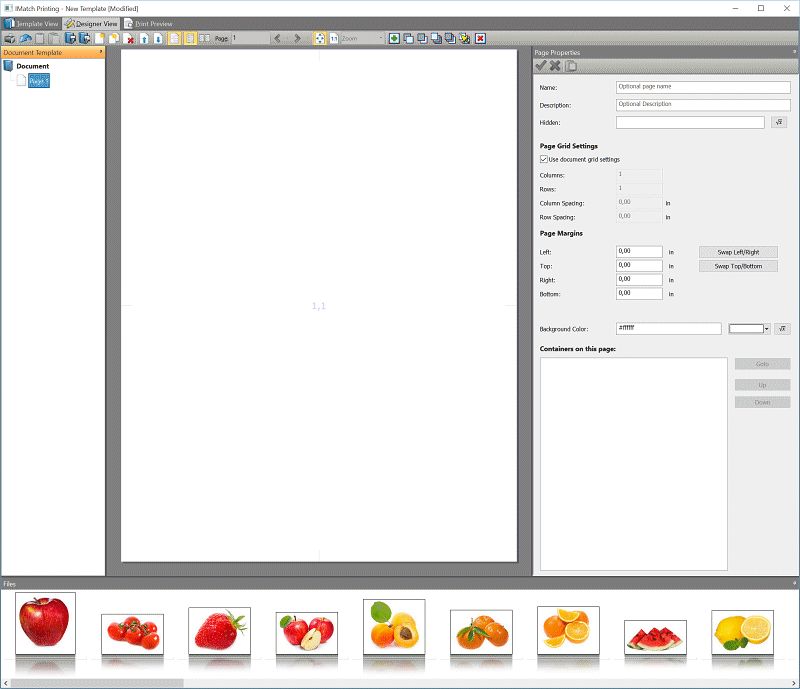
The empty page we have just created is ideal to explain the options and settings available for pages in IMatch Printing.
Click the page in the document tree on the left, or just click somewhere in on the page itself inside the editor. This opens the properties of the page in the properties panel on the right.
Name | This is the name of the page. It is used to represent the page in the document tree. If you leave this empty, IMatch uses a generic name. The name of the page is also accessible via a variable. |
Description | An optional description. If you want to keep some notes for a page, enter them here. The description of the page is accessible via a variable. |
Hidden | This property takes a Boolean value (0 or 1, true or false) or a variable. You can use this to dynamically show or hide pages in your template. This technique is often applied when working with Dynamic Templates. |
Each page has a grid. This can either be the grid defined in the document properties, or a custom grid configured for that page. The grid is a flexible tool for positioning images, text and other elements on a page. It works together with the page margins.
By default, the grid has exactly one column and one row, which creates one cell. If you have not set any page margins, this single cell fills the entire page.
The following screenshot shows a page with margins and a grid with four columns and six rows. The grid fills the entire page, excluding the page margins. The remaining space is divided evenly in as many columns and rows as defined in the page grid. For a 4 x 6 grid, the result is 24 cells. Each cell later contains one or more containers.
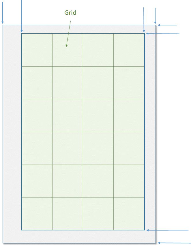
A page with margins (gray) and a grid with 4 columns and 6 rows.
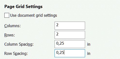
Try it for yourself. Click on the empty page in the Designer to bring up its properties in the property panel. Now, add some margins - we used 0.5 inches on either side for this example:

Then uncheck the option Use document grid and create a custom grid with 2 columns and 2 rows. Specify 0.25 in for the column and row spacing. These measures control the distance between the cells in the grid you create.
After making changes in the properties panel, you must save and apply them by clicking on the green arrow button in the toolbar. Press Ctrl+S on the keyboard for the same effect.
IMatch automatically saves changes to the current container when you click on another container.
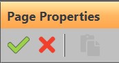
To undo changes made in the properties panel, click on the red X. This reloads the original settings.
You can also use the undo command at any time to undo the past 10 steps. Click on the Undo button in the main toolbar, or press Ctrl+Z on the keyboard.
The page shown in the editor now looks like this:
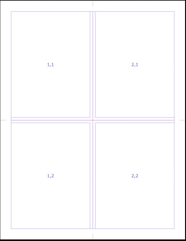
The resulting page: A margin of 0.25 inches all around, and a grid with 2 columns and two rows, resulting in four cells. The editor displays the column and row number of each cell inside the cell.
Try to get a feel for margins and grids. Change the margins (e.g., set the left margin to 1 inch) and see how the grid adapts. Change the number of rows and columns (don't forget to apply your changes via the green arrow button or Ctrl+S).
Grids are very helpful. By using a grid you can easily control the layout, size, alignment and position of objects you add to your template.
Containers are the most important object in IMatch Printing. Everything you add to a page, e.g., images, graphics or text, is placed inside a container.
A container is a rectangular box with a position and a size. There are different container types for different types of objects. All container types share a common set of properties, like border style or fill. Specialized containers add more options, e.g., to control text attributes or image scaling.
This table lists all available container types. We'll look at each type in more detail in the remainder of this topic.
File Container | This container type renders (displays, prints) files from the current database. This is the most common container type. Using this type of container also gives your template access to all metadata available for the file in the database. |
Text Container | This container type displays text and offers many options. Text containers can display a free mix of literal text and variables. |
Graphics Container | This container type is used to display external graphics which are not indexed by the current database. Use this for clipart, watermarks, borders, overlays, logos, icons and similar graphic objects. Graphics containers support EMF files (Windows Enhanced Metafile) which allows you to render vector graphics in high quality. |
QR Code Container | This container type renders QR codes. It's ideal to include machine-readable information in your templates. |
Rectangle Container | This container type is used to render rectangles and lines, to fill page backgrounds, and the like. You can control the fill color, border width and color, opacity, etc. |
You can add any number of containers to a page. To add a container, click the Add Container button in the main toolbar (right side of the zoom control) or press Ctrl+N. You can also use the right-click context menu of a page, which offers additional options.
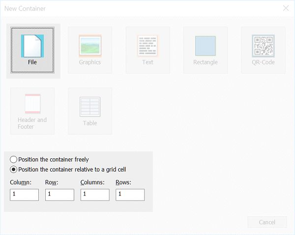
IMatch opens the Add Container dialog box:
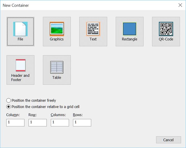
The New Container dialog box allows you to select from one of the pre-defined container types.
The upper area of this dialog box shows all available container types. Some of these types insert multiple containers at once, e.g., the Header and Footer type.
Right-click any container to open up the context menu with commands and settings.
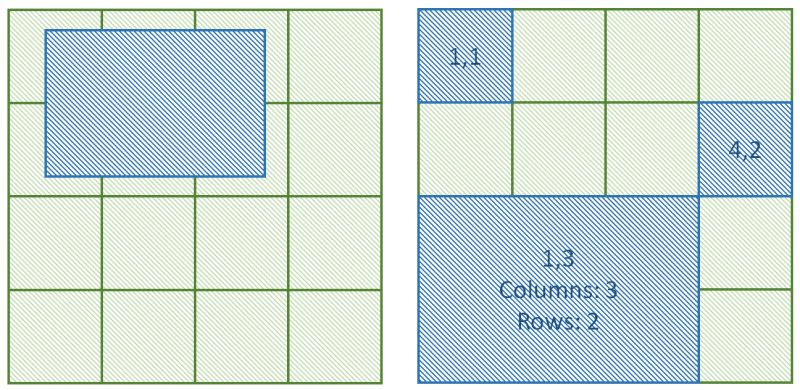
Containers can be positioned (placed on the page) in one of two modes:
Position the container freely | A container with this position mode can be moved and resized freely on the page. You can control its size and position using the mouse, or by entering the position and dimensions in the property page of the container. |
Position the container | This position type links the container to a grid cell. The container 'snaps' to the cell and assumes the position and width/height of the cell. If the grid changes (e.g., when you add or remove rows or columns, or you change the page margins) the container automatically adapts to the new cell size. This container type is the most used, because it automatically aligns with other grid cell containers and you can easily change the layout by changing the grid. Using the Columns and Rows settings you can make containers span multiple columns and/or rows. With the Margins and Size within cell settings you can size and position the container within the cell. This is usually only needed when you want to place multiple containers in the same cell. |
The following image shows containers which are freely positioned (independent from the grid) and containers which are positioned relative to the grid, in cells:
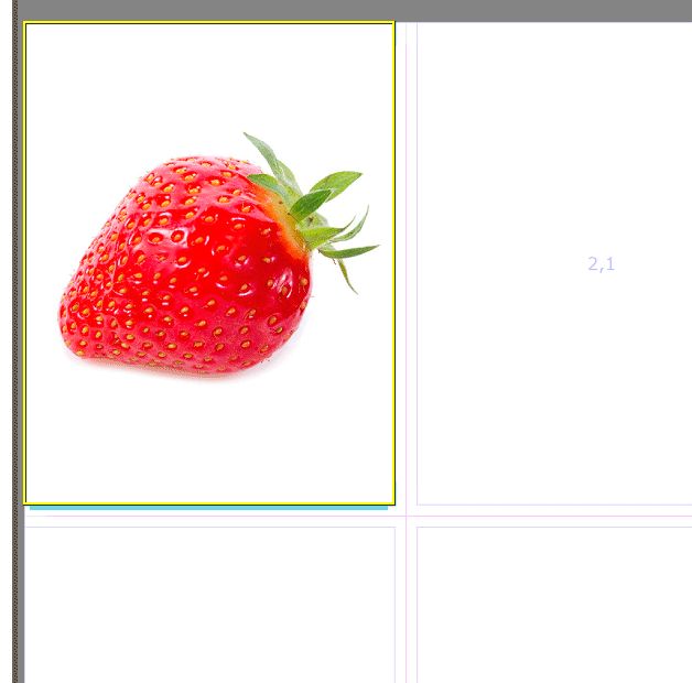
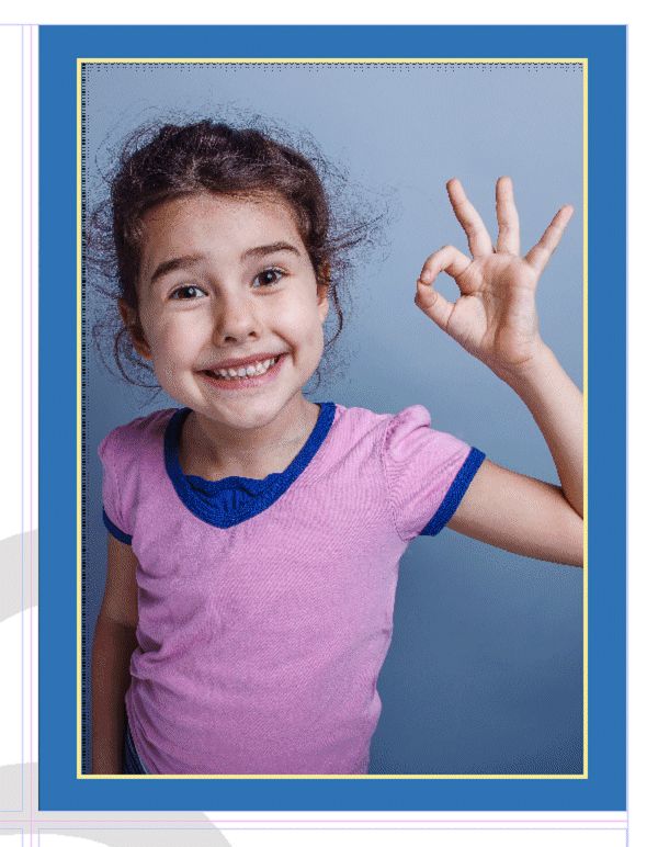
For this example, we'll choose the option to produce a relative container and we position it in the cell in column 1, row 1. Click on the File container type icon to complete the step.
IMatch now creates the container and positions it into the first grid cell (1,1). The container automatically sizes itself to match the size of the cell. In the editor, the result looks like this:

The new container is linked to the first cell in the grid. It has the same position and size as the cell.
This is a File container, which means it takes a file from the database. To fill it, click on a file in the thumbnail panel at the bottom and drag it into the container.
The container after dropping a file from the thumbnail strip (your image will be different of course).
You can replace the file in a container any time. Just drag another file from the thumbnail panel into the container. IMatch replaces the existing file in the container, retaining all settings you have made to the container.
You can use Copy & Paste to copy the container into other cells. See the Clipboard topic below for details.
Let's add another file container. This time, we use the context menu: right-click into the cell 2,1 (column 2 in row 1) in the top right corner. In the context menu, choose the Add Container command. This opens the same New Container dialog box as before, but also initializes the column and row position from the coordinates of the cell you've just clicked:
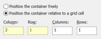
The Column and Row settings have already been filled in.
Left-click a container to make it the focused container. The properties of the focused container are displayed in the property panel on the right. You can select multiple containers by Shift + left-click. Note that only the properties of the focused container are editable in the property panel.
Alternatively, you can use the Tab and Shift+Tab keys when in the editor to move between containers. This also moves the focus to the next or previous container.
Add a second container. This time, add a Rectangle container and choose the position the container freely option (first choose the option, then click on the container icon). The new container is initially positioned at the center of the page.
To move a container, left-click it and, while holding the left mouse button pressed, move it around on the page. It will automatically snap to the snap grid you have defined for the document. This means that you position the container only at positions that align with the invisible snap grid. This makes it easier to align containers with the page margins or other containers.
To move the container without snapping, hold down the Ctrl key.
When you drag a container around, IMatch displays lines on each edge of the container that align with another container, or one of the page margins. This also helps to align containers alongside each other.
To resize a container, click on one of the square resize handles:
The resize handles in the corners allow you to change both the height and the width simultaneously. Hold down the Shift key to resize the container proportionally.
You can only move and resize freely positioned containers that way.
Containers which are positioned relative to a grid cell automatically size with the cell.
Containers offer a lot of functionality. They not only control how images and other objects are placed on a page, but also in which size and orientation. All containers share a common set of properties. Specialized containers like Text or Graphics, add additional properties.
Name | The name of the container. You should always give containers a meaningful name, because this makes it easier to identify them when you work with many containers on a page. | ||||||||||
Hidden | This property takes a Boolean value (0 or 1, true or false) or a variable. You can conditionally hide containers with this property. Sometimes you want to hide a container temporarily, while designing a page. Or you hide it based on one or more variables as needed, while printing. | ||||||||||
Positioning | This option defines how the container is positioned on the page. The following modes are available:
| ||||||||||
Position and Size | For freely movable containers, you control their position and size via these options. You can also move and resize containers using the mouse. | ||||||||||
Cell Settings | For containers which are placed relative to a grid cell, these options take the column, row, colspan and rowspan values. | ||||||||||
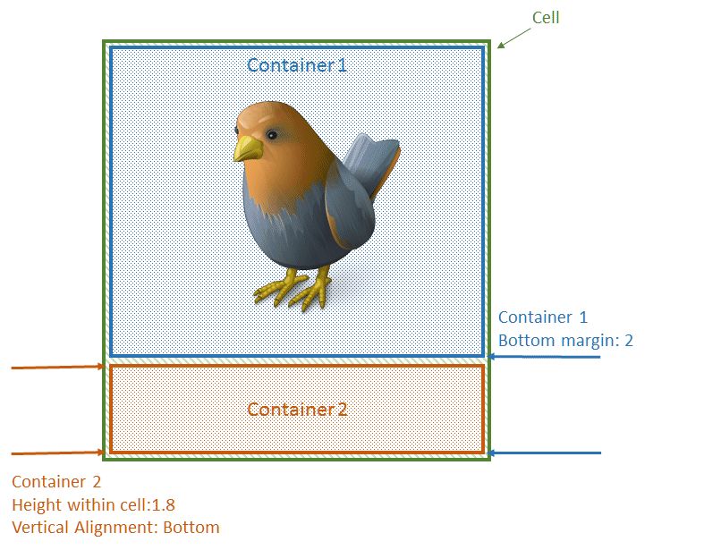
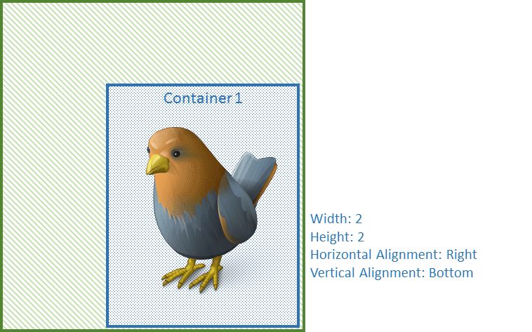
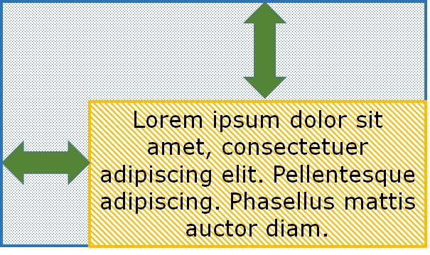
Cell Margins | These settings control the distance between the container contents (e.g., an image) and the cell borders. See the image below for additional info.You can use negative bottom/right margins to move the container outside the cell. | ||||||||||
Size within cell | This setting allows you to control the size of the container within the cell. By default, containers have the same size as the cell. You can use these options to make the container smaller, e.g., when placing multiple containers into the same cell. | ||||||||||
Horizontal Alignment | If the container is smaller than the cell (See Size within cell option above), this setting controls how the container is aligned within the cell. | ||||||||||
Vertical Alignment | If the container is smaller than the cell (See Size within cell option above), this setting controls how the container is aligned within the cell. | ||||||||||
Inner Padding | These options control the padding between the container and its contents (e.g., an image). If you enable a padding, the container background color surrounds the container contents (e.g., an image) and this allows for some nice effects: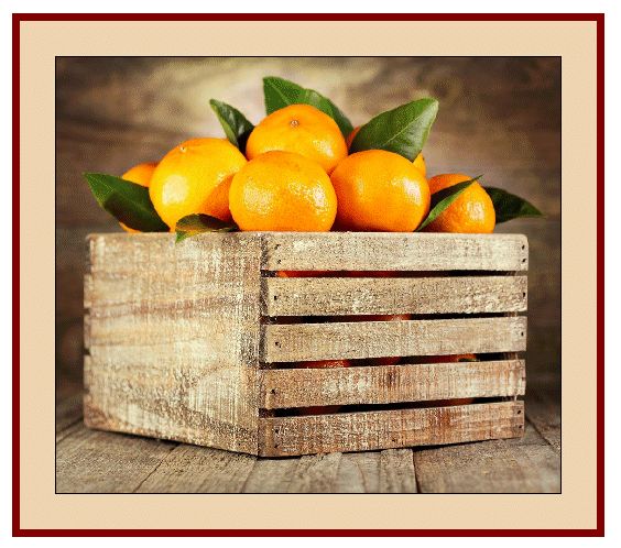 This container uses a padding of 0.5 in all around.  A similar effect is shown in this screenshot. |

Container Measurements
By default, containers which snap to grid cells assume the width and height of the cell. Using the Size within cell and Cell Margin options you can arrange the container individually within a cell. Usually you do this when you want to place more than one container in a cell, e.g., a File and a Text container.
If the container is made smaller than the cell, you can use the Horizontal and Vertical Alignment options to control how the container is positioned within the cell:
You can use negative margins to move a container 'outside' the cell. This can be used for a variety of purposes, e.g., to produce easy shadows. Consider the following example:

This Rectangle container uses the following margins: Left: 0.25, Top 0.3, Right -0.24, Bottom -0.3.
For the fill we used the color rgba(0,0,0,0.25) , which is black with 25% alpha. This produces an almost transparent rectangle which is positioned slightly outside the cell. If you now add a File container to the same cell, the result looks similar to this:
A Rectangle container in the back produces a shadow effect, and the File container renders the image.
IMatch Printing allows you to specify colors in one of three text-based formats. This matches how IMatch Printing expresses colors and also allows you to use variables (e.g., document variables) to specify colors. The following color formats are supported:
#rrggbb | A standard HTML color value, with Red,Green,Blue components. The color values are given in hexadecimal notation, between 00 and FF. Examples:
| ||||||||||||||||
rgb(r,g,b) | A standard HTML RGB color value. The color values are given in decimal notation, from 0 to 255. Examples:
| ||||||||||||||||
rgba(r,g,b,a) | Standard HTML RGB color with alpha channel. The a component specifies the opacity of the color between 0 (fully transparent) and 1.0 (100% opacity). Specifying colors this way enables you to make e.g., container background colors partially transparent. Examples:
|
The color picker allows you to pick predefined or custom colors directly. It fills the color input field with the corresponding rgb() color value. If you want to make the color more or less transparent, change rgb to rgba and add the alpha value between 0 and 1 yourself.
The color picker and the eyedropper tool.
The eyedropper button next to the color button is used to pick a color directly from the screen. Click the button, move the mouse cursor to the spot on the screen where you want to pick up the color, and then click again. Press ESC to cancel.
The face of the color button updates to reflect the color under the mouse cursor while you use the eyedropper tool.
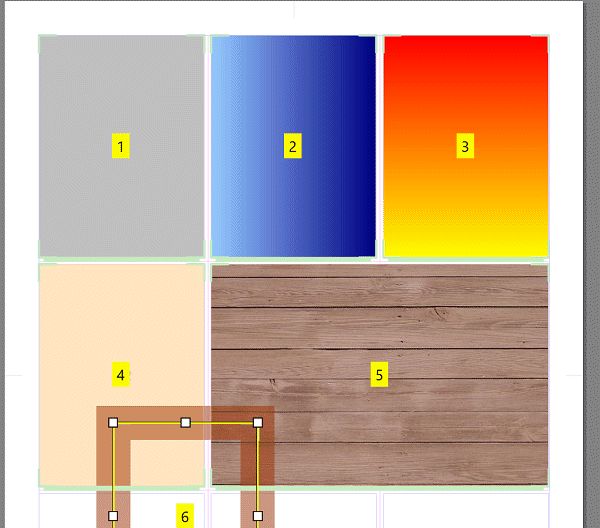
Containers can be filled with solid colors, gradients or images. They can have a color border and also draw a border around their content. On this page, 6 rectangle containers were added. Each container uses a different kind of fill or border: Gray fill, horizontal gradient, vertical gradient, fill with 25% opacity, fill with an image (wood) and finally a freely positioned container without a fill, but with a semi-transparent border:

This is the border drawn around the container. You can choose a color and a width in units.
A container can optionally be filled with a solid color, a horizontal or vertical gradient or an image.
The fill is rendered 'below' the actual container content, which makes this even more versatile.
If you use padding, you can show more or less of the container background around the contained object.
To fill a container with an image, you select Image as the Fill type, and then pick a file in the Fill Image Properties option group:
Filling a container with an image.
You can control if the image should be scaled, tiled or cropped, whether you want to rotate it, match the container orientation and more. Make a few tests to see how these options work together.
For Rectangle containers, the border and the fill are the most important properties (there is not much else). If you work with text containers or image containers, filling the background of the container with a color or even an image file creates many new design possibilities.
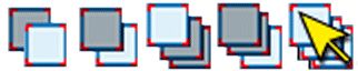
The order in which containers are drawn is called Z-Order. Containers are drawn from back to front and may overlap each other. If containers overlap, the Z-Order determines which container is drawn on top.
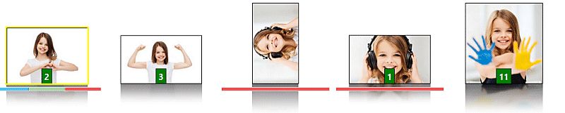
In the following image, you see two overlapping containers. On the left, the Band Aid is on top of the banana. On the right, we moved the container with the banana image above the band Aid in the Z-Order. This ensures that the banana is drawn on top.
The quickest way is to select the container that you want to change in the Z-Order, and then click on one of the Z-Order buttons in the main toolbar. You can move containers one level up or down, bring them to the top or send them to the back.
Ribbon buttons to change the Z-Order.
On the right, the button which switches into the Z-Order Mode.
Alternatively, right-click the container you want to change, and then use one of the commands available in the Bring forward or backward menu.
The third option is the special Z-Order Mode. Press Ctrl+I to enter this mode (or click the corresponding toolbar button). The editor now displays the Z-Order of each container:
Editing Z-Orders interactively
Now left-click the containers in the order in which you want them to be placed within the Z-Order. The first container you click will get the Z-Order 1, the next 2, then 3 and so on. The container with the lower number is lower in the Z-Order: Container 2 is higher than container 1.
IMatch automatically leaves the Z-Order Mode when you have clicked all containers once, you click somewhere outside a container or you press ESC.
The Z-Order mode displays the Z-Order of all containers in the editor. A great way to see how the containers are stacked.
The page properties dialog box includes a list of all containers on the page. To see it, click on the page in the Document Panel or just click somewhere on the page in the editor.
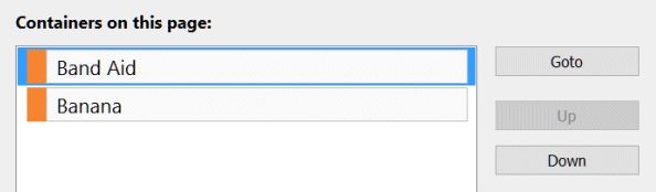
The two containers from our example in the container list. The container named Band Aid is on top of the Z-Order and thus drawn on top of the container named Banana.
This list becomes very useful when you create complex layouts with many containers on a page. All containers on the page are shown in this list. Each container type is associated with a color that is used in this list and also when drawing the container in the editor.
This is the container list for the 'Container Types' sample below.
To quickly locate a container, just click on the corresponding entry in this list. IMatch makes the container blink in the editor for two seconds.
To set the focus to a specific container, double-click it in the list, or use the Goto button.
To change the Z-Order of a container, use the Up and Down buttons.
We have already mentioned the available container types in passing above. In this section, we look at each container type in detail.
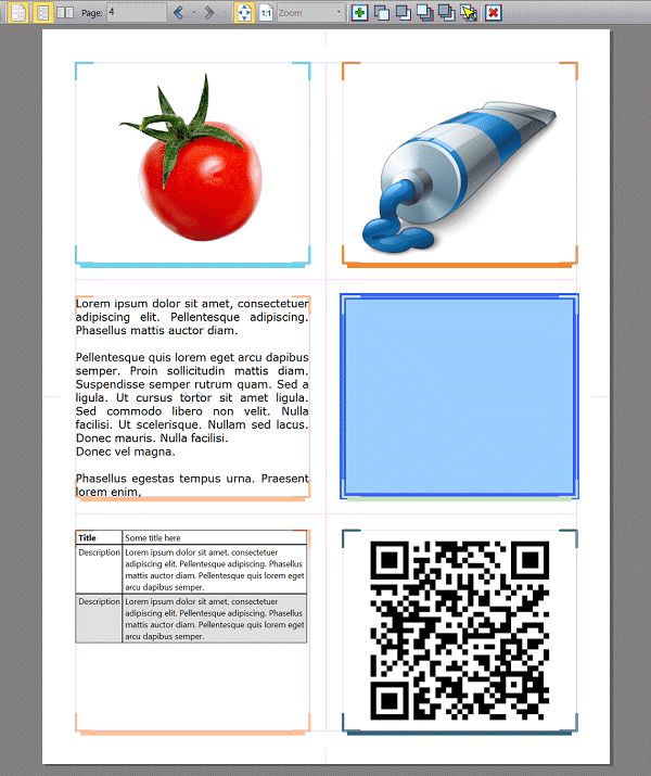
The following screenshot shows a page with six containers. From the top-left: A File container with an image, a Graphics container with an external image (not in the database), a Text container, a Rectangle container, a Text container with a table and a QR code container.
This is the most commonly used container type. A file container simply renders (prints) a file from your database. File containers have all standard container properties (see above), and additionally offer a wide range of options to control how images are fitted, scaled and rotated.
File containers are linked to a file in your database and can serve as data sources for other containers. Data sources are explained below.
The fit mode controls how IMatch fits the file (image) into the container. Here are some examples for fit modes:
Different fit modes for the same image.
| 1 | Fit into container |
| 2 | Fit into container, auto-rotate |
| 3 | Fill and center |
| 4 | Fill, top/left-aligned |
| 5 | Fill, top/right-aligned |
| 6 | Fill and center, auto-rotate |
| 7 | Fill and center, auto-rotate (same as 6) |
Fit into container | In this mode, the image is scaled to fit into the container. This works well in many cases, but not in all. If the orientation of the container and the image differ (e.g., portrait container and image in landscape orientation), the image may be displayed quite small with large margins. In the screenshot above, this is what happened to container 1. |
Fit into container | This mode works as the first mode, but automatically rotates the image to match the orientation of the container. See container 2 above. If you want to create a layout which uses the available space in the container optimally, using the auto-rotate mode is usually a good idea. |
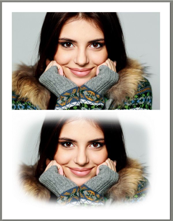
Fill... | All Fill modes resize the image to fill the entire container. This ensures that the complete container is covered, but may crop one or more edges of the image. The various available Fill modes allow you to control which of the edges of the image are 'outside' the container and thus cropped. Which mode you choose depends mostly on where the important area of the image is located. In the sample image above, container 3 uses "Fill and Center", container 4 uses "Fill Top/Left" and container 5 uses "Fill Top/Right". The Smart Fill ModeWhen you select this mode, IMatch tries to keep the important section of the image in the center when cropping by looking at the face annotations in the image. When an image contains faces, IMatch tries to prevent cropping the faces by shifting the image accordingly. 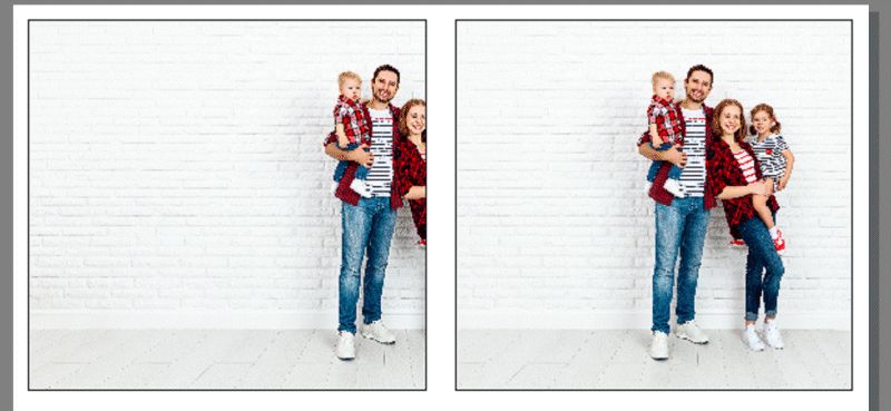 The Smart Fill Mode in action: Left: Fill and Center, right: Fill Smart. |
Fill/Rotate... | These modes work like Fill, but automatically rotate the image to match the orientation of the container. Again, which mode to choose depends on the specific requirements of the image placed in the container. Container 6 in the image above uses "Fill/Rotate and Center". Container 7 uses the same mode, but since this container is much wider and matches the orientation of the image, the image is not rotated. |
Don't grow | This setting tells IMatch not to enlarge the image when fitting it. Useful if you work with small images (e.g., icons) and you don't want IMatch to blow them up to match the container size. |
Scale | Best combined with one of the Fill Modes. If you want to resize the image before rendering it into the container (e.g., to zoom into a relevant portion), enable this option and select a scale value. |
Horizontal Alignment | If the image is less wide than the container (in one of the Fit modes), how to align it. |
Vertical Alignment | If the image is less high than the container (in one of the Fit modes), how to align it. |
Offset | These vertical and horizontal offset allow you to fine-tune the positioning of the image in the Fill modes. Sometimes neither of the modes is exactly right and you may need to shift the image manually in a specific direction for an inch or two. This can be achieved with these options. Use positive or negative values to manually shift the image up/down or left/right. 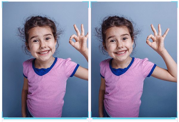 Fill and Center on the left. |
Opacity | If you want to make the image semi-transparent, use a value less than 100% for this. Whatever is under the image then shows through. |
| Effects | |
|---|---|
USM Sharpen | Unsharp Masking (USM) allows you sharpen images individually. |
Gaussian Blur | This option allows you to blur an image. This effect is often used to blur an image that is used as a background. Try using it together with an opacity less than 100% to make the page background color shine through. You can also use the HSV effect in addition to reduce the saturation.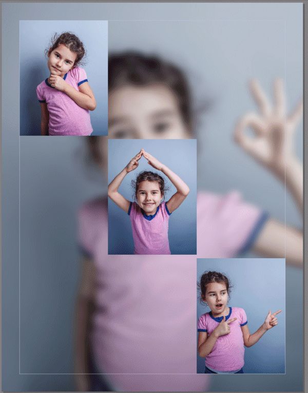 Here we use a file container in the background to fill the entire page. We reduced the saturation by about 50% and used the Gaussian Blur effect to blur the image. |
HSV Adjustment | These controls allow you to adjust the hue, saturation and value independently. A quick way to lower the saturation of images you want to use as a background fill. |
Mirror horizontally | Mirror the image horizontally. |
Mirror vertically | Mirror the image vertically. |
By default, IMatch uses cache images for printing. This usually gives the best performance. If you work with less than 100% cache images in your database, or your original files have transparencies / alpha channels, you can enable this option. IMatch then loads the original file from disk instead of accessing the corresponding cache image.
Only enable this option if the original files are on-line and IMatch can handle the format without creating a cache file first (this is the case for all standard image formats).
File containers support image overlays. An overlay is an image that is rendered on top of the image in the container. Often this is used to add logos, watermarks or borders to images.
A File container with an image overlay.
You can control how the image is fit into the container, how it is scaled and rotated. The opacity control allows you to make the image semi-transparent.
You can use both standard image formats (e.g., JPEG or PNG or TIFF) for overlays, or you use EMF vector files. Most vector programs can output files in Windows EMF format, which allows you to create overlays which render at the best possible quality, independent from the size of the container or the final print resolution.
The following example shows an image with a custom border. This border was created in a vector graphic application (e.g., the free Inkscape) and saved in Windows EMF vector format. The border scales with high quality to any container size.
The center of the border image has been left 'open' (transparent) and this is where later the image shows through when we use the border as an overlay:
The center of the border is transparent (here made visible with green color).
Using the same method you can create all thinkable types of borders. If you search the Internet you'll find plenty of free border clipart you can use as well.
Adding a border to an image is easy using the Overlay feature.
This is a cool way to use free border clipart you can find on the Internet, or to quickly create your own custom borders.
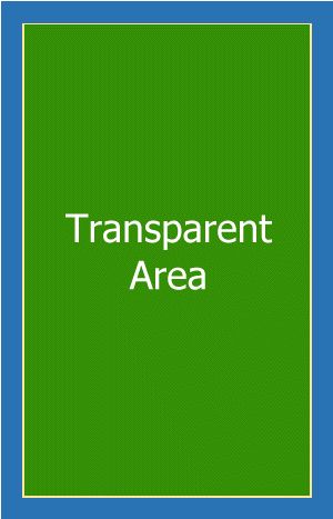
A mask allows you to remove areas of an image. This can be used for vignettes or similar effects. A mask is a grayscale image or an image with an alpha channel. Areas which are pure white do not change the image in the container, and areas which are pure black hide the corresponding area in the image completely. Consider the following mask:

This was quickly drawn in an image editing application using a black background and a soft white brush. Then the mask image was then saved as a PNG file. Loading this image as a mask into a file container produces the following quite pleasing result:
Without and with mask
Since the mask is in portrait orientation but the image is in landscape, we used the Match container orientation mode for the mask. This causes the mask image to be rotated to match the orientation of the container.
If you want to use the alpha channel of the mask image instead of the image itself, enable the corresponding option. Alpha channels are supported for PNG, TIFF and PSD files.
You can align and scale the mask to meet your requirements. Usually the stretch mode works best. The opacity setting enables you to fine-tune how the mask knocks out image areas.
You can use drag and drop from Windows Explorer to quickly set the fill image, overlay or mask image. If you drag a file from Windows Explorer onto a File container, IMatch asks you what you want to do with the file.
The Graphics container is almost identical to File Containers. They offer the same options and controls, with the major difference that Graphics containers work with external files - files not in your database. They are usually used to add logos, icons, backgrounds, clipart or similar elements to documents.
In the following example we combined a File container (the image of the two girls) with three Graphic containers:
Note that the shadow of the pin falls on both the File container image and the background. This is because the pin container has a higher Z-Order.
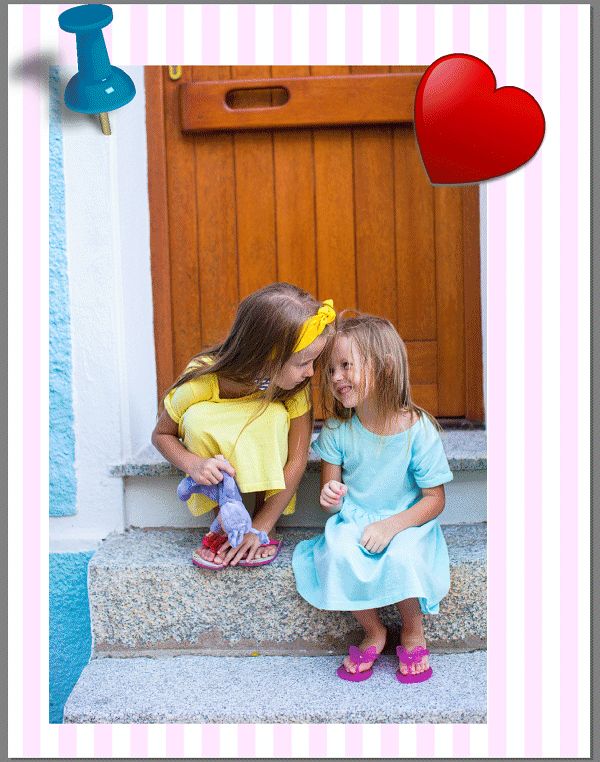
Using Graphic containers to include external images and clipart.
The standard way is to use the Add Container button in the main toolbar or the corresponding command from the context menu in the editor. This allows you to position and size the container first. Then either use the ... browse button in the properties panel to select a file:
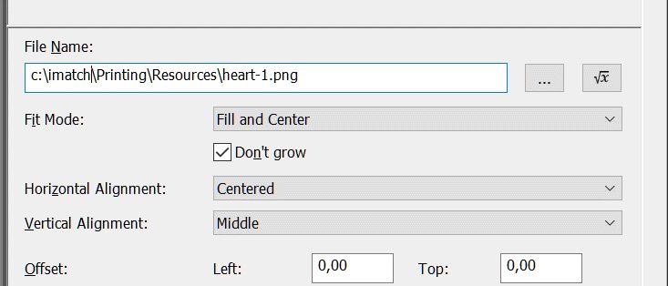
Selecting the file for a Graphics Container
Alternatively, use drag & drop from Windows Explorer. Drag the file from a Window Explorer window into an existing Graphics container. IMatch automatically transfers the file name of the dropped file into the File Name property of the Graphic container and loads it.
This setting is on by default when you drop an external file to an existing container. If the container is larger than the dropped image, the file will not be enlarged to more than 100% of it's size.
This command is available in the toolbar and also the context menu of Graphics containers. It allows you to fit the container size to the size of the contained image.
When you drag an image file from Windows Explorer somewhere on the page (outside a container), IMatch creates a Graphics container automatically. The initial size of the container depends on the dimensions of the dropped file. You can later resize the container as needed.
When you drop a file from Windows Explorer on an already existing Graphics container which already has a file assigned, IMatch offers you the following options:
When you drop a file from the database to a Graphics container, IMatch allows you to:
This is the simplest container type. It is basically a rectangle of any size on the page. A Rectangle container can be filled with a solid color or a gradient or it can have a fill image like other container types. It can also have a mask and an overlay. In most cases you use Rectangle containers to render lines or color 'boxes'.
Text containers render text. You can control many attributes, like font size and color, alignment and others. Text containers are used for a variety of purposes, from headlines to copy, headers and footers and, most important, to display metadata. Text containers fully support IMatch Variables, which means that you have access to all metadata and Attributes in your database.
The following page demonstrates some of the possibilities of text containers:
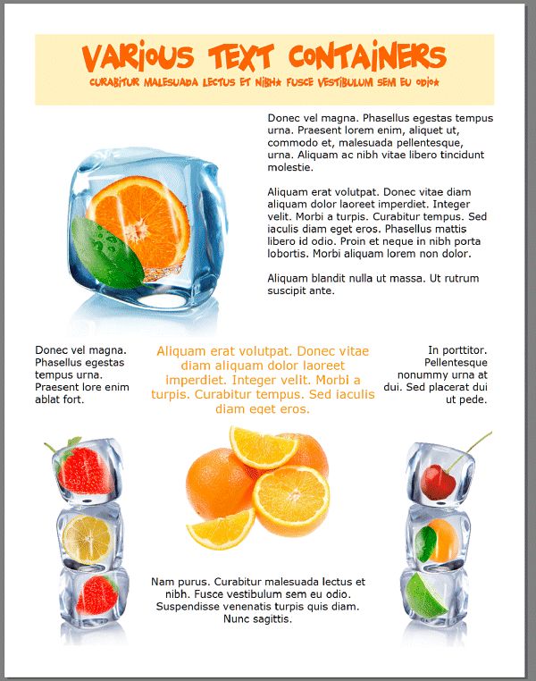
Going crazy with text containers... (Print Preview).
This is how the page looks in the editor:
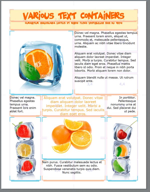
A page with multiple File and Text containers.
The text displayed in Text containers can be a mix of literal text and IMatch variables. There is no length limit; whatever fits into the container will be displayed and the rest will be clipped.
You can control the font face (family), the size in points and also set text attributes like bold or italic. Text can be rendered in any color, including semi-transparent colors specified as RGBA color values.
This setting controls how the text is aligned.
The text block resulting from Text Alignment may be smaller than the surrounding container, depending on the amount of text to render and how the text wraps. You can align this text block within the container using the Horizontal and Vertical Alignment options.
Aligning the text block within a container.
Text can be rotated in steps of 90° to the left and right.
If you enable this option, the text content is interpreted as XAML markup. This gives you a lot of additional design and formatting options, at the expense of getting accustomed to the simple XAML markup supported by IMatch.
For more information, please see IMatch XAML support.
You can switch to XAML markup when you want to perform in-line formatting in the Text container, e.g., using a bold font for some of the text, or maybe different font sizes for different sections in the TextBlock.
Often you can achieve the same result by using multiple text blocks next to each other. You can then use bold font, or different colors or font families as well.
When you switch to XAML, you must use an outer element of type <Border>, <StackPanel>, <WrapPanel> or a <TextBlock>.
<TextBlock TextWrapping="Wrap" FontFamily="Verdana" FontSize="14pt">
<Bold>This text is bold.</Bold> Now follows normal text that should wrap into a second line.
We can also use a LineBreak<LineBreak/> to start a <Italic> new line</Italic>.<LineBreak/><LineBreak/>
With <Run Foreground="#ff0000" FontFamily="Times New Roman" FontSize="36pt">a Run we can</Run> change color and font <Run FontSize="48">whenever</Run> we want.
<Run Background="#fcc0ff">Even the background color.</Run>.
</TextBlock>
When you copy and paste the XAML markup from above into a Text container with the Interpret as XAML Markup option enabled, the result looks like this:
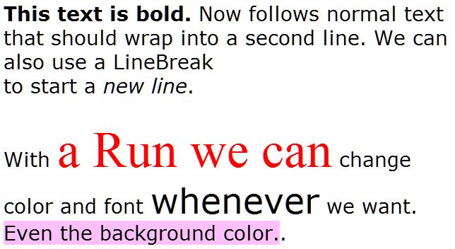
XAML markup rendered by a Text container.
You can also experiment with <Border> or <Grid> to pep up your Text containers. See the XAML help topic for more info.
Design & Print extends XAML to support non-screen devices like printers. The device-independent unit filter allows you to specify measurements in in, cm or mm, e.g., for border dimensions, TextBlock dimensions, BorderThickness and other elements. See the DIU section in the XAML Markup help topic for more details.
Example:
<TextBlock FontSize="18pt" Padding="0.25cm|diu" Margin="2.5cm,2.5cm,0cm,0cm|diu" VerticalAlignment="Center" HorizontalAlignment="Center" Width="5cm|diu" Height="5cm|diu" Background="#fcfc00">
Your text here!
</TextBlock>
This container type allows you to print machine-readable information. Most smartphones have an app to read QR codes and most barcode readers also handle QR codes.
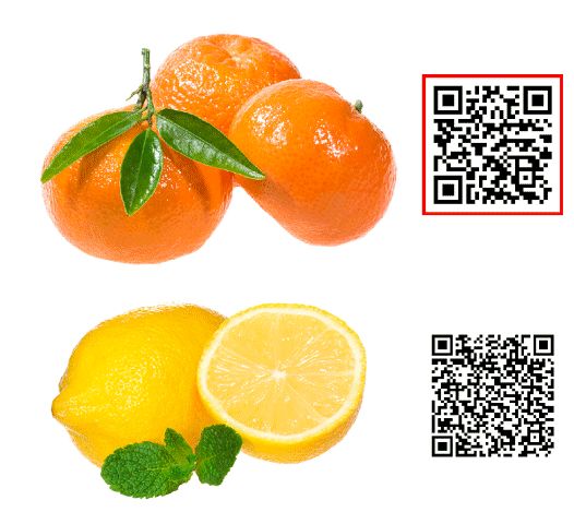
QR code containers. Use your smartphone to scan the two codes for additional info.
QR code containers are ideal if you want to include information in your printouts that can be quickly read by smart phones. Typical use cases are credentials, website addresses, machine-readable photo descriptions, price tags and the like.
The only additional property to the standard container properties is the value property, which takes the text for the QR code. Like Text containers, QR code containers support a free mix of literal text and IMatch variables.
IMatch Printing makes use of the Windows clipboard in a variety of ways. You can reach the clipboard commands via the page or container context menus (right-click a page or a container in the editor to open this menu).
Copying and pasting text | You can copy text (e.g., container content or colors) by selecting it in the input field (Ctrl+A) and then copying it into the clipboard with Ctrl+C. Paste it for example into the same option for another container to give both the same value. You can also transfer text from other applications into Text or QR code containers using the clipboard. |
Copying containers | Select the container and copy it into the clipboard using Ctrl+C. You can also select multiple containers and copy them all at once. Switch to the page on which you want to insert the copy (can also be the same page as before) and press Ctrl+V to insert the container(s). For freely positioned containers, IMatch inserts the copy a short distance away from the original container. For containers which are positioned relative to a grid cell, IMatch inserts the copy into the same cell. The copy is automatically selected and focused so you can change the position and other attributes in the property panel. A better method in this case is to use the context menu to insert the copy of the container: right-click somewhere into a cell to open the context menu and choose Paste. IMatch asks if you want to insert the container into the original cell, or insert it into the cell you just right-clicked. This makes it much easier to copy containers into multiple grid cells. |
Copying settings | First copy a container into the clipboard. Now select one or more other target containers. Press Shift+Ctrl+V to open the Paste Attributes dialog box. Tick the check boxes of the attributes you want to paste (e.g., border color or text settings) and then click the OK button. |
Copying entire pages | Use the Duplicate Page command in the Document panel. |
This view shows all available templates. It has two tabs:
My Templates shows all the templates you have created.
System Templates shows templates which have been shipped with IMatch. You can use these templates as the base for your own templates.
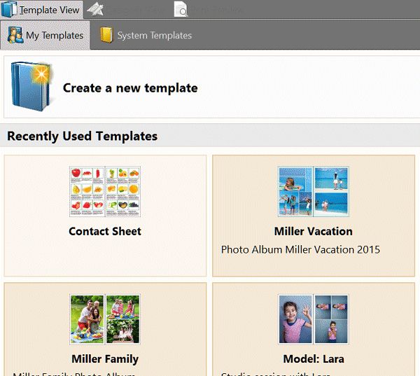
The Template View
Templates can be stored in one of two locations:
1. Your personal templates. These templates are visible only to you.
2. Shared templates. These templates are visible for all users.
Both template types are combined in the My Templates tab.
When you save a template in the editor for the first time (or when you use the Save as... command to store a template under another name), IMatch prompts you to choose a location for the template.
Standard Templates and Dynamic Templates are displayed in two different colors in the Template View.
In the example above, the Contact Sheet template is a Dynamic Template, all other visible templates are Standard Templates.
To create a new template, click on the Create a new template button at the top.
To open an existing template, just click on it. IMatch loads the template and switches into the Designer View automatically.
To delete a template, right-click the template and choose Delete from the context menu.
To duplicate a template, first open it and then save it under another name in the Designer. Don't forget to change the name in the Document properties as well.
From the context menu you can also force the Template View to refresh. This may be required if you made changes to templates in an external application.
You can save templates in the Designer View. If you want to duplicate a template, use the Save As... command to save it under another name. You may also want to change the Document Name and Description in that case. To do this, click on the Document node in the Document Panel, and then enter the new name and description in the property panel on the right.
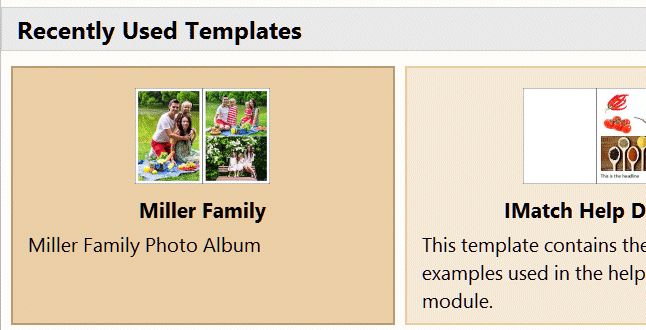
When you save a template, IMatch creates the thumbnail from the first two pages which contain File containers (consuming containers, to be precise). This may take a few seconds and the Template View may not immediately reflect the new look of your template.
The name and description you enter for your Templates in the Document properties is used by the Template View:
If you create many templates, you may want to group them by a name. Just enter a new Template Group name in the Document properties, or select an existing group name from the drop-down list. The Template View arranges your templates based on the group name automatically:
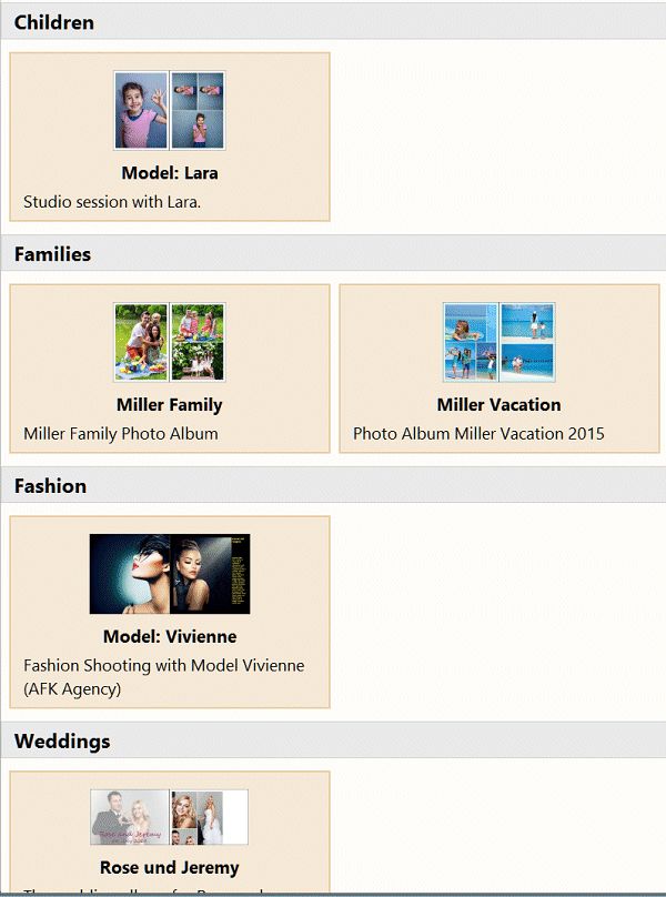
Organizing templates with groups.
This view shows the final document as it will be sent to the printer or another output target. You can display multiple pages at the same time, zoom in and out to check details etc. The preview can display up to 40 pages at once - although that's rarely needed (and probably a bit slow).
A photo book template in the Preview. We display 2 rows with 4 pages each.
You can abort the rendering in the preview with the ESC key (make sure to click somewhere into the window before to make it active).
This may be useful if you have accidentally selected too many pages to display or it just takes too long to load and process all the images.
Changing the number of displayed pages, the zoom level or the current page will restart the rendering.

The first button opens the print dialog box. See below for more information.
The following buttons control whether images, grids/margins and containers are displayed.
For quick layout checks, you can disable the image preview. This speeds up things a lot when you display a lot of pages at the same time. You may want to show containers in this case, else you won't see much.
The next button enables you to toggle soft-proofing and to select a proofing color profile.
The third group of buttons controls the zoom level.
The fourth group of buttons controls how many pages are displayed: 1, two or a variable number of pages.
The fifth group displays the current page number and allows you to navigate the document.
Soft proofing allows you to display the pages using a specific printer color profile. This gives you a better impression of how the pages will look on your printer.
To soft-proof a document you first need to select a printer profile using the corresponding command in the drop-down menu. Then you can switch between normal render mode and soft-proofing mode by clicking the toolbar button.
Please note that factors like inks, the paper, printer settings etc. also impact the final output.
When your template is complete, you can print the resulting document on any printer connected to your system (including PDF and XPS printer drivers). You can also have IMatch print each page to a separate image file on disk. The latter method allows you to send the files to your printer, or take them with you to your local print shop.
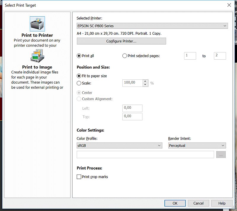
To start printing, click on the Print button left in the Print Preview toolbar. IMatch opens a dialog box which allows you to select and configure the output target.
This output option prints all or selected pages on a printer connected to your system. The following options are available:
Selected Printer | Pick a printer from this list. |
Configure Printer | Opens the options dialog box for the printer. What you see here varies from printer to printer. |
Print All | These options allow you to control which pages to print. |
Fit to paper size | If you set this option, IMatch scales the pages to fit within the printable area of the printer. |
Scale | The scale mode enables you to print the pages at 100% or another size. If you have used margins large enough to accommodate for the non-printable areas of your printer, or you print on paper larger than the paper size for which you have designed your template, 100% is usually the best choice. |
Center | Centers the page on the paper. This is the default and usually works best. |
Custom Alignment | Enables you to position the page freely on the paper. This may be useful if you print on oversize paper or you want larger margins for easier cutting. |
Color Profile | With these options you can control in which color space the images are sent to the printer. In many cases, Printer manages colors is a good choice. If you have created a custom printer profile, you can switch to the Custom mode and select your printer profile via the Browse (...) button. |
Print Crop Marks | Enable the option to print crop marks if you want to print out special marks which make it easier to cut the paper. You usually only need this when you print on larger paper and you cut the pages yourself afterwards. Most commercial print services create their own crop marks and you should not use this option in that case. |
If you install a PDF print driver (available for free or at a cost from several vendors) you can output PDF files as well.
Windows 10 includes a PDF printer driver. It gives you less control than most of the commercial PDF print drivers, but it's free.
This option exports each page in your document into a separate image file. This is ideal if you want to print externally.
The following options are available:
Output Folder | The name of the folder to which the image files are written. |
Empty output folder | Enable this option if you want to delete all files in the output folder before new files are created.This option deletes all files in the output folder, not only files created by the IMatch Printing module. |
File Name Mask | This mask is used to create the file names. IMatch automatically ensures that the files get unique file names by appending numbers as needed. The default mask is Page {Print.Process.Page}Which produces file names in the form 'Page 1', 'Page 2', ...The variable {Print.Process.Page} is one of the many variables available in IMatch Printing. It returns the sequential number of the printed page, starting with 1. |
Scale | The scale for the output images. In almost all cases you will use 100% for this option. |
Format | The output file format. Supported are JPEG, PNG and several variants of TIFF. |
Resolution | The resolution to use when creating the output images. 72 DPI means standard screen resolution. If you plan to view the images on high-res monitors (144 to ~ 200 DPI) or print them in an external shop, use the appropriate setting. Usually you don't go higher than 200-300 DPI even for high-quality printers. |
Quality | The quality setting for JPEG files. A good compromise between file size and quality is something between 60% and 80%. |
Output Sharpen | If you want IMatch to apply some extra sharpening to all output images, pick one of the pre-defined sharpen settings here. Usually Low or None is good. |
| Adjustments | |
|---|---|
BrightnessContrastSaturation | These three settings allow you to fine tune the resulting images. The values are applied to the entire output image. In most cases, keeping these to 0% (disabled) is best. |
Color Profile | The color profile to use for the output files. In most cases, the sRGB profile works best for all kinds of displays, web uploads and the like. You can use a custom profile and select the file containing that profile using the Browse (...) button. |
Render Intent | The render intent. The default Perceptual is usually the best choice. |
When you click OK, the dialog box closes and a print job is created. IMatch processes print jobs in the background, while you can continue to do other things. If you add multiple print jobs, they are processed in the order in which they are added.
The print progress is displayed in the print pane in the IMatch status bar:
Monitoring the print progress in the status bar.
If you want to cancel print jobs, left-click the print pane in the status bar. IMatch will ask you whether you want to cancel all running and waiting print jobs.
When you use variables like {File.Name} in a Text or QR code container, which file is meant by this? A page can print 1, 2, 5 or 20 files. Which of these files is chosen as the data source for the variable?
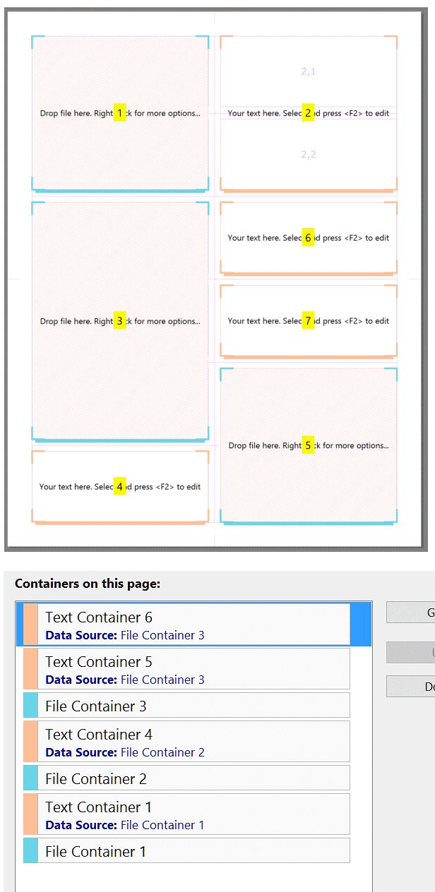
Consider a page like the following. It has three File containers and four Text containers:

Assuming Text 1 uses {File.Name} to print the name of a file, which of the three files on the page is used? How can you tell the Text 4 container that it should use the data for the file printed in File container 2?
By default, IMatch determines the data source for Text and QR code containers by their Z-Order. The Z-Order not only controls in which order containers are printed (from back to front), but also establishes an order that is used to automatically find the data source for containers.
Let's look at the page from above again, but this time we display the Z-Order in which we arranged the containers:
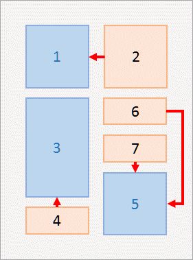
The same page as above, with the Z-Order of each container. The red arrows indicate the data sources.
As you can see, containers with higher Z-Orders find their data source by looking down the Z-Order. The Text container with Z-Order 2 uses the File container with Z-Order 1 as the data source. The Text containers 6 and 7 use the File container with Z-Order 5 and so on.
You change change the Z-Order of containers by pressing Ctrl+I, the Z-Order toolbar buttons or in the page properties panel.
See Z-Order above for more information.
The file which is linked to the File container is used to retrieve the data from the database. If container File 1 above renders file "c:\images\beach.jpg", container Text 2 uses this file when processing the variable {File.Name} - and it shows "beach".
The Text 6 and Text 7 containers use the same file (from File container 5). Both can show different data of course, by using different variables. Maybe you display {File.MD.title} in a large font in Text 6 and {File.MD.description} in a smaller font in Text 7. A very flexible concept.
In Standard templates, all File containers are 'consuming' containers, because they are linked with a file in your database. In Dynamic templates, both File containers and Text containers can be consuming containers. Both can be set to consume a file from the set of files you are printing, and hence can serve as data sources.
The Z-Order only considers containers on the same page. You cannot access data from containers on other pages that way. See below for other options.
Looking at the same example in the Designer, it looks like this (we pressed Ctrl+I to enable the Z-Order display in the editor):
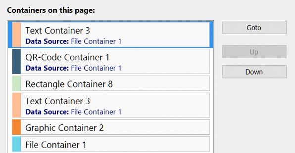
The container list in the page properties not only lists all containers, but also shows the data source for each container (Text and QR code only). This makes it easy to determine which container accesses the data of which file. You can also change the Z-Order directly in this list.
If you click on a Text or QR code container, it indicates its data source with an icon:
After clicking on Text container 2, its data source container shows the data source icon.
The data source is displayed and can be changed directly under the content input field:
Occasionally (rarely) it may be required to specify the data source for a container independently from the Z-Order. Maybe you create two-page spreads and need to display data on the right page for a container on the left page. Or you need to overlap containers in an order which interferes with the use of variables.
In such special cases, you can specify the data source of a container in other ways:
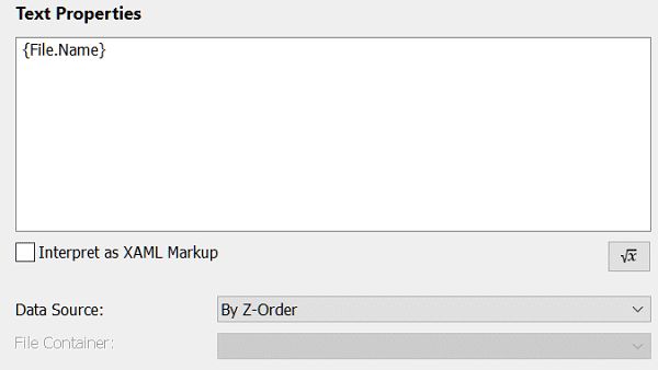
| By Z-Order | This is the default setting. It automatically determines the data source by looking for the next consuming container with a lower Z-Order. |
| By container name | Uses a fixed container as the data source. You can select the container from the drop-down list. Give your containers meaningful names to make them easy to identify. |
| Specific file | If you switch to this mode, you can drop a file from the thumbnail panel on a Text or QR code container. The container then links itself with the file and uses it as the data source. This mode only works with Standard Templates and is not available for Dynamic Templates. |
When you use variables in a Text or QR code container, the container uses the file associated with a File container or another consuming container. This container is serves as the data source. By default, the data source container is determined by looking for the first consuming container with a lower Z-Order. You can override this default handling and pick specific containers or files if required. The data source for any container can be identified in the editor via the data source icon. The container list in the page properties panel lists each container together with its data source.
In addition to all standard IMatch variables, IMatch Printing offers a range of specialized variables directly associated with the print process. The variables have names beginning with Print.
Print.Property.* | Access a document variable defined by you. The * stands for the name of the variable to access. |
Print.Folders.SystemTemplates | The fully qualified name of the folder containing system and shared templates, with a trailing backslash. Usually something like:C:\ProgramData\photools.com\IMatch*\printing\ |
Print.Folders.UserTemplates | The fully qualified name of the folder containing user templates, with a trailing backslash. Usually something like:C:\Users\USER-NAME\AppData\Roaming\photools.com\IMatch*\printing\ |
Print.Folders.SystemResources | The fully qualified name of the folder containing printing system resources, with a trailing backslash. Usually something like:C:\ProgramData\photools.com\IMatch*\printing\resources\ |
Print.Template.FileName | The file name of the current print template, without extension. |
Print.Template.Type | The type of the template: standard or dynamic. |
Print.Template.Path | The fully qualified path of the current template, including file name and extension. |
Print.Template.Folder | The folder containing the template, without trailing backslash. |
Print.Template.Name | The name of the template as specified in Document properties. |
Print.Template.Description | The description of the template as entered in Document properties. |
Print.Template.Created | The date and time the template was created. |
Print.Template.LastSaved | The date and time the template was last created. |
Print.Template.Page.Width | The page with in units. |
Print.Template.Page.Height | The page height in units. |
Print.Template.Page.Orientation | The page orientation: portrait or landscape. |
Print.Template.Unit | The template unit: in, cm, mm or pixel. |
Print.Document.PageNumber | The current page number. This is the 1-based number of the page. |
Print.Document.PageNumber.Printed | The current printed page number (sequential page number). This number refers to the actual number of the printed page, ignoring hidden pages or print ranges. If you print pages 1, 3 and 5, this number goes 1, 2, 3. |
Print.Document.TotalPages | The total number of printed pages in the document. |
Print.Document.Files | The total number of files used in this document. |
Print.Document.Files.Unique | The total number of unique files used in this document. This number differs from the variable above when the same file is printed multiple times. |
Print.Page.Orientation | The page orientation: portrait or landscape. |
Print.Page.Odd | 1 when the page number is odd (1, 3, 5,...) This variable can be used to display different headers or footers on odd or even pages, to dynamically hide containers on odd or even pages and similar purposes. |
Print.Page.Name | The name of the page as specified in the page properties. |
Print.Page.Description | The description of the page as specified in the page properties. |
Print.Page.Files | The total number of files used in this page (File Containers only) |
Print.Page.Files.Unique | The total number of unique files used on this page. This number differs from the variable above when the same file is printed multiple times. |
Print.Section.Type | The numeric type of the current section. For Standard Templates this is always 100. |
Print.Section.TypeName | Dynamic Templates only. The name of the current section: "front-cover", "group-header", "group-page", "group-footer", "back-cover". For Standard Templates this is always an empty string. |
Print.Section.PageNumber | The page number within the current section. If you want to create per-section page numbers, this variable will be helpful. |
Print.Section.TotalPages | The total number of pages in the current section.If you want to create per-section page numbers, this variable will be helpful. |
Print.Group.Index | The 1-based group index. If you print 3 groups, this number goes from 1 to 3. |
Print.Group.Name | The name of the current group. This name is derived from the data source, e.g., the name of the category from which the group was created. |
Print.Group.PageNumber | The page number within the current group. |
Print.Group.TotalPages | The total number of printed pages in the current group. |
Print.Group.Files | The number of unique files printed in the current group. |
Print.Group.FilesPrinted | The number of files printed in the current group. This number will be higher than {Print.Group.Files} if files are printed multiple times because of non-consuming containers. |
Print.Group.Level | The group level (1 to n). If you use the print template with nested folders, categories or collections, this level allows you tell from which level the current print group was created. Print groups are non-hierarchical by nature. You can use this variable to show or hide group headers or footers dynamically, or maybe change the pare number style or similar things. |
Print.File.Index | The 1-based index of the current file. |
Print.File.PageIndex | The 1-based index of the current page. |
Print.File.HasNext | true if there is a next file, false if all files have been printed. |
Print.File.NotHasNext | The inverse of {Print.File.HasNext). This variable returns true when the other returns false. This makes it easier to use it with the Hidden property of containers. You can use these variable to show or hide containers conditionally, e.g., if you want to hide a container if there are no more files to print. |
Print.Container.DataSource | The name of the container used as the data source. |
Print.Container.ConsumedOid | The unique file oid consumed by this container. This is merely for debugging purposes. |
Print.Container.Name | The name of the current container. |
Print.Container.Width | The width of the current container in units. |
Print.Container.Height | The height of the current container in units. |
Print.Container.Width.Pixel | The width of the current container in pixels. |
Print.Container.Height.Pixel | The height of the current container in pixels. |
Print.Container.Column | The 1-based grid column number. |
Print.Container.Row | The 1-based grid row number. |
Print.Container.Column.Odd | Returns 1 if the column is odd (1, 3, 5), else 0. |
Print.Container.Column.Even | Returns 1 if the column is even (2, 4, 6), else 0. |
Print.Container.Row.Odd | Returns 1 if the row is odd, else 0. A typical use case for this variable is to render the cell background in different colors, depending on whether the row is odd or even. For example, use a variable like: {Print.Container.Row.Odd|is:0,#f0f0f0,#fcfcfc} for background color option. This produces different shades of gray for odd and even rows. |
Print.Container.Row.Even | Returns 1 if the row is even, else 0. |
Print.Container.ZOrder | The 1-based Z-Order of the container. |
Print.Process.DesignMode | Returns true if the layout is used in the context of the Designer or Preview. |
Print.Process.Printing | Returns true when this layout is used for actual printing (printer, image output). You can use this variable e.g., to dynamically hide pages or containers during the actual printing. Very convenient for lead-in pages or suchlike. |
Print.Process.FillPage | Returns 1 if this is a fill page. When you use the page flow to enforce that pages start on odd/even page numbers, IMatch may need to add extra pages. If such an extra page is printed, this variable is 1. You can use it e.g., to add a text like "intentionally left blank" and to show/hide containers on these special pages. |
Print.Process.RegularPage | 1 if this is not a fill page. |
Print.Process.OutputFolder | The fully qualified path of the output folder, with a trailing backslash. This is only filled when you print to files. |
Print.Process.OutputFileName | The fully qualified file name of the current page file. This is only filled when you print to files. |
Print.Process.DPI.Horizontal | The horizontal resolution used for printing in dots per inch. |
Print.Process.DPI.Vertical | The vertical resolution used for printing in dots per inch. |
Print.Process.DateTime | The date and time the print job was started. You can use this for example to display the date and time a document was printed. |
Everything explained in this topic also applies to Dynamic Templates. In addition, Dynamic Templates enable you to create templates which work with any number of files, which create chapters based on categories or folders and which can be easily customized with a few mouse clicks.
Dynamic Print Templates
Create templates which work with any number of files. Perfect for contact sheets, reports and similar print documents.
Printing Tips & Tricks
A selection of useful tips & tricks for IMatch Printing.