
IMatch Albums offer an easy and unique way to organize, present, view, and print images and other IMatch objects. Use free or page-based layouts on an infinite canvas, create print layouts, or design sophisticated family trees or storyboards. Whether you use the built-in themes or control every aspect of your album manually, albums always look great.
Albums are a unique IMatch concept. They are stored in your IMatch database and provide a virtually infinite canvas for organizing and laying out images and other objects contained in your database. You can create any number of albums for any number of purposes.
IMatch uses HTML to render albums in an embedded web browser. This offers superb quality and access to all styling features modern HTML provides.
Albums use themes to configure aspects like background, text color, fonts, page layouts, object formats etc. Then you use the property editor to configure the properties of objects, like headers or footers, text styles, borders, and more.
You can save custom styles and apply them later, so you can create a favorite style once and reuse it for objects you add to albums.
Albums are, in addition to the File Window and the Viewer, a new way to present and browse your image collection.
Albums work with live IMatch objects. This means when you place an image or a folder on the Album canvas and the image or folder is changed in your database, these changes reflect in the album. When you delete a folder or category that was used in one or more Albums, it is automatically removed from these Albums.
The fact that objects in Albums are live enables some additional functions, like the ability to open the folder containing an image in a File Window or to navigate to a person in the People View directly from an Album. You can also open the selected file object in the Viewer.
Here are some screen shots of Albums created for various purposes.
Looking at your images and other files in File Windows or the Viewer is great. But when you're done with the files and all editing and metadata is done, you may want to enjoy your work in a more stylish way, like an interactive photo book, a collage, a family tree, or a visual timeline.
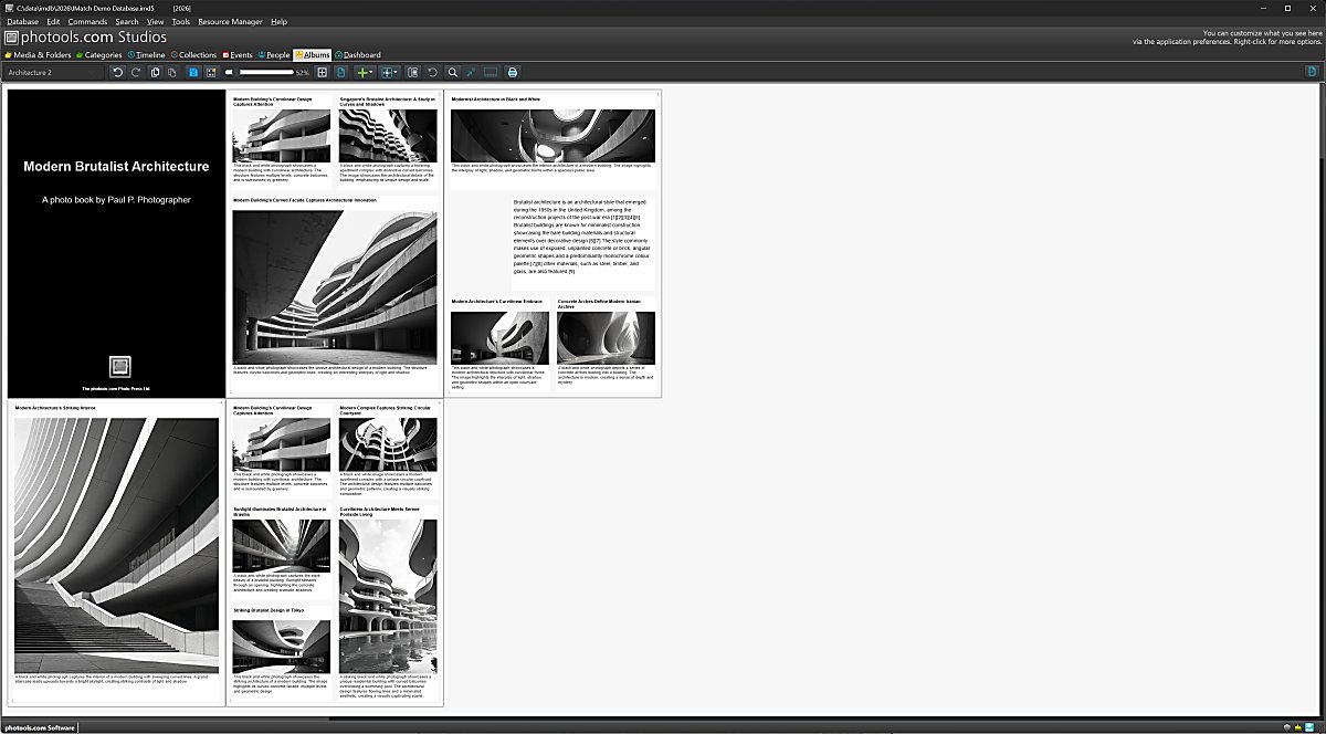
Create albums for specific events in your life, such as a wedding, city trip, or photo challenge. You can freely mix pages and freely placed images, text boxes, graphics, and more. Add an unlimited number of pages in each direction.
If you plan to print an album or create a PDF, use a page-based layout with the intended print size, such as Letter or A4. Albums make it easy to lay out images and other objects inside pre-made page layouts.
If you work with persons in IMatch, you can create family trees of any size in one or more albums.
Albums are aware of person relations you have created in the People View. You can also create relations between persons directly in an album.

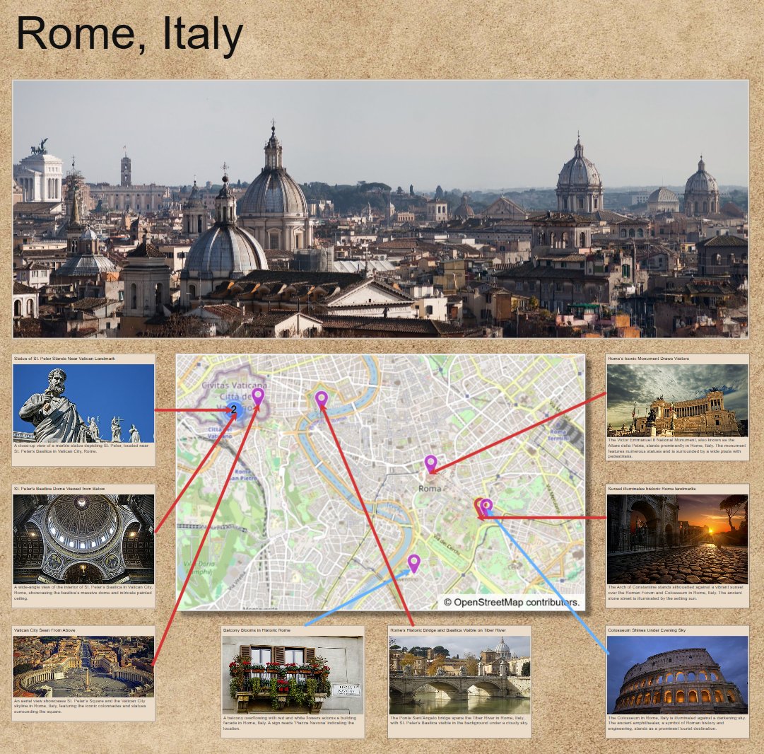
TRhis album visualizes the location of photos taken in Rome. The photos show the headline and description from XMP metadata.
We could add more text using text boxes, photos of restaurants and museums we've visited, and more. Albums are virtually infinite in both directions, giving us plenty of space to show things and explain things.
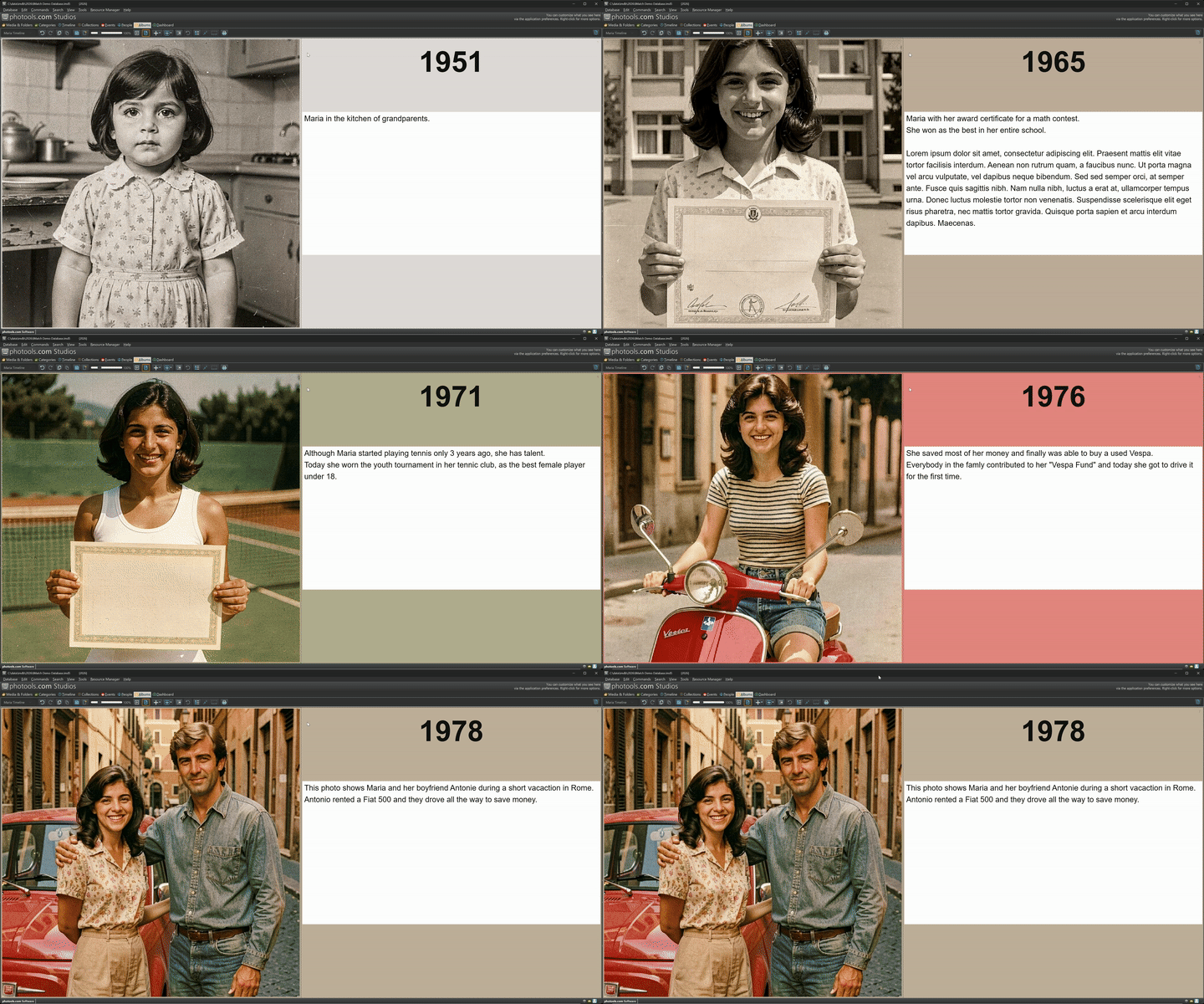
Albums make it easy to build timelines in all shapes and forms. Here is an example for a person timeline:

You can add navigation between pages / nodes in the timeline using buttons or switch to presentation mode where IMatch displays each page of the Album in fit-to-view mode, with navigation using keyboard or mouse:
There are very few limits to what can be done with IMatch Albums, thanks to HTML as the core technology. Here is a more stylish album page with an image in the background, a neat shadow effect for the images, and a vertical arrangement. The year numbers are created from round markers with a large font and custom background colors.

The text displayed in the footers is fetched from the database via the {File.MD.description} variable. Using standard IMatch variables gives albums full access to all the metadata in your IMatch database.
If you organize animal photos, maybe car, train, or plane photos, you can utilize albums to quickly create visually pleasing fact sheets, overviews, infographics, and more.
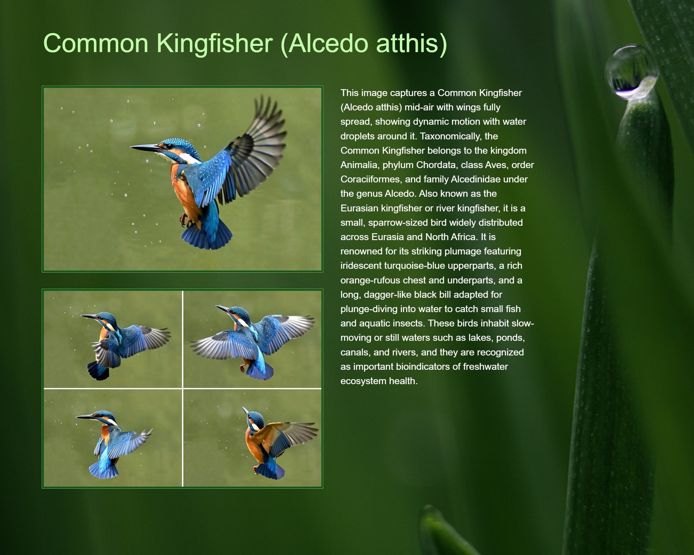
Albums can contain images and other files, categories, folders, events, external graphics, text, and more. Whether you want to keep track of files and folders used in a project, or you just need a place to temporarily store stuff while you organize your images or content for a presentation, albums are the perfect tool.

Since all objects are live, you can navigate to the folders, categories, images, events, and persons shown in your scrapbook album with a double-click or Ctrl + G
Many other variants of albums are possible, depending on your needs and preferences. Consider albums a playground for discovering new ways to see and interact with the contents of your image collection.
Albums are managed in the Album View.

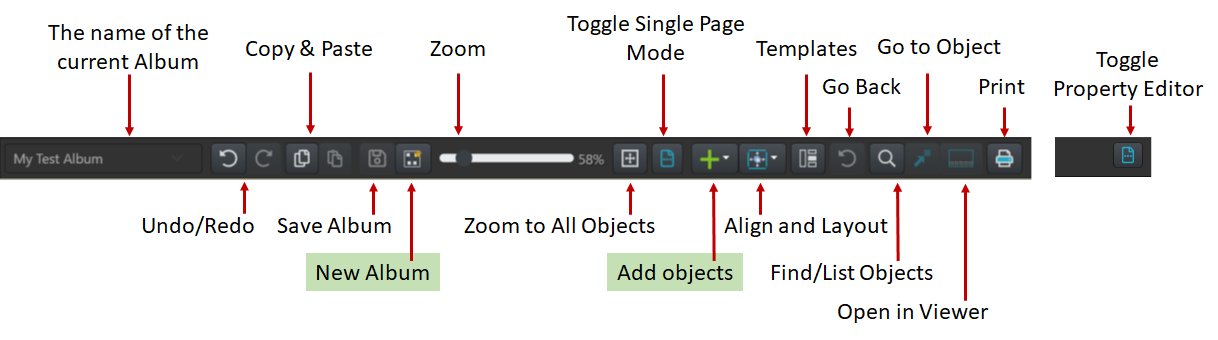
At the top of the Album View is the main ribbon, which gives access to commands.
| Zoom and Navigation | |
|---|---|
Ctrl + 1 | Zoom to 100%. |
Ctrl + 0 | Zoom to fit all objects in the album. |
Ctrl + wheel | Zoom in and out. |
Home | Go to first page. |
End | Go to last page. |
| Selecting Objects | |
Click | Select an object. |
Shift + click | Select multiple objects. |
Ctrl + A | Select All. |
Ctrl + D | Deselect All. |
| Undo and Redo | |
Ctrl + Z | Undo the last change. You can undo and redo the last 50 operations. |
Ctrl + Y | Redoes the last operation. |
| Clipboard | |
Ctrl + C | Copies the selected objects to the clipboard. |
Ctrl + V | Pastes objects from the clipboard. This includes files, folders, categories, events, and persons. |
| Commands | |
Ctrl + N | Open the New Album assistant. |
F2 | Toggle property editor on and off. Also disables presentation mode. |
ESC | Cancels/Aborts the current operation. Also disables presentation mode. |
Ctrl + S | Saves the Album. |
Ctrl + T | Open the Template Manager. |
Ctrl + G | Go to object. |
Ctrl + P | Print the album. |
Shift + Ctrl + O | Open the selected file in the Viewer. This only works when exactly one file is selected. |
Ctrl + F | Find objects and pages. |
F11 | Toggle full-screen mode. |
Backspace | In presentation mode: Go back to last navigation position/page. |
Click the drop-down list on the left of the ribbon to see a list of all available albums. Select the album you want to view or edit.
Depending on your mouse, clicking the wheel and
To zoom in and out, use the zoom control in the ribbon or hold down the Ctrl key and use the mouse wheel.
With Ctrl + 1 you zoom to 100%, and with Ctrl + 0 you zoom out to reveal all objects in the album.
Saving an album also saves the current position and zoom.
To select an object, click it. To select multiple objects, hold down Shift while clicking objects. Shift + click deselects already selected objects.
Click and drag in an empty area to select all objects in the selection rectangle. Press Ctrl + A to select all objects. Click on the canvas or press Ctrl + D to clear the selection.
When you select objects of different types, the property editor becomes disabled.
Switch to the Album View and click the New Album button in the ribbon or press Ctrl + N to create a new album.
IMatch displays the New Album assistant, where you select the type of album you want to create. After you complete the assistant, IMatch creates the album, opens it, and gives it a default name, ready for editing.
If the property editor is not visible on the right side of the Album View, show it with F2.
The first thing you should usually do is give the album a meaningful name. Click the album background to make sure no page or object is selected. The Property Editor then shows the album properties. Enter the name you want to use and apply it.
A good album name makes it easier to find the album later, especially when you create multiple albums for projects, events or presentations.
IMatch ships with a set of standard themes you can use as a starting point for your album. Themes control aspects like background and text colors, the look of objects you add to albums, font families and sizes, colors, and more.
Most of the settings a theme applies to an album can be overridden.
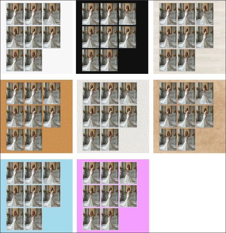
Applying the sample themes to a new album.
You can change the theme of an album at any time. Overrides to theme attributes like the background color are retained.
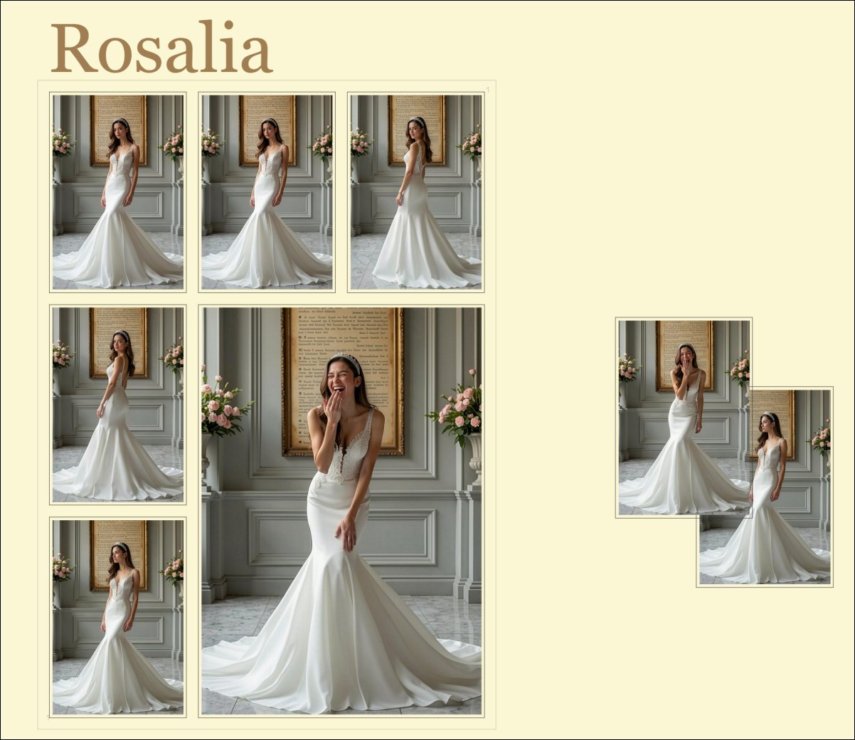
Using a custom background color picked from one of the images for this new Album with just one page so far.
The Color dialog offered by the Windows WebView component used by IMatch has a known issue and does not work. Albums therefore provide a custom color picker to overcome this:
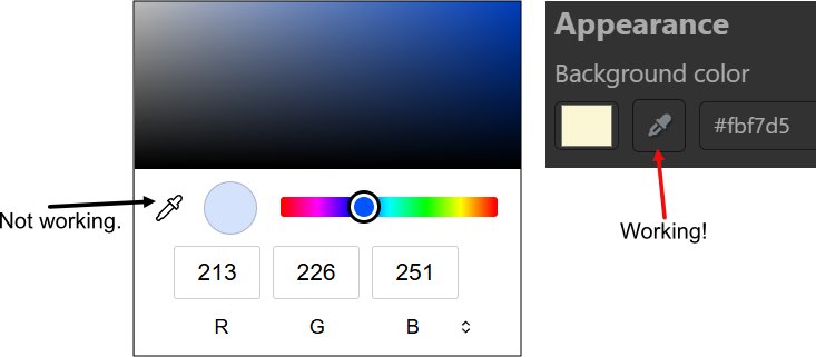
Use this button to pick a color for the album background, a font, or other color properties. Using colors from images displayed in an Album as a background, for text or borders often produces pleasing results.
While the album background is selected, you can also configure the most important album-wide settings:
| Setting | Description |
|---|---|
Background color | By default, albums inherit their background color from the selected theme. You can customize the background color using this option. Use the color selector or enter a color in HTML format. For example, #fbf7d5 produces the light yellow we've used throughout this help topic. |
Snap to grid | Controls whether objects align to the album grid when you move or resize them. Hold down the Alt key while moving or resizing objects to override snap to grid temporarily. |
Grid size | defines the horizontal and vertical spacing of the grid used for snapping and visual alignment. |
Page size | determines the size of album pages when you work with page-based layouts. |
Page size presets | Sizes such as A3, A4, A5, Letter, Legal and Ledger make it easy to switch to common print formats. |
Swap width and height | Lets you quickly switch between portrait and landscape page orientation. This may be useful if you use a page size preset and you want to print in landscape mode instead. |
Fit page to view | This option automatically sizes pages to match the dimensions of the Album View. |
Page outline opacity | This setting controls how strongly page borders are shown on the canvas. |
Connector display mode | This option controls how person relation connectors and link lines are shown in the album. |
| Additional Commands | |
Import Album | This command allows you to import an Album from a JSON file. Note that importing an Album into a different database will cause some database-specific objects to become stale in the album. IMatch tries to re-map objects like files, folders or categories using their path when an Album from a different database is imported. |
Export Album | Exports the current Album to a standard JSON file. |
Clone Album | Duplicates the current Album under a unique name derived from the current Album name. You can change files in containers by dragging or pasting a different file into the container. This allows you to, for example, fill cloned albums with new files. |
Delete Album | Deletes the current album after you confirmed the deletion. There is no undo for this operation! |
An Album provides a virtually infinite canvas and you can place and size images and other objects wherever you want. The optional pages serve the purpose of arranging objects, like you would arrange them in a photo book or when you create print layouts in Design & Print.
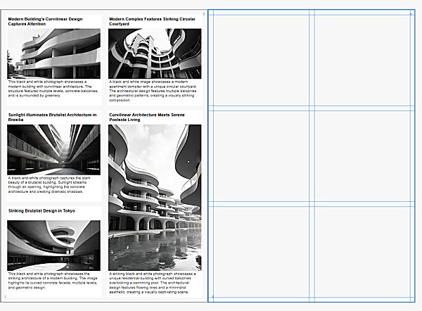
Arranging image objects on a page, using the grid to size and align them.
Pages make it easier to produce consistent layouts and to use Albums like you would use an actual photo book - navigating between pages using the scroll wheel or the Page Up and Page Down keys with presentation mode enabled.
Albums print only objects placed on pages.
Albums offer a number of standard page sizes you can pick from, or you enter your own page sizes in pixels. If you plan to print your Album or save it as a PDF file to share it with others, use one of the standard page sizes.
If you enable Fit page to view, IMatch automatically adapts the page size to the dimensions of the Album View. The page size automatically adapts when you change the size of the IMatch window.
is useful for presentations and screen-based layouts, especially in combination with presentation mode.
If you position objects on pages using page grid, they will automatically adapt their size and position when you change the IMatch window size and so the page size of the album.
Albums support a wide variety of IMatch and Album-specific objects.
{File.MD.description} or {Person.description} to access and display file metadata and other data accessible via variables.The following screen shot the different object types, from files to markers and external images.

You can add objects to an Album using drag & drop or copy & paste.
1. To add one or more images to an Album with drag & drop, select them in a File Window and then drag them onto the Album View tab at the top of the IMatch window. This switches to the Album View and you can place the images.

Dragging files into the Album View.
2. To add one or more images to an album using copy & paste, select them in a File Window and press Ctrl + C, then switch to the Album View, click it to make it active, and press Ctrl + V to add the images.
3. To add folders, categories, or events, select the e.g. the folder in the Media & Folders View, and use the same keyboard shortcuts.
If an object is selected when you paste from the clipboard, the pasted objects are inserted nearby the selected object.
Whether you paste or drop new objects, the Album automatically arranges them side-by-side and selects them:
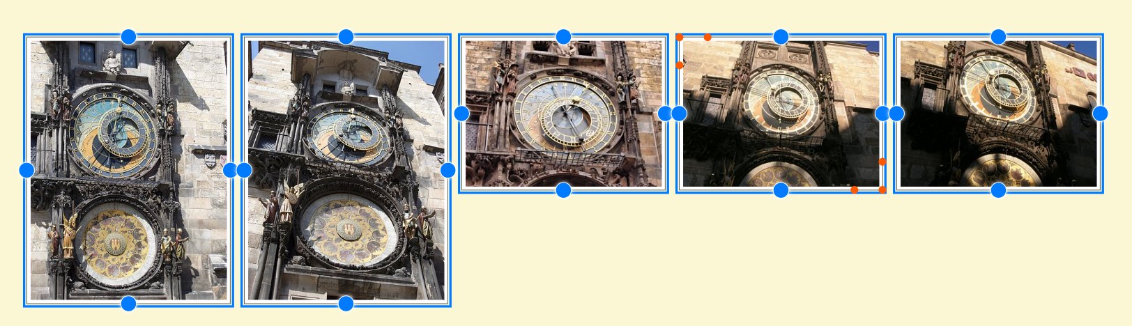
You can now move and resize all new elements together. Or you click the album background to clear the selection (Ctrl + D) and then move and resize individual objects.
Select one or more folders in the Media & Folders View and drag them into the Album View. Or use copy & paste.
Folders by default are represented by a folder icon and show the folder name in the footer:

If the folder uses color-coding, the representative color is shown in a little color label at the top-right. In the property panel you can enable the Use thumbnail option. Folders are then represented by their folder thumbnail:
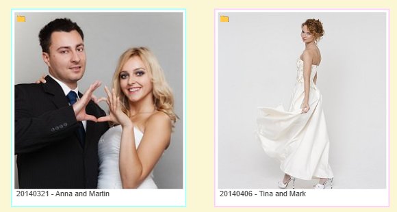
The border color used represents the color-coding. You can use use a CSS style like border-width: 10px; to change the width of the border to your liking.
The little folder icon at the top left tells us that this is not an image object, but a folder object.
Everything written about folders above works the same for categories.
To add an event to an album via drag & drop, drag it from the Event View to the Album View. To add multiple events, select them in the Event View and use copy & paste to transfer them to an Album.
Events are represented by their cover file(s) and the footer by default uses the code {Event.Name} variable:
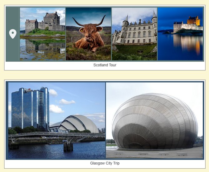
The main purpose for adding folders, categories, or events to an Album is to link them to other objects like persons or files and to quickly navigate to the corresponding folder, category, or event in IMatch.
To add one or more persons to an Album, drag them from the People View into an Album or use copy & paste.
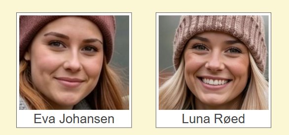
More about working with persons in Albums and how to create family trees in the section about connectors below.
To go to the selected object, double-click it, press Ctrl + G or click on the go to button in the ribbon or the go to button shown in the property editor.
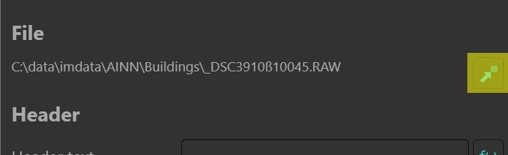
The Go to button in the property editor.
Go to means that IMatch switches from the Album View to the folder, category, person, or event in the associated view. This is one of the many useful features of albums, because you can use them as a kind of jump board to navigate across your database.
Use this, for example, to create visual bookmarks to places in your collection. Or use albums to collect all the things in your IMatch database that belong to a project.
To change the position of one or more objects, select them and then click a selected object and move the mouse. Hold down Shift to select multiple objects.
If you have enabled snap to grid in the Album settings, objects snap to the nearest grid cell, which makes aligning objects very easy.
Hold down Alt while moving objects to temporarily disable snap to grid.
While you move or resize objects, IMatch shows alignment lines to make it easier to align objects to each other:
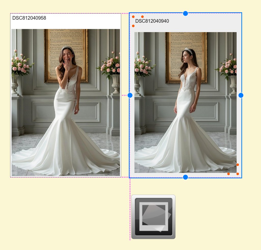
While the objects are still selected, select the command Layout Selection from the ribbon drop-down:
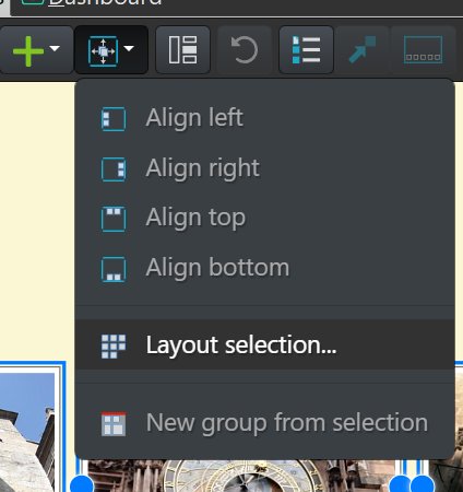
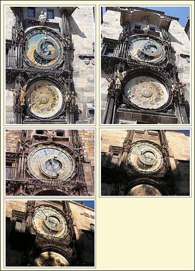
This command allows you to arrange all selected objects into rows and columns:
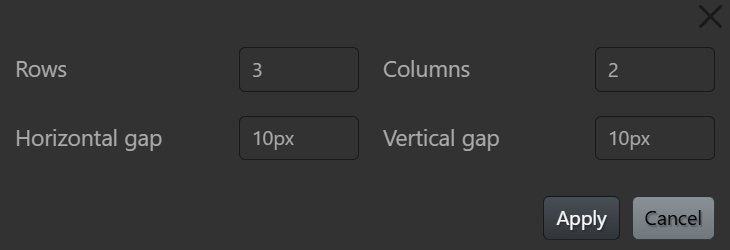
Each object shows six orange resize handles:
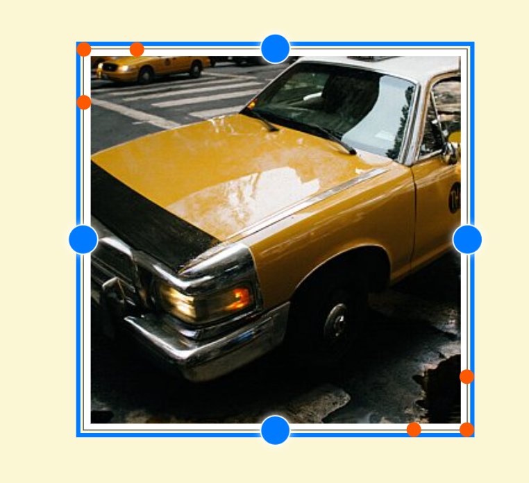
The resize handles on the vertical and horizontal edges resize the object only vertically or horizontally. The resize handles at the upper-left and lower-right corner resize the object both vertically and horizontally.
To resize an object proportionally with the corner resize handles hold down the Shift key while dragging a corner.
When multiple objects are selected, they are resized together.
Albums fill the object with the image. This means there may be some clipping on the horizontal or vertical axis, depending on how you size the object in relation to the dimensions of the image.
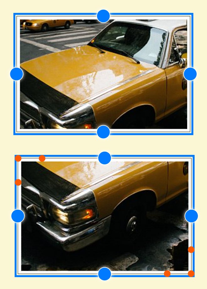
You can resize the object to better fit the image. Or You reposition the image vertically or horizontally by holding down Alt and dragging the image inside the object. This allows you to ensure the relevant section of the image is visible.
The image of the taxi was shifted inside the file object to bring the relevant area into view:
If you have ever used IMatch's Design & Print, you'll know the concept. The Album View displays a property editor at the right side, with the properties of the currently selected object. If multiple objects are selected, the property editor shows the properties of the last selected object.

The property editor showing of the properties for the header of a file object.
All styles the Album and the contained objects come from the theme you have applied to the Album, like the background color of file objects, the fonts and colors used for the header and footer, borders etc. Many of these styles can be changes in the property editor using controls or CSS styles.
Changes done in the property editor are immediately applied to objects. You can press the Cancel button at the bottom of the property editor to undo all the changes you did after selecting a new object.
You can also use the Undo button in the ribbon or press Ctrl + Z) to undo recent changes.
When multiple objects are selected, the data displayed in the property editor is the data of the last selected object. Changes you make are applied to all selected objects.
If the selected objects have different values for one or more properties, IMatch indicates this with a small orange icon. For the following screen shot, the file object on the right was selected first, then the file object on the left. The left object has a header and footer, with custom font sizes.
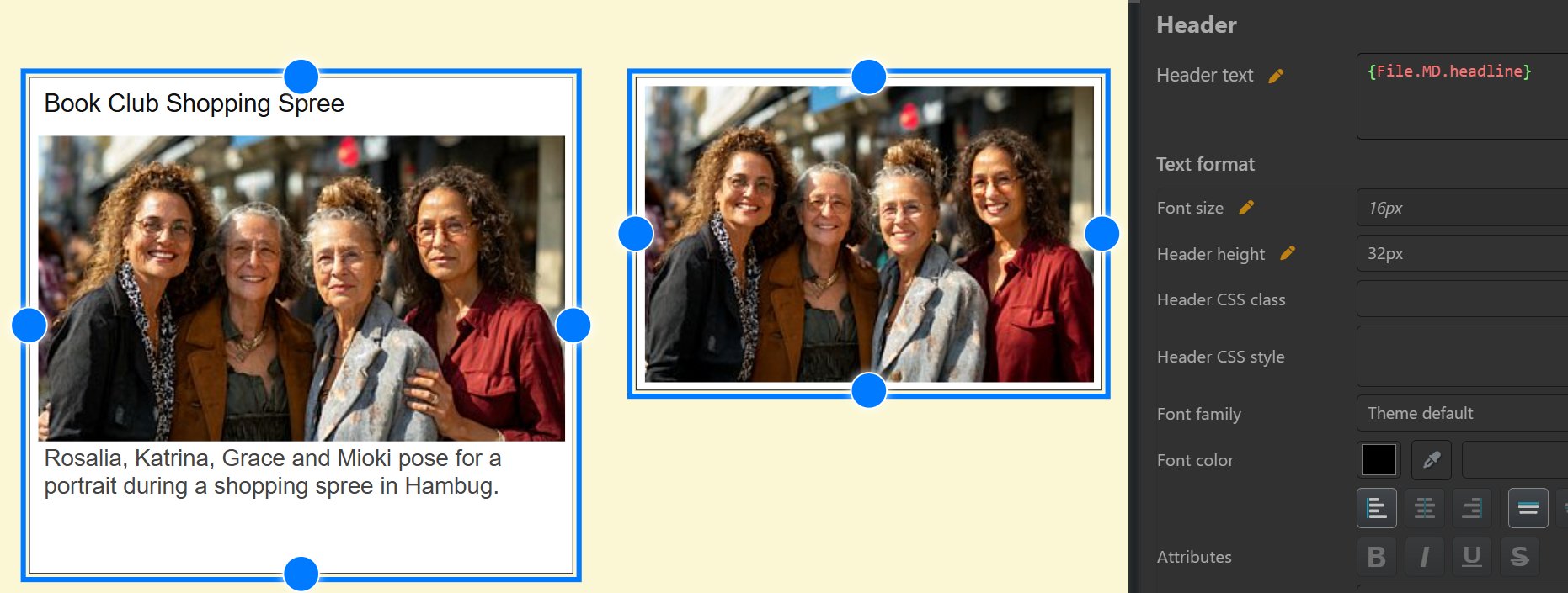
The pens in the property editor indicate which properties differ. By clicking the pen , you apply the values shown in the property editor to all selected objects.
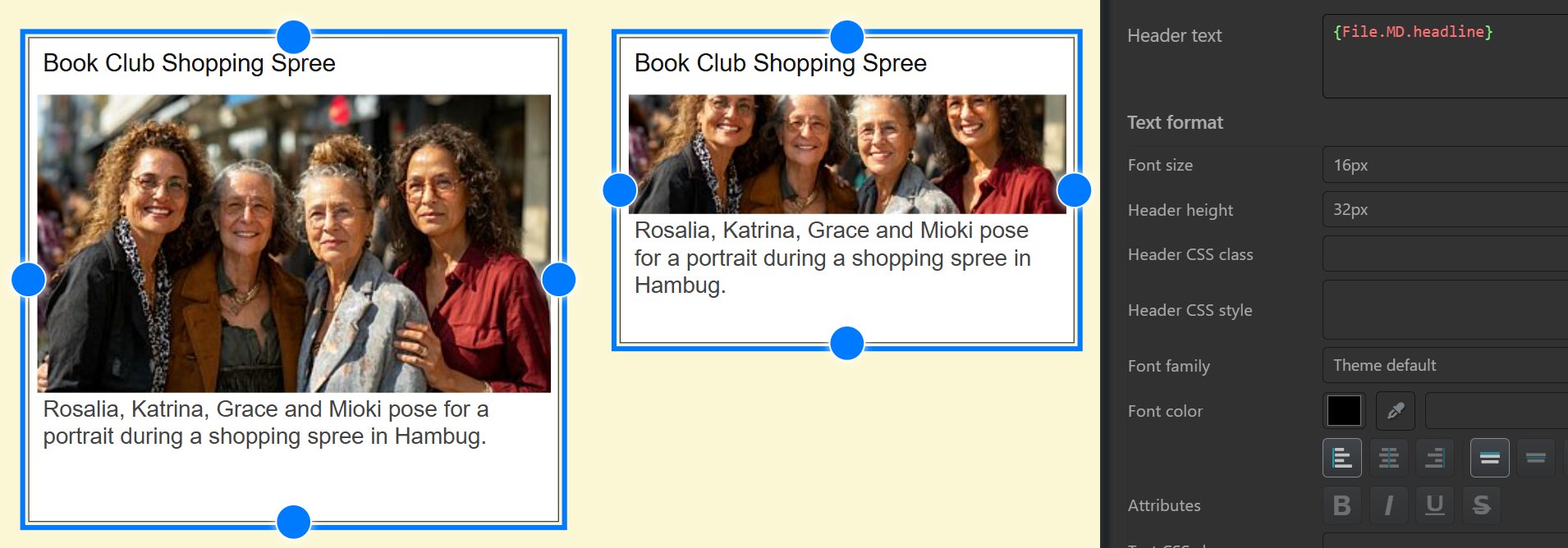
All that's missing now is to resize the right object to make more room for the text and image, or, by clicking the pen icons for the width and height properties, make them the same size:


When you arrange objects in an album, it is often required to make objects the same size. This is the quickest way:
All objects now have the same width and height as the size source.
The Align menu in the ribbon offers commands for aligning objects in different ways. Alternatively, you can select the objects you want to align and the objects you want them to align to last. And then click the pen in front of the X or Y property.
Select the object(s) to delete ans press Del. Use the Undo command to restore accidentally deleted objects.
Alternatively to manually positioning and sizing objects you can use page-based layout for your Album. This is also the recommended approach when you plan to print your Album or save it as a PDF for sharing.
Albums print only objects positioned on pages.
The default page size and layout is configured in the Album properties. You select from a standard page size or enter your own size. Then you set gutters and margins and the number of rows and columns you want.
Here is an example for a page sized as U.S. Letter, with 20px gutters, 20px margins and different combinations of rows and columns:
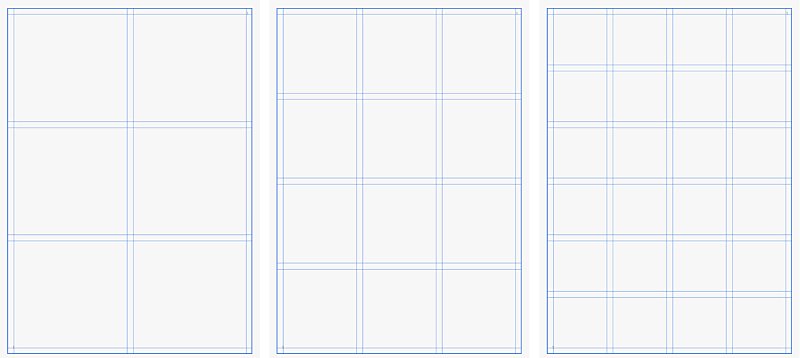
All new pages inherit the default Album page size and layout. But you can override these settings on a per-page basis when needed.
If you create your Album using the "For Print" option in the wizard, a starter page is created automatically.
When the Album has no pages yet, add the initial page from the Plus menu in the ribbon.
When a page is selected, you can add new pages on each side using the corresponding controls in the property editor:
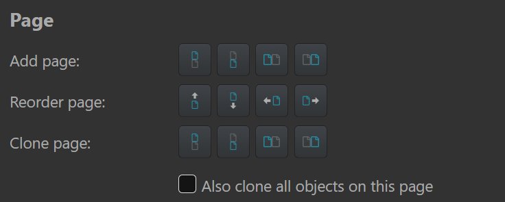
Commands for adding, moving and cloning pages.
In the same section are buttons allowing you to reorder or clone pages.
Cloning pages may save some work when you have changed properties. If you also clone all contained objects, there is a neat trick for file objects: You can replace them with another file!
In the following example we have cloned the page on the left as a new page. And then just dragged & dropped (or copied & pasted) other image files into the existing file containers. The new images automatically inherited the size, position and other properties of the exiting containers.
Use the Delete Page command at the bottom of the property editor while a page is selected.
You can define page grid layouts in the Album properties and override them for individual pages.
You can freely position objects on any page by moving them with the mouse to their desired location. When you use a layout grid made from columns and cells, IMatch offers features to automatically size and position objects in the layout cells.
1. Drag the upper left corner of the object into the desired cell.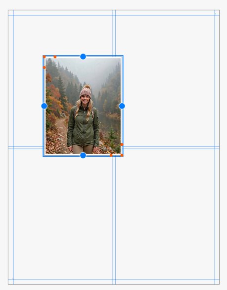
Position the upper-left corner of the object into the desired cell.
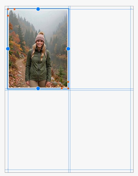
The image object is positioned and sized to fill the cell.

The finished page.
When you place an object the first time with Ctrl + L, IMatch displays a small dialog where you can enter the number of columns and rows the object should occupy:

Press ESC or click outside the dialog to close it.
For objects already positioned inside a page, the property editor shows controls for rows and columns.
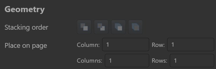
Specifying the number of columns and rows for an object.
Here we used that to spread an image object over two columns on the second page in the album:

This semi-automatic positioning and sizing of objects based on page cells makes it very easy and quick to lay out pages in your album.

The Album now has four pages and this took maybe a minute.
You can just press Ctrl + P and print the resulting Album with four pages e.g. to a PDF file:
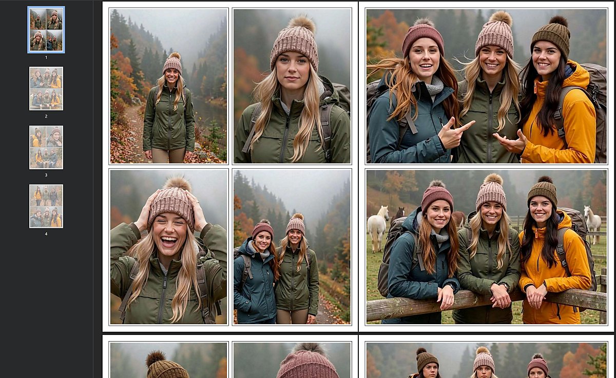
The Album printed as a PDF and viewed in a web browser.
This is an easy and cross-platform way to share images with other persons.
PDF files work on all operating systems and all that is needed to view them is a web browser.
New pages inherit the page dimensions and layout of the Album. But you can override these settings on a per-page basis. To change page size or columns/rows disable the Inherit from album default option in the property editor for that page and then configure the page as needed.
Text objects like headers, footers, and text boxes inherit their colors, fonts and sizes from the selected theme. You can override frequent settings directly in the property editor using the controls provided. For detail-level control, you can assign CSS classes or input CSS styles and attributes directly.
The text to show in headers and footers is entered in the property editor. As usual, you can use a free mix of literal text and IMatch variables. The property editor shows a variable selector button next to the input field. It opens the standard variable selector you know from other IMatch features. The button below opens the text in a larger text dialog, which makes it easy to work with longer texts.
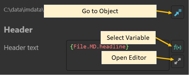
Buttons for the text input field in the property editor.
The following screen shot shows how we use the variable {File.MD.description} to specify the header for the file container. Since the header text is no longer empty, the file container displays the header section:
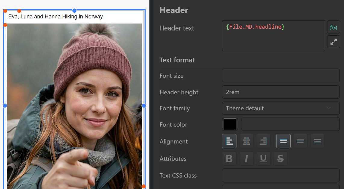
The font size, color, header height and other styles comes from the theme. Most themes use a default header font size of 1rem and a header height of 2rem.
The CSS unit rem is relative to the font size used for the root element of the Album. If the theme specifies 12px for the root element font size, 1 rem is equal to 12px. Using rem instead of units like px makes themes more flexible, because changing the font size of the root element changes everything specified with the unit rem scale properly.
If your headlines are too long to fit into the default header height, just increase it to 3rem or more. Here is the header with a height of 4rem, enough to fit about 3 rows of text.

In the same way you can change the font height. The following screen shot shows a header with a font size of 2rem and a header heigh of 5 rem.

px or pt, feel free to do so: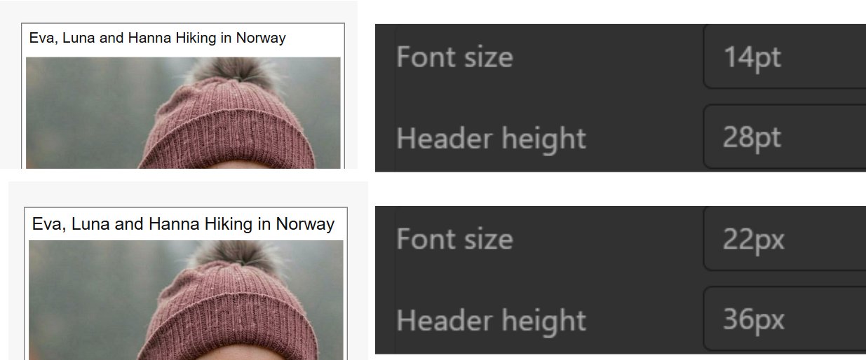
Albums by default offer a standard selection of font families available in web browsers.
If the selection of fonts is not to your liking or you must use a CI font, you can do that by specifying it via the CSS property font-family like so:

The Architects Daughter is a font included with Windows 11.
Working with CSS styles is an advanced feature. If you don't see these fields in the property editor, enable the expert mode in the property editor settings. Click the icon at the top of the property editor.
When you enable the Render HTML option, you can use HTML tags to style the actual text as it is rendered. This allows you to add line breaks with <br> or to make parts of the text bold or italic:
<b>IMatch</b> is an <em>awesome</em> DAM.
produces this result for a text box:

If Render HTML option is not set, you can add line breaks using Shift + Enter. Use the <br> tag to add a line break in HTML mode.
Text objects can be used to add all sorts of annotations, headlines, footnotes and more. Use the Add text box command from the Add menu in the ribbon.
This adds a text box you can fill with literal text and variables and customize to your liking, including using HTML for detailed formatting (see above).
Here is an example showing 3 text boxes with different fonts, background and text colors. One text box with a background for the header, one text box with the description and one text box using a small and right-aligned text with a hyperlink as the footer:
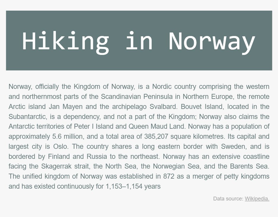
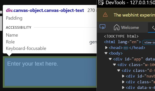
Experiment with the CSS style padding to create room between the text and the text box outline. Themes use a default padding, usually 5px.

CSS style: padding: 0; border: solid 1px black;
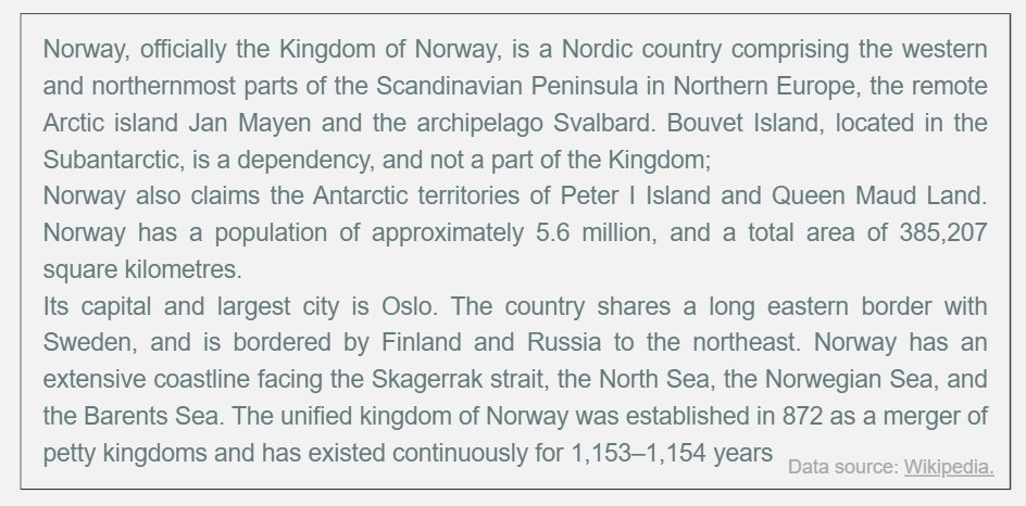
CSS style: padding: 10px; border: solid 1px black;
A text box with the Render HTML option enabled can include hyperlinks. A hyperlink looks like this:
<a href="https://www.photools.com">Click here.</a>
In the Album, this link looks like this:

The ability to include hyperlinks in Albums makes it easy to reference external sources, family home pages, Wikipedia articles etc.
Albums automatically intercept links in the background and open them in the default web browser you have configured.
IMatch includes a range of built-in markers you can add to Albums. Markers support different shapes like dots, arrows, or stars. They can be freely resized, you can change the color and other properties.
Use the Add marker command from the Plus menu. This adds a default red dot marker, but there are many others to choose from:
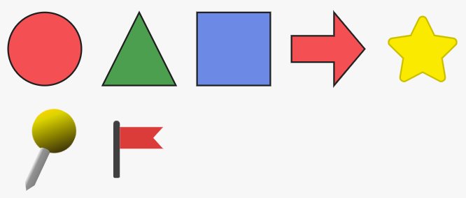
Use the property editor to change marker style, colors, borders, rotation:
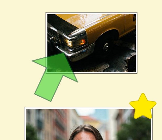
We changed the marker style to arrow and also changed the fill and border colors, the opacity, size and rotation. The image below got a star marker.
In addition to adding images managed by IMatch in an Album, you can also add external images and graphics, like logos, maps, or decorative images.
Albums are basically web sites, running in a secure WebView container and using IMatch Anywhere™ WebServices to access IMatch database contents. This imposes certain security restrictions. You cannot add images from arbitrary folders on your disk to an album. WebView would not load them for security reasons.
To handle this in a safe way, external images in albums are loaded via a special URL: http://useralbums/<name of the image.ext>
This is a virtual "host" provided by IMatch. It maps to the physical folder %APPDATA%/photools.com/IMatch6/albums on your computer. You can copy and paste this folder name into the address bar of Windows Explorer to open it.
If your user name is Mario, the path would be C:\Users\Mario\AppData\Roaming\photools.com\IMatch6\albums
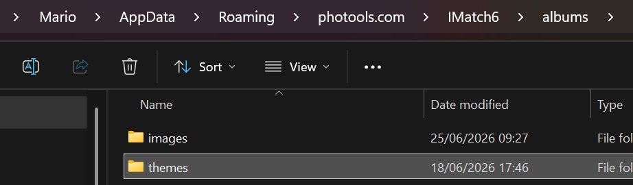
We recommend creating a sub-folder named images or similar in the albums folder. Place all the images you want to use with Albums in that folder.
Use the Add Image command from the Plus menu. This creates an initially empty image object:
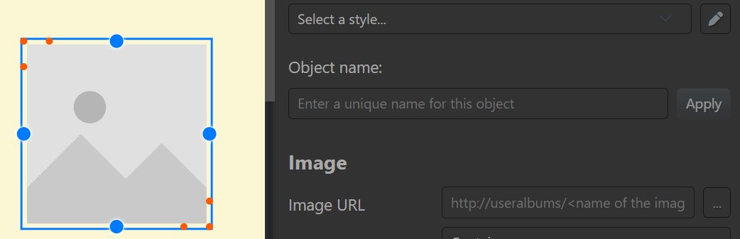
A new empty image object.
Click on the ... button on the right of the Image URL input field. IMatch displays a file selector dialog where you can select an image from the albums folder or a sub-folder of it. We loaded a sample image named star.svg.
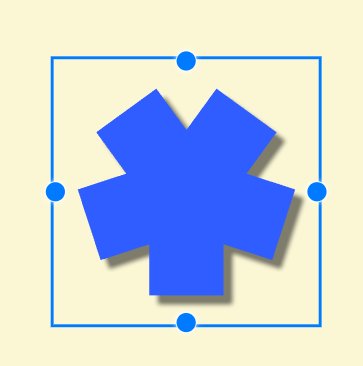
You can now resize, move, and style the image to your liking. If you work with vector images in SVG format, no quality loss will occur when you resize the image.
Support for external images makes it easy to incorporate all kinds of logos, symbols, borders, backgrounds, and more into your albums.
If you look at the example Album with the two family trees above: the maps of Norway, Sweden and Japan have been added as external images.
You can create and customize connectors between objects in an Album, e.g. to visualize relations between persons, or other objects shown in images in the Album.
Each album object has four blue connection anchors which are used for outgoing or incoming connectors:
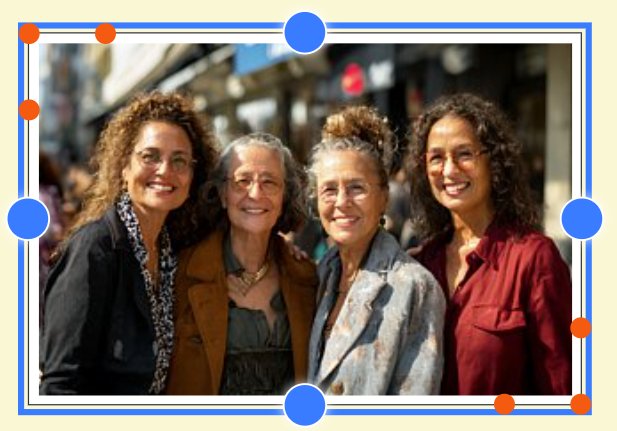
Here is an example of an Album that links a photo of an architect to photos of some of his buildings presented in the Album.

To create a connector, select an object and click and drag from one of the blue connector anchors to the blue connector anchors of another object:
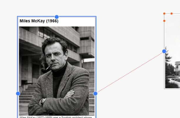
Once the connector has been created, you can customize it in the property editor.
To move an existing connector to another anchor of the connected object or to another object, select the object and then click the anchor of the connector and drag the connector line to it's new target.
To create additional connectors for an already used anchor, hold down Alt key before starting to drag a new connector line.

An anchor with multiple outgoing connectors.
First select the object the connector you want to move is connected to, then the other object. When you know click the anchor point, the connector connecting the two objects is moved.
When you enable the Render HTML option, you can use HTML tags in connector labels and apply custom styles.
For example, if a label is not correctly positioned and none of the alignment options available in the property editor are suitable, you can for instance use margin-left:20px to add a bit more space in front the label.
Another use is to apply some additional formatting to a connector label. For example:
<b>Urban Living</b> Experiment (1972)
results in a label that looks like this:

Select the connector line and press Del.
Text boxes display text and optional global variables. Text objects by default are not associated with any objects, which mean you cannot use variables like {File.*} or {Person.*}.
This changes when you create a connector between a text box and a file object or another object:
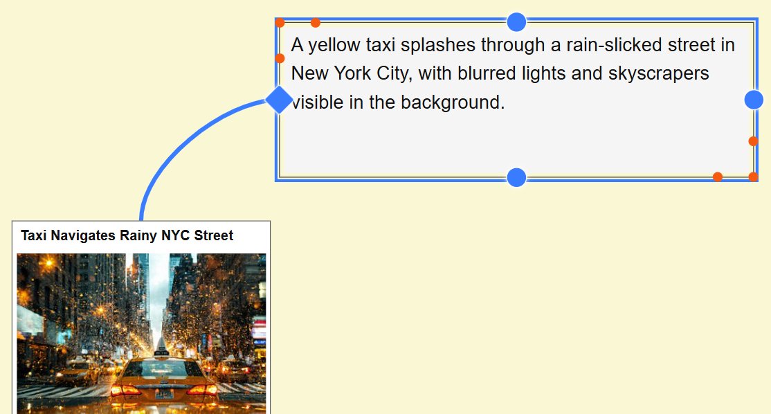
The text box is now connected to a file and able to use variables like {File.MD.description} and to display metadata and Attributes for the linked file.
You can also connect text boxes to other objects like persons or categories:
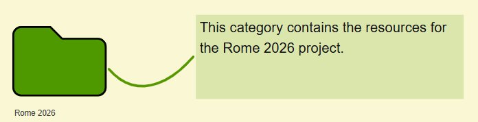
Connectors between text object and other objects are by default hidden when the text object is not selected. You can change that in the connector properties..
You can use Albums to visualize person relations you have created for persons in the People View. And you can create person relations directly in Albums between persons you have added to the Album.
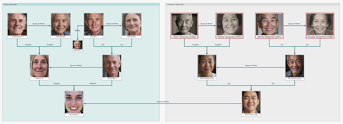
A family tree in an Album, visualizing person relations and two families.
In the section about person relations in the People help topic we've created family relations for the members of the Born family. When we drag Maggie and Richard from the People View to an Album, the Album automatically creates a matching person relation connector between these two persons:

If we now also add their daughter Henrietta to the album, the child relation between Richard and Maggie and Henrietta produce tow additional connectors:

It is recommended to add the "oldest" generation first (great-grandparents, grandparents, parents, children, ...) because this allows the Album to create optimal connector placements for you.
It avoids having to manually move connectors to different anchor points.
Alternatively to creating person relations in the Person Editor, you can create them directly in an Album.
Drag the persons you want to create relations for into an Album and place them. Click into an anchor point of the from person and drag the dotted line to an anchor point of the to person.
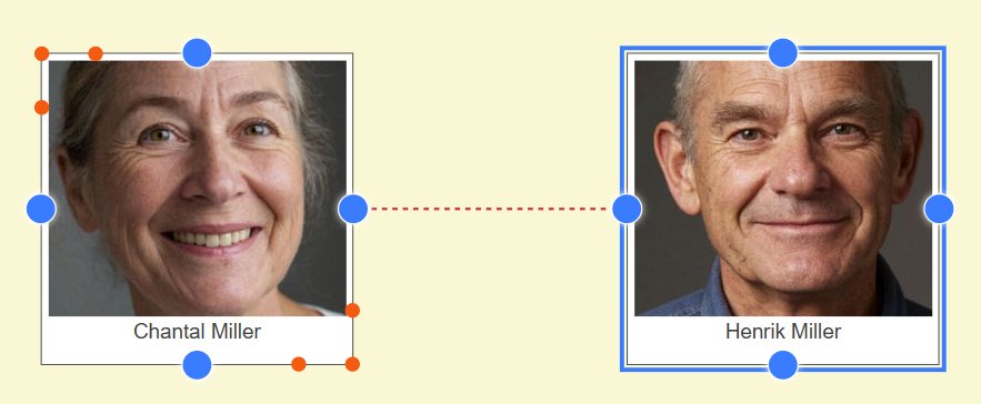
The Album displays a dialog where you select the type of person relation you want to create. The two most frequently used relation types are available as buttons right at the top. Clicking them creates the relation and connector and closes the dialog. Else select a relation type from the drop-down list and click OK to create the relation and connector.
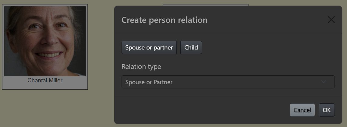
Albums treat connectors between persons in a special way. instead of the normal Link type, they are of type Person Relation and IMatch automatically maintains the corresponding relations in the database. If you add a relation in an Album, it also shows in the Person Editor. If you delete a relation connector in an Album it is also removed from the database.
Regular connectors used Bezier lines while person connectors use elbow lines. This makes them easy to distinguish.
Via the Album settings you can control which person relation connectors albums display. By default, only explicit (user-made) relations are displayed. If you also want to see inferred (dynamically created relations like uncle or grandparent) you can enable this via the Connector display mode setting in the property editor for the Album. This can make a family tree look crowded but may be useful at times.
When you create "tight" layouts the feature to display a label for each connector may get in the way, causing labels to overlap.:
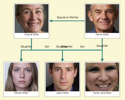
Showing all connector labels.
There are two ways to handle this. Albums offer a Connector label mode option that controls which labels are displayed.
The both extremes are all and none. You can also configure the Album to show only the outgoing or incoming connector labels for the selected persons.
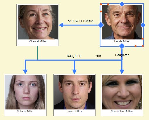
Showing only the outgoing connector labels.
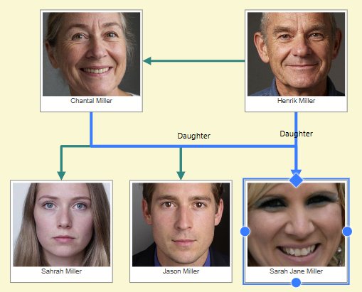
Showing only the incoming connector labels.
In addition to this global setting, you can hide individual connector labels, or format them with for instance a background color to make them stand out.
Here is a family tree where the labels of the children connectors were hidden and a text box was added with the text "Children". The label between Henrik and Chantal was changed to "Couple".

Albums allow you to group objects. Objects inside a group are moved together when the group is moved. Groups can be named and collapsd to hide the group contents.
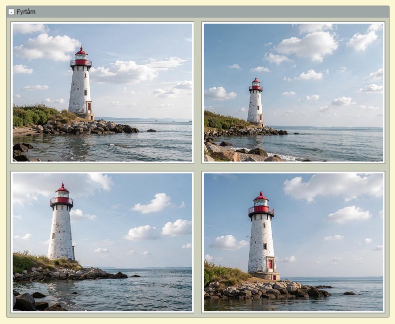
A group containing four file objects.
A good use for groups is to organize families or related objects.
Use the Add group from the Plus menu to create a new and empty group. Resize as needed using the orange resize handles. When you drag an object completely inside a group rectangle, it becomes part of the group.
Alternatively, select the objects you want to group and use the Add group from selection command from the Plus menu.
When you move or resize objects inside a group, the group automatically grows as needed.
To remove one or more objects from a group, select the object(s) and start dragging it with the mouse. Press and hold down the Alt key while continuing moving the object(s) out of the group rectangle.
When you delete a group, the group and all contained objects are deleted. If you want to keep the objects, move them out of the group before deleting the group.
Via the Find button in the ribbon or Ctrl + F you can search for objects in the current Album.
Depending on the object type, the file name, folder name, category name, event name, or person name is used for the search. For objects like text boxes, markers, the internal id is displayed. But you can use the Object Name property of each object to give objects a searchable name:
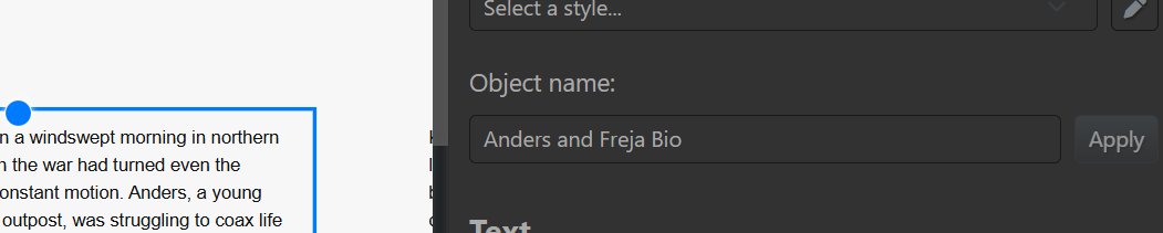
Naming an object.
In the Go to Object/Page dialog you can search for these names:

The search favors the object name, and falls back on the default name (e.g. a file name) for objects without an object name.
If your albums contain many pages and/or many objects, this makes navigating to specific objects very easy.
IMatch Album styles and templates are time-savers and help you to design albums with consistent styles and dimensions.
When you have styled an object to your liking, you can save the style and reuse it in the future. This is especially helpful when you work with CSS styles or custom CSS classes to produce sophisticated object styles. Thanks to saved styles, you have to do the work only once.
Consider this example: The default style for file objects on the left, right after we have styled the file object with a header and footer:
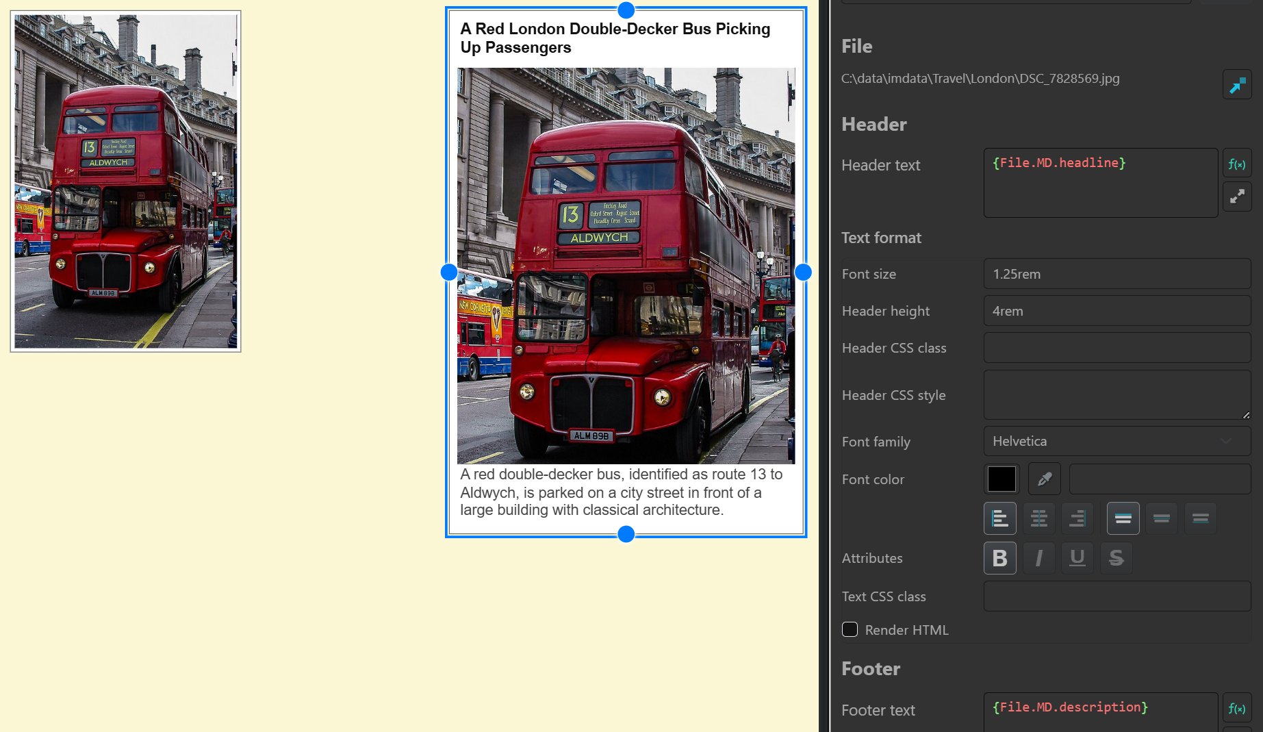
To create a new style from the selected object, click on the pen button next to the style selector in the property editor:

This opens the Style Editor dialog. Enter a name for the new style and click on Create new style button.
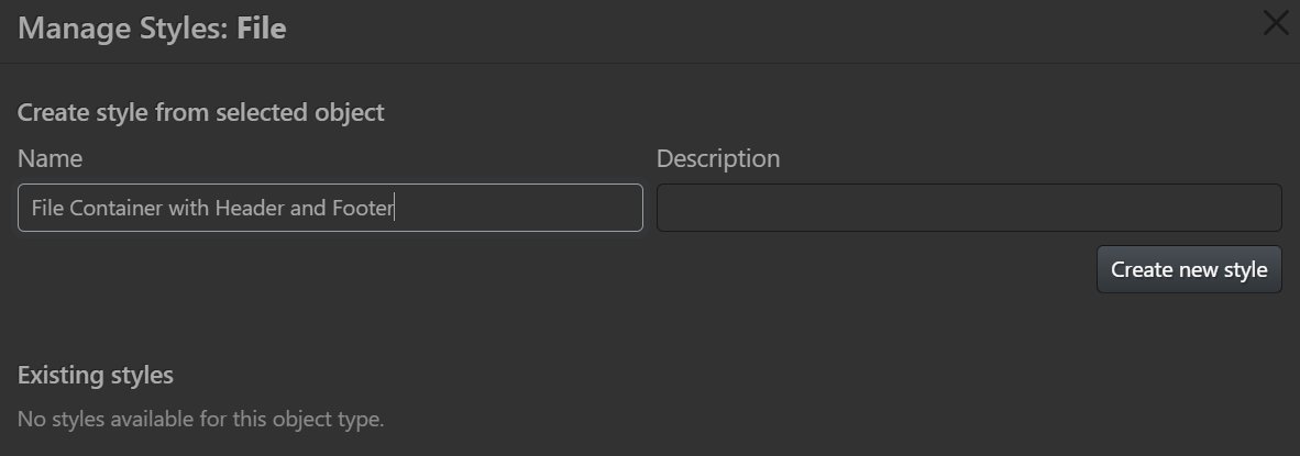
The new style shows up in the list of existing styles, where you can modify some additional options:

If these options are enabled, applying the style also sets the width and height of the object(s) you apply the style to to the same width and height of the object the style was created from. This can be desirable, or not.
When you enable this option, objects of the same type (File, Person, ...) added to an Album are automatically styled with this style. This basically allows you to override the default styles in the theme used for an Album.
You can store objects of type text, image, marker, and button as templates and reuse them in the same or different albums. This is very helpful for static text, external graphics, or other elements you need often in the same size and style.
To insert an existing template, click on the Templates button in the ribbon or press Ctrl + T.
To create a template from a supported object type, select the object before opening the Template Manager.
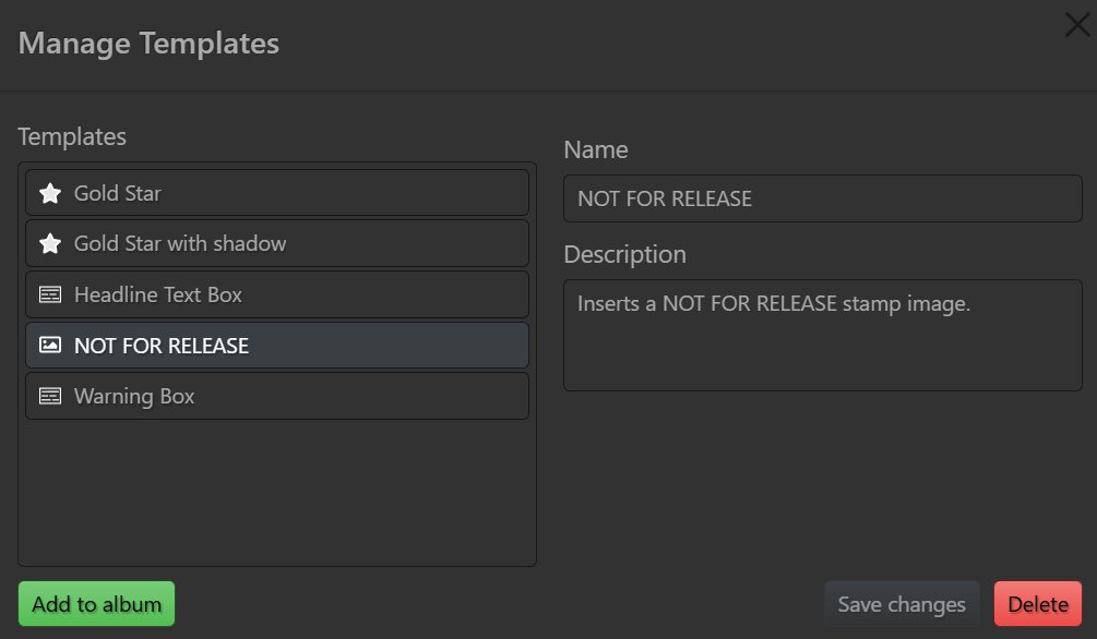
The list on the left shows all templates you have created. The type of the template is indicated by the icon used. Double-clicking or clicking the Add to Album inserts the template into the Album:

A template based on an external vector image in SVG format.
Let's create a template from this text object:

The text includes a variable, so it will always show the current year:
Copyright © {Application.DateTime|format:YYYY} Mario M. Westphal & photools.comSelect the object and press Ctrl + T to open the Template Editor. Since a supported object type is selected, it shows additional controls for creating a new template:
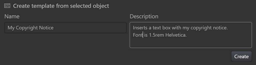
After creating the template you can insert it by opening the Template Editor at any time.
In presentation mode (F4 or the button in the ribbon) Albums show only one page. Ribbon, Property Editor and other chrome is hidden. This mode is designed for minimum distraction and a "Flipping through a photo book" user experience.
You navigate between pages using the PageUp and PageDown or the mouse wheel.
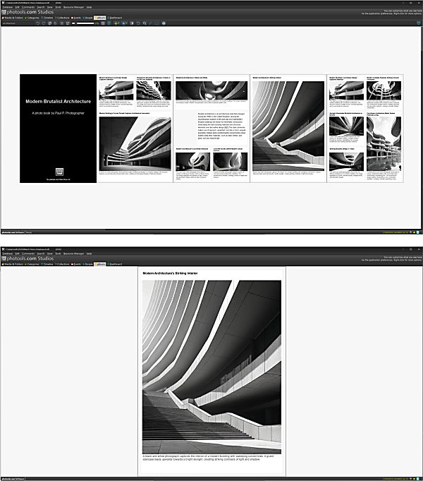
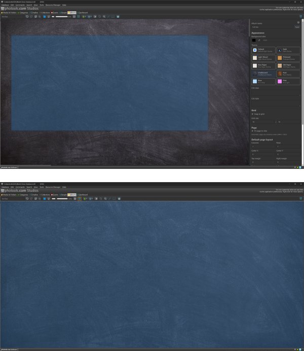
Normal View Mode (top), Presentation Mode (bottom).
For convenience, pressing ESC or F2 or F4 deactivates the presentation mode.
When you create an Album from the "Full Size" template or you enable the option Fit page to view in the property editor, the Album sizes the page to match the full size of the Album View.
The following screen shot shows the full-size page in blue at the top (we zoomed out a bit to show it better) and the same page in presentation mode, filling the entire Album View:
Here is a page that contains images. On the top in normal display mode, and in presentation mode:

When you change the size of the IMatch window, the page size in Fit to view mode will adapt. Objects positioned in page grid cells will automatically adapt to the new page sizes, growing or shrinking as needed. Freely positioned objects may need some manual adjustment.
Buttons allow you to navigate to a specific target in an Album. This can be a page, an arbitrary object or a simple next/previous page navigation.
Buttons can be placed anywhere in an Album, making them useful controls for quickly navigating large Albums, implementing a forward/back-style navigation inside pages and more.
Buttons support multiple actions:
| Action | Description |
|---|---|
Go to next page | Go to the next page. |
Go to previous page | Go to the previous page. |
Go to last | Go to the page/ object from which the current page/object was reached. This is the same functionality as Backspace while in presentation mode. |
Go to target | Jump to a specific page or object. |
When the presentation mode is active, clicking a button triggers the assigned action. In the normal edit mode, clicking a button selects it and opens the property editor. Use Alt+click to trigger the action in this case.
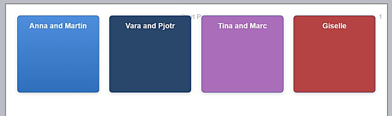
On this page the album shows four buttons, which jump to different sections of the album:
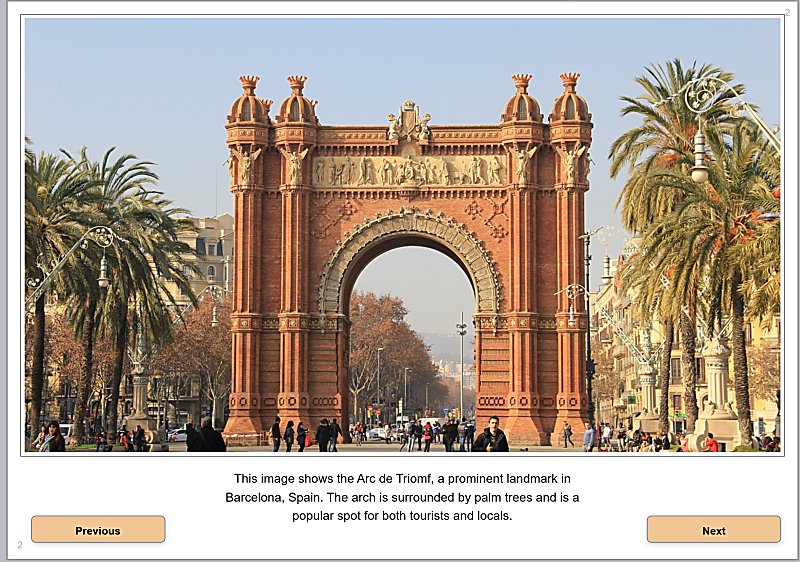
This album shows one image plus description per page. It uses handy buttons to move to the next and last page just by clicking/tapping the buttons:
When navigating Albums using buttons, you can go back to the previous navigation point by pressing Backspace or the Go back button in the ribbon.
If you plan to print an album or save it as a PDF, choose a page size that matches your printer or the desired PDF page size like US Letter or A4.
Add as many pages as you need. For simplicity, we recommend to add pages in one direction only, e.g. horizontally.
Arrange images and other objects on the pages as needed. Once you are satisfied with the results, press Ctrl + P to open the print dialog.
Make sure to select the Album page size in the printer options dialog and use the Print Actual Size option. Printing of background graphics must be enabled and most cases you want to set margins to None

The printed album in a PDF Viewer.
PDF is an ideal format for sharing your albums with friends and families. They work on any platform and any device, from workstation computers to smart phones. All the recipient needs to view your Album in high quality is a web browser.
IMatch's Design & Print is a very powerful all-purpose design and print feature, with powerful automation and dynamic templates. It can be used to design and run practically every print job.
Albums lack many of the more sophisticated features Design & Print offers. On the other hand, it is very easy to create Albums that look awesome on screen, printed or as a PDF.
Pick the tool that works best for your requirements.
You can export Albums to a JSON text file and import the Album into another database. To export or import an Album, click the Album background and then use the buttons at the bottom of the property editor.
Importing an Album creates a new Album with the same name as the imported Album. If the database already contains an Album with that name, the name of the imported Album is made unique by appending a number.
Albums contain database-specific references to objects like files, folders, categories, events, persons. Exported Albums include additional information that often makes it possible to reconcile objects. For example, for files, the full file name is exported. If the database in which you import the Album contains the same file, the album resolves the object to the id of the file.
In a similar fashion Albums attempt to reconcile other objects like folders or categories.
If an object in an imported Album cannot be reconciled, it remains in the Album as stale and you can update or remove it.
Albums use themes for styling. You then can use the controls provided in the property editor to customize things like fonts and colors, text alignment, text attributes like bold or italic, and much more.
If this doesn't suffice, you can utilize all the styling features supported by cascading style sheets (CSS). CSS is used to style web sites and apps. It is simple to learn (at least the things you'll use for Albums) but also very powerful at the same time.
To see advanced CSS properties and styles in the property editor, enable the expert mode in the Album settings. Click the at the top of the property editor to open the Album settings.
For CSS documentation, tutorials and examples, visit:
Your CSS know-how can also be applied to the overlay feature used in the Viewer, Peek View, File Window Tip and My Panel.
user-styles.css CSS FileFor maximum flexibility, Albums support CSS classes loaded from a user-provided external style sheet file and 'ad-hoc' CSS styles directly applied to objects.
CSS classes defined in the %APPDATA%\photools.com\IMatch6\albums\themes\user-styles.css file can be reused in every album. This is the best way to define frequently used classes you need often.
For editing the user-styles.css we recommend using an editor that has syntax-highlighting and syntax-checking for CSS, like the free Microsoft Visual Studio Code.
A CSS file is a normal text file that contains CSS classes. For example:
.canvas-object .font-red {
    color: red;
}
The CSS class named font-red sets the text color to red. The .canvas-object selector means this class is applied only to objects contained in an object that has the canvas-object class, which applies to all objects you see in an Album (file objects, text objects, markers, ...). Using this selector with your custom classes is just good style.
Let's give this a try. After adding this class to user-styles.css and saving the file, we click the album and press F5 a few times to force a reload.
Albums load the user-styles.css only during the initial load, which is why we need to reload so the changes done to the CSS file are applied.
Now, select a text box and in the Text CSS class, add the font-red class:
Use only the name of the class, without the leading dot.
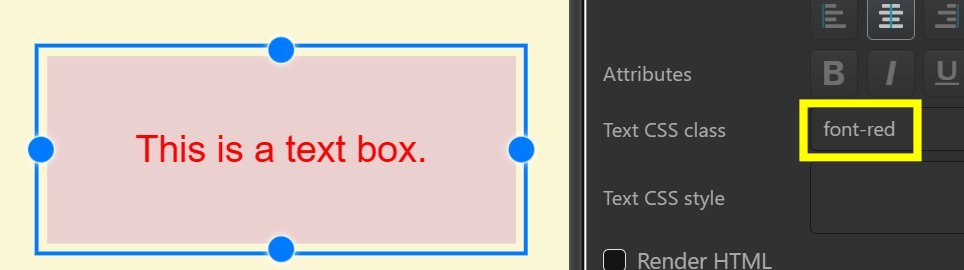
The color of the text changes to red, as expected.
Yes, we could have achieved the same result by just using the Font color control in the property editor. But changing the color makes a good first example.
Now, let's create a second class that specifies the font family to use:
.canvas-object .font-comic-sans
{
    font-family: 'Comic Sans MS';
}
Comic Sans MS is a font included in Windows 10 and later. After saving the CSS file and reloading the Album with F5, we can use the new style:
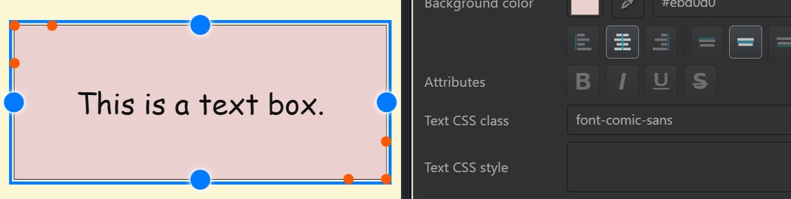
The font used for the text box has changed. We can also combine multiple classes. Separate the class names with a blank:

Maybe you want to style all text objects that serve as headlines. A class like this would do that:
.canvas-object .headline-big
{
    font-family: Arial;
    font-size: 36pt;
    font-weight: bold;
}
This class specifies the font family to use, the height in points and also makes the text bold. In the Album, this looks like this:
This is how user-styles.css works. You define CSS classes for styles you need often once, and then use these classes for all objects which you want to style in specific ways.
If you change one of your classes later, all album objects using the class automatically update after the next reload.
If you don't want to use user-styles.css or you need a style only for one object, you can enter the CSS directly in the CSS style property of the object.
Text objects have Text CSS style and CSS style for the "box" that contains the text. File objects have CSS styles for the header, footer and the file object itself. This makes things more flexible.
For styles that change the border or padding, usually the object itself is where to apply the style. For text styles like font family or weight, the Text/Header/Footer CSS Style property is the one to use. If something does not work, try moving the style between the object and text/header/footer.
Styles are separated with a semicolon. For a better overview, place each style in its own line using Shift + Enter.
In the next example, we added two styles. One changes the color of the text; the other changes the font family:

If you apply multiple styles, separate them with a semicolon ;. You can additionally wrap the styles into multiple rows using Shift + Enter for a better overview.
The next example adds a thick red border to a text object and removes the padding set by the theme:
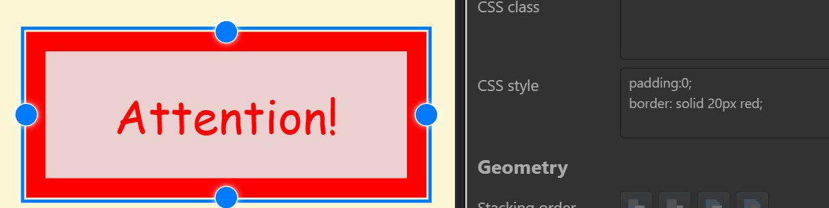
The CSS styles and rules for CSS class and CSS style use the same syntax. You create a class for styles you want to use often, and use styles directly if you need them only once.
In the next section we explain the most commonly used CSS styles, from an Album perspective. Please refer to these online resources for all details about CSS:
Your CSS know-how can also be applied to the overlay feature used in the Viewer, Peek View, File Window Tip and My Panel.
Albums use standard HTML/CSS color values, e.g. for text and background colors. Multiple formats are supported.
#rrggbb | This format specifies color using hexadecimal numbers between 0 and f (f is 15 in decimal). Optionally an alpha channel / transparency value can be added at the end.
| ||||||||||||||||||
rgb(red,green,blue) | Each value can be specified as a number in the range 0-255 or as a percentage in the range 0-100%.
|
You enter the color value directly for text color, background color, border color and all other object and Album properties that support colors.

Entering a background color for an album.
Use the color picker next to the color input field to pick a color from an image or other object. This often produces a pleasing result.
There are additional ways to specify color values in HTML. See Mozilla Developer Network for a full list.
The syntax for borders is border: style width color
For example: border: solid 10px ##ff0000 or border: dashed 10px ##ff0000

This style was applied to the file object itself. You can also add border styles to the header and/or footer:

Using the CSS Style property of the header and footer (or their CSS Class property) you can set individual background colors, font families and more:

For the header CSS Style we used:
font-family: 'Comic Sans MS';
background-color: #726751;
For the footer, we used:
background-color: #320611;
The header overrides the default font set by the theme in addition to setting a custom background color.
To remove a border stemming from the theme used, use:
border: none;
Themes may use padding to produce an empty space between the border and the inner content of, for example, file objects. In the image above, this is the white padding surrounding the header, footer and the image itself.
From the top left, clockwise:
padding: 10px;
padding: 5px;
padding: 0;
padding: 20px 5px;

In most practical cases, you will either remove the padding the theme uses or use larger padding in combination with borders.
In the next example, we add a border, change the background color of the file object, and add more padding. When adding more padding, the background color of the file object fills the space created by the padding:
padding: 20px;
background-color: #e3d3ab;
border: solid 3px #666;
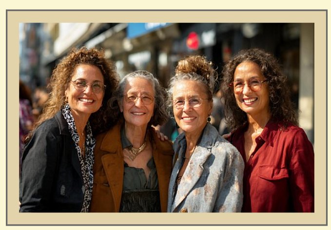
Maybe add a shadow too?
box-shadow: 0 12px 12px -8px black;
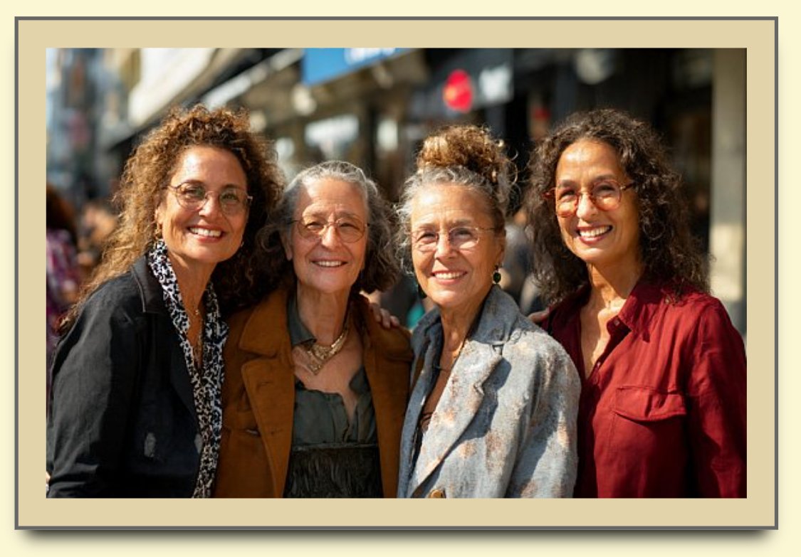
Note that once you have styled an object, you can save it as a style and later reapply the same styles and settings to other objects.
Some themes use a color for the background. You can easily change this in the property editor.
To remove the background image for a theme, just add the style
background-image: none;
in the property editor for the album.
To use a custom image or texture for the album background, use the background-image style:
background-image: url('http://useralbums/images/my-texture.jpg');
background-size: cover;
This style loads the specified image from your useralbums/images folder and stretches it (cover) to fill the visible canvas area. There are more styles and arrangements you can create using backgronud CSS styles. See the cited online resources for all details.
The canvas image is fixed, it does not pan with the album.
Reliable sources for free background textures are https://pixabay.com/ and https://unsplash.com/
This was just a quick overview of some of the CSS styles you can use to design the look of objects in IMatch albums. If you want to learn more, search the web for CSS tutorials and references.
For CSS documentation, tutorials and examples, visit:
You can find detailed specifications, tutorials, and examples for each CSS style mentioned here on the Internet. Give your favorite search engine or AI a spin.
Albums have been designed to allow users to create their own themes. This is a fairly easy process:
%APPDATA%\photools.com\IMatch6\albums\themes contains your custom themes._themes.json file that is inactive by default. Remove the leading _ to make it active.
my-theme.css in the same folder.Use a software like the free Microsoft Visual Studio Code to edit style sheets (CSS files). It has a built-in highlighter and checks the syntax automatically, informing you about problems.
The starter theme we've included with IMatch is really simple:
.canvas-wrapper {
    /* Change the background color of the album to orange */
  --album-canvas-bg: #ff5e00;

  /* Change the text color used for general items and page labels.*/
  --album-text-color: #ffffff;
  --album-page-label-color: #ffffff;
}
It sets the background color to orange and the text color used for objects like text boxes and page labels to white.
This is your starting point. To figure out which classes to include in your theme to style individual elements, have a look at "C:\ProgramData\photools.com\IMatch6\webroot\albums\themes\default.css" and the other themes in that folder.
If you enable the developer mode in the IMatch Application settings, you can use the Inspect command from the context menu in the Album View to inspect the elements shown in an album:
Inspecting a person object in an album with the built-in develper tools.
This allows you to see details about each object, including the CSS classes applied to the object to style it. When you want to change the style of objects, this tells you which classes you have to add to your custom theme.
The styling is performed using variables, in almost all cases. For example, to change the default text color for text boxes, you would use
--album-text-color: orange;
In your custom theme you just add the variables which you need to change to create the custom look of your theme.
--pen-orange-color: Accent color used by shared UI chrome in the canvas shell.--pen-orange-color-hilite: Highlight version of the shared accent color.--album-canvas-bg: Solid background color of the canvas wrapper.--album-canvas-bg-image: Background image for the canvas wrapper.--album-canvas-bg-repeat: Background repeat mode for the canvas wrapper.--album-object-bg: Default object background.--album-object-border: Default object border color.--album-object-text: Default object text color.--album-object-border-width: Default object border width.--album-object-border-style: Default object border style.--album-object-general-border-style: Border style used by the standard tile-like object types such as files, people, folders, categories, and events when they should keep visible card borders while other object types stay borderless.--album-object-selected-outline: Outline used for selected objects.--album-header-font: Font family for object headers.--album-header-size: Font size for object headers.--album-header-color: Text color for object headers.--album-header-bg: Background color for object headers.--album-header-padding: Padding for object headers.--album-footer-font: Font family for object footers.--album-footer-size: Font size for object footers.--album-footer-color: Text color for object footers.--album-footer-bg: Background color for object footers.--album-footer-padding: Padding for object footers.--album-object-icon-caption-color: Backward-compatible fallback color for icon-mode captions.--album-object-icon-header-color: Text color for headers on icon-mode objects such as folders and categories that do not use the standard white caption area.--album-object-icon-footer-color: Text color for footers on icon-mode objects such as folders and categories that do not use the standard white caption area.--album-object-icon-header-bg: Background color for headers on icon-mode objects.--album-object-icon-footer-bg: Background color for footers on icon-mode objects.--album-object-icon-header-indent: Extra left indent for icon-mode headers when a color accent swatch is present.--album-text-font: Font family for text object content.--album-text-size: Font size for text object content.--album-text-color: Text color for text object content.--album-text-padding: Padding inside text object content.--album-button-padding: Inner spacing of button objects.--album-button-border: Default button border.--album-button-radius: Default button corner radius.--album-button-background: Default button background.--album-button-shadow: Default button shadow.--album-button-color: Default button text color.--album-button-font: Font family for button captions.--album-button-font-size: Font size for button captions.--album-button-font-weight: Default button font weight.--album-button-text-decoration: Default button text decoration.--album-button-hover-border: Button border while hovered.--album-button-hover-background: Button background while hovered.--album-button-hover-shadow: Button shadow while hovered.--album-button-hover-color: Button text color while hovered.--album-button-hover-font-weight: Button font weight while hovered.--album-button-hover-text-decoration: Button text decoration while hovered.--album-button-active-border: Button border while pressed.--album-button-active-background: Button background while pressed.--album-button-active-shadow: Button shadow while pressed.--album-button-active-color: Button text color while pressed.--album-button-active-font-weight: Button font weight while pressed.--album-button-active-text-decoration: Button text decoration while pressed.--album-button-active-transform: Optional transform applied while pressed.--album-button-focus-outline: Keyboard focus outline for buttons.--album-button-focus-outline-offset: Offset used for the keyboard focus outline.--album-button-transition: Shared transition used for button state changes.--album-group-padding: Outer padding used when measuring group bounds.--album-group-default-width: Default width for newly created groups.--album-group-default-height: Default height for newly created groups.--album-group-collapsed-width: Width of a collapsed group.--album-group-header-height: Height of the group header bar.--album-group-border: Border for normal groups.--album-group-bg: Fill for normal group bounds.--album-group-hover-border: Border for hover state.--album-group-hover-bg: Fill for hover state.--album-group-radius: Corner radius for group bounds.--album-group-header-bg: Background for the group header bar.--album-group-header-color: Text color for the group header bar and title.--album-group-header-font: Font family for the group header bar.--album-group-header-size: Font size for the group header bar.--album-group-header-gap: Gap between the toggle button and title.--album-group-header-padding: Padding inside the group header bar.--album-group-toggle-size: Size of the expand/collapse button.--album-group-toggle-border: Border for the expand/collapse button.--album-group-toggle-bg: Background for the expand/collapse button.--album-group-toggle-color: Text color for the expand/collapse button.--album-group-toggle-font-size: Font size for the expand/collapse button.--album-group-drag-over-border: Border shown while dragging over a collapsed group.--album-group-drag-over-bg: Fill shown while dragging over a collapsed group.--album-group-selected-border: Border shown for selected groups.--album-page-border: Border color for page outlines.--album-page-bg: Background fill for page surfaces.--album-page-label-size: Font size for page labels.--album-page-label-font: Font family for page labels.--album-page-label-color: Text color for page labels.--album-connector-color: Default connector stroke color.--album-connector-width: Default connector stroke width.--album-connector-selected-color: Stroke color for selected or connected connectors.--album-connector-selected-width: Stroke width for selected or connected connectors.--album-connector-link-color: Default color for generic link connectors.--album-connector-link-width: Default width for generic link connectors.--album-connector-filelink-color: Default color for fileLink connectors.--album-connector-filelink-width: Default width for fileLink connectors.--album-connector-grouplink-color: Default color for groupLink connectors.--album-connector-grouplink-width: Default width for groupLink connectors.--album-connector-label-size: Default connector label font size.--album-connector-label-color: Default connector label text color.--album-connector-label-stroke: Outline color used around connector labels.--album-connector-label-stroke-width: Outline width used around connector labels.--album-alignment-guide-color: Color of alignment guides.--album-resize-handle-color: Color of resize handles.--album-object-type-badge-left: Left offset for the folder/category type badge.--album-object-type-badge-top: Top offset for the folder/category type badge.--album-object-type-badge-size: Size of the type badge icon.--album-object-type-badge-padding: Padding around the type badge icon.--album-object-type-badge-radius: Border radius of the type badge container.--album-object-type-badge-bg: Background of the type badge container.--album-object-type-badge-border: Border of the type badge container.--album-object-type-badge-shadow: Box shadow for the type badge container.--album-object-type-badge-opacity: Opacity of the type badge container.--album-object-thumbnail-accent-border-width: Border width used for thumbnail accenting.--album-object-icon-accent-strip-height: Height of the icon accent strip.--album-object-icon-accent-strip-width: Width of the icon accent strip.--album-object-icon-accent-strip-radius: Corner radius of the icon accent strip.--album-object-icon-accent-strip-color: Color of the icon accent strip.